Miro just got a major update. We refreshed our interface and made Miro even more customizable to your needs with the launch of an add-on library that allows professionals with different workflows to customize the boards’ functionality.
Each product update is made with purpose and has a story behind it. As Miro’s head of product, I’d like to share the story behind the new customizable version of our platform and our learnings.
Inspiration
We have been thinking about the next big step for Miro as a product for some time, and we’ve seen a lot of requests from our users who wanted to expand the possibilities of the tool beyond online whiteboarding – far beyond.
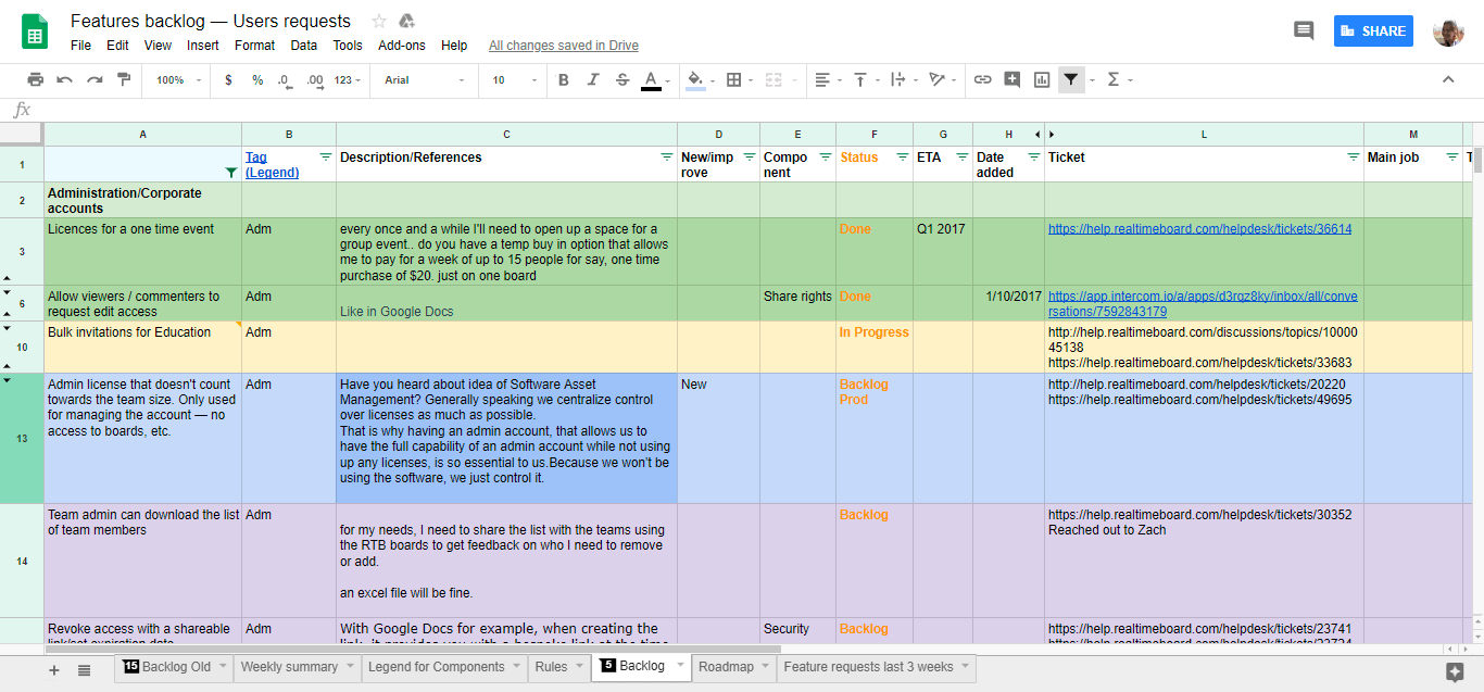
As a customer-centric company, we started to dig deeper into our customers’ needs and realized that there are several things customers would like to use Miro for, from simple drawings during collaborative meetings with the distributed team to complex engineering diagrams.
While analyzing these requests, we noticed that product teams have members with different backgrounds, and all of them speak different “languages,” using images, data, spreadsheets, diagrams, maps, etc.
Miro’s main job is to offer a collaborative space where all team members can easily think and plan together and sync their minds regardless of format, location or time zone.
The idea of being a visual hub where teams can do their jobs and explain complex concepts all in one tool inspired us to build the new version of Miro. Our product, design and engineering teams started to combine their efforts to create it.
Miro as a team hub: the challenge
A shared workspace should help users complete their tasks and work with a wide variety of formats and tools. These two things require a lot of new features, adding a lot of potential complexity. Moreover, not all the features are essential for every team or team member.
Obviously, no one likes complexity. Our users love Miro because of its simplicity and low learning curve. They often say, “It just works!” Keeping this in mind, we started to work on a solution.
After several iterations, we realized that we must keep the basic product simple and allow people to use it the way they want to. So, the major challenge was to find a balance between simplicity and functionality and to build a scalable solution that will allow us to add more features over time.
Why’s
When we started to work on the solution, we realized that we would have to define the Why’s that would keep the teams working on the new version of Miro on the same page.
Here are some things that we committed to from the very beginning.
Why we built the new version of Miro:
- Our customers should be able to customize the tools they use on the board.
- The layout should be easily expandable with future add-ons (e.g. toolbar, export menu, libraries, etc.).
- We should have the ability to build pre-made sets of tools for different types of users to boost adoption of the product.
- Content creation should be simplified in terms of behavior and types of content.
Three product principles
While building a product, we go through many iterations, and teams may start to think about new solutions to local problems, running the risk of overdesigning. To help us stay focused, we came up with three major principles that allowed us to make decisions quickly if we got stuck.
- Simplicity. None of the product decisions should add any complexity in performing tasks, and performing tasks shouldn’t be more time consuming than in the previous version.
- Consistency and predictability. The behavior of all the tools should be consistent and predictable for the user.
- Scalability. We do not want to build a one-time solution for each feature. Everything in terms of UX and tech architecture should be done with future updates in mind.
Insights
We believe that building a successful product requires really good understanding of customers’ needs. Here are some insights that helped us build the new version of Miro:
On average, people use 10–15 Miro tools for content creation on a regular basis, while we have more than 25 available. This means that some of the tools are really not necessary for some segments of users.
There are some tools that are used by all the users regardless of their role (and they stay in the product as default options), and some tools are only used by some types of customers (they can be added on).
Some organizations have strict policies about using particular types of tools/cloud storage, etc., so we should include the ability to allow company administrators to control access to certain plugins.
A lot of users use touchscreens in their work, so we have to think about an easier way to add content from touch devices.
The solution
Within several iterations, we built a new version of the product that allows our customers to adapt Miro to their workflow easily, while keeping the product really intuitive for those who only need basic functionality.
The new Miro update includes three major parts:
Customizable layout. The new Miro interface can be easily adapted to any user’s needs. Simply by dragging and dropping, you can rearrange the tools in the toolbar and easily add necessary ones from the library. For instance, if you frequently use Iconfinder, you can now add it to your toolbar and open it with one click.
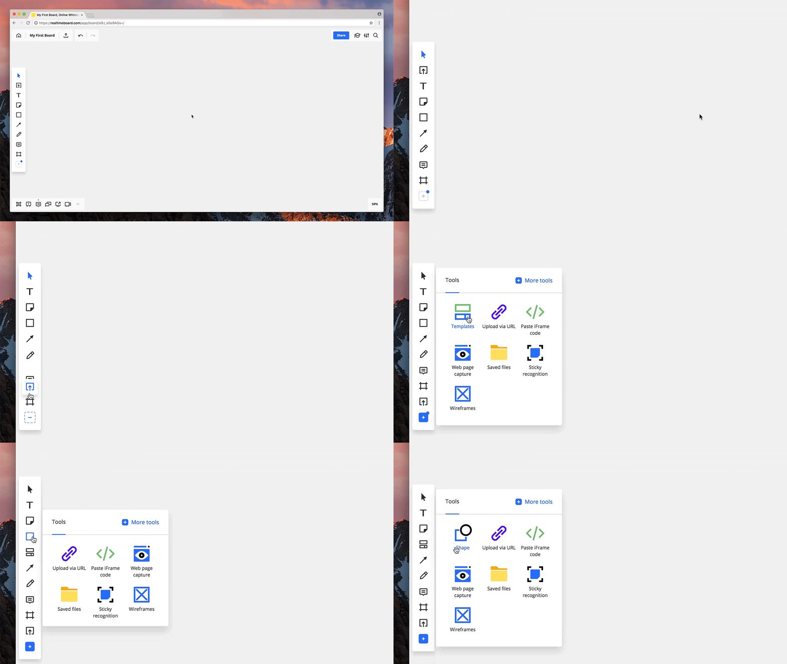
Add-on library. Under More tools you can now find a growing library of add-ons that allow users to extend the functionality of Miro. Some are related to content creation (e.g. Unsplash, diagramming icon sets, etc.). Those appear in the library after installation and can be added on the toolbar. Others are related to collaboration or a specific task, and they appear at the bottom bar (e.g. voting, video chat, timer, etc.).
Administrative settings. Company and team administrators can now set up the availability of certain add-ons for team members, which improves the security and adds administrative control for enterprises.
All these things together turn Miro into a flexible, simple and powerful platform for teams of any size, opening up the possibility of Miro as a company-wide tool.
You can learn more about the updates and new features in this article.
The process
The process of building the new version of Miro took us about six months from initial prototype to final release. Here are main steps we took:
Building the first version for initial testing. The initial prototype to test the idea of customization and a drag-and-drop interface allowed us to easily validate the hypothesis from a technical perspective.
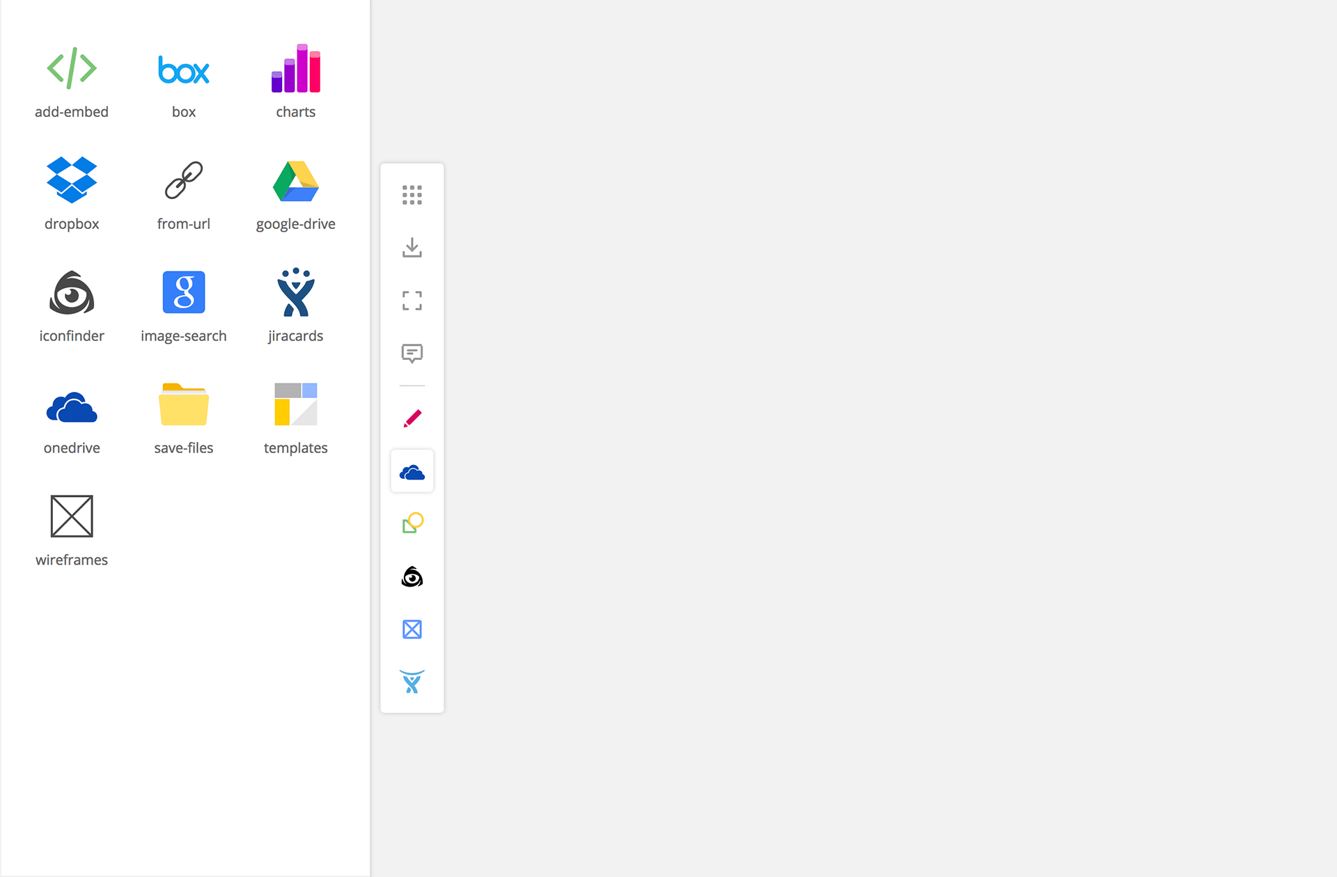
Gathering user feedback. We organized user interviews at each iteration with significant changes to ensure that we didn’t make a negative impact on the user experience.
Design and engineering. The whole process was a continuous collaboration between the designer, developers and product manager, allowing us to build and iterate really fast.
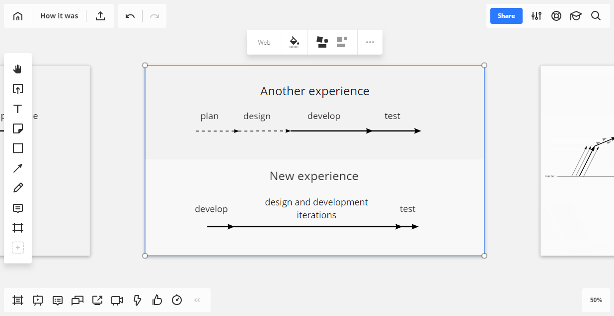
We have two major parts that were designed and developed: a new layout and the add-on library.
At first, we designed a system that allows us to work with all the elements consistently and defines the behavior of all the tools and features.
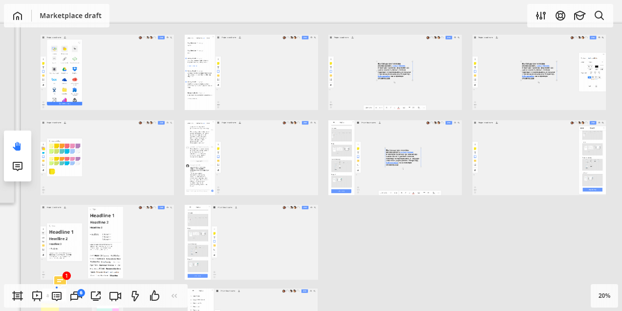
During the next steps, we started to polish the interface and work on sidebars, icons, windows and more.
The add-on library was also designed in several iterations.
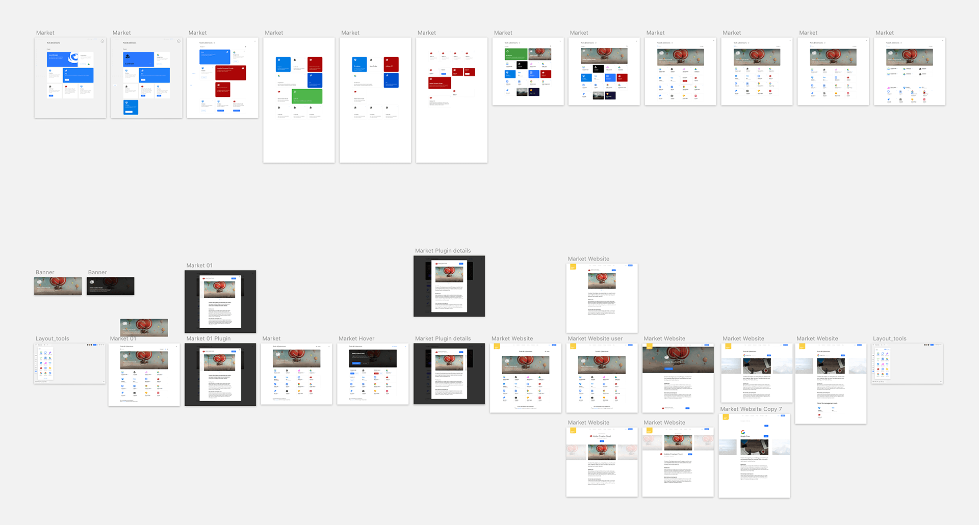
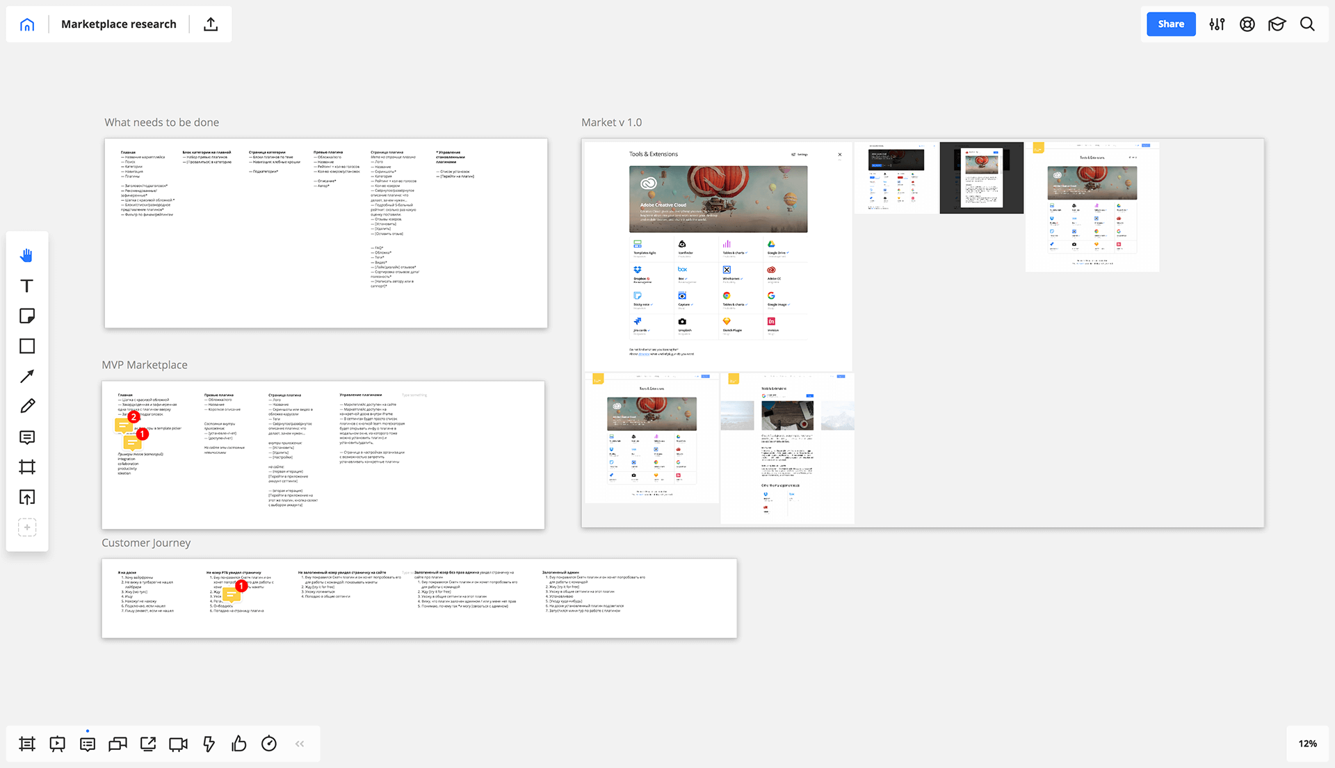
Rolling out the new version. When something is built, it’s time to ship it. The main challenge was to ensure that everyone experienced a smooth transition. That’s why we rolled it out in two steps.
A beta version with the ability to revert back to the old Miro. This really helped us gather initial feedback, fix UX issues and be more confident in the new version.
After all the testing was done, we opened the final release of the new Miro for all users.
During the process of design and development, we relied on our users’ feedback and data, and it really helped us build a product and experience that is easy to use, powerful and engaging.
What’s Next
We continue to improve Miro and build new add-ons that extend the functionality of the shared visual workspace. As the next big step, we would like to give our users the possibility to build new add-ons for third-party developers, opening up endless possibilities for teams and companies to improve their workflows. And of course, we will do anything in our power to enhance the product to better serve the teams all over the world who trust us and are optimistic about the future of work!

