
Figuring out how to make a diagram seems easy enough. You draw shapes, use lines and arrows to connect them when necessary, and then add labels. Not so bad, right?
But creating an effective diagram — one that clearly represents your information — involves more than doodling. Here are eight common diagramming mistakes to avoid (and why it’s worth your effort to get these visual aids right).
Why bother with effective diagramming?
During the construction of the Denver International Airport in the 1990s, the planning team wanted to build a completely automated baggage handling system.
Spoiler: It didn’t go well. They couldn’t get the system to work right and the finished airport had to sit unused for a full 16 months, causing huge delays and millions of dollars wasted.
There were a lot of reasons for that project’s failure, but here’s one you might not know: bad diagrams. Yep, unclear blueprints meant that conveyor belt sections were installed in the wrong direction or at incorrect angles, causing lots of jams and snags.
It’s proof that bad diagramming can cause big problems. But if you need a little more convincing, here’s what an effective diagram can easily accomplish:
- Simplify complex information: Long and dense information is too overwhelming to wade through in text form. Diagramming simplifies those details into a more digestible format.
- Enhance understanding: Diagrams can serve as a universal language that can convey your message to anyone.
- Improve problem-solving: Creating a diagram forces you to organize your thoughts and identify patterns. By mapping out relationships and connections, you may be able to understand problems more clearly and even find more creative solutions.
- Boost efficiency: Research states that the human brain processes visuals 60,000X faster than text. Whether you use a flowchart to teach a process or a bar graph to share data, diagrams help people understand the material better and more quickly.
- Increase retention: Our brains also have an easier time remembering visual representations than text-based information (it’s called the “picture superiority effect”).
8 common diagramming mistakes to avoid
Diagrams offer plenty of potential benefits, but you can only reap them if your design is done well. Here are a few common blunders to avoid so you can create a better, more helpful diagram.
1. Choosing the wrong diagram
From graphs to maps to flowcharts, there are a lot of different types of diagrams out there. Success starts with choosing the right format for your needs.
For example, a bar graph or pie chart is effective at distilling data, but it won’t detail the steps of a process. A mind map can help you brainstorm and connect ideas, but it’s not useful for showing a hierarchy of information.
To find the right diagram for you, start by identifying your end goal: What does your diagram need to accomplish? Then peruse various mapping and diagramming templates to see your options and make your choice.
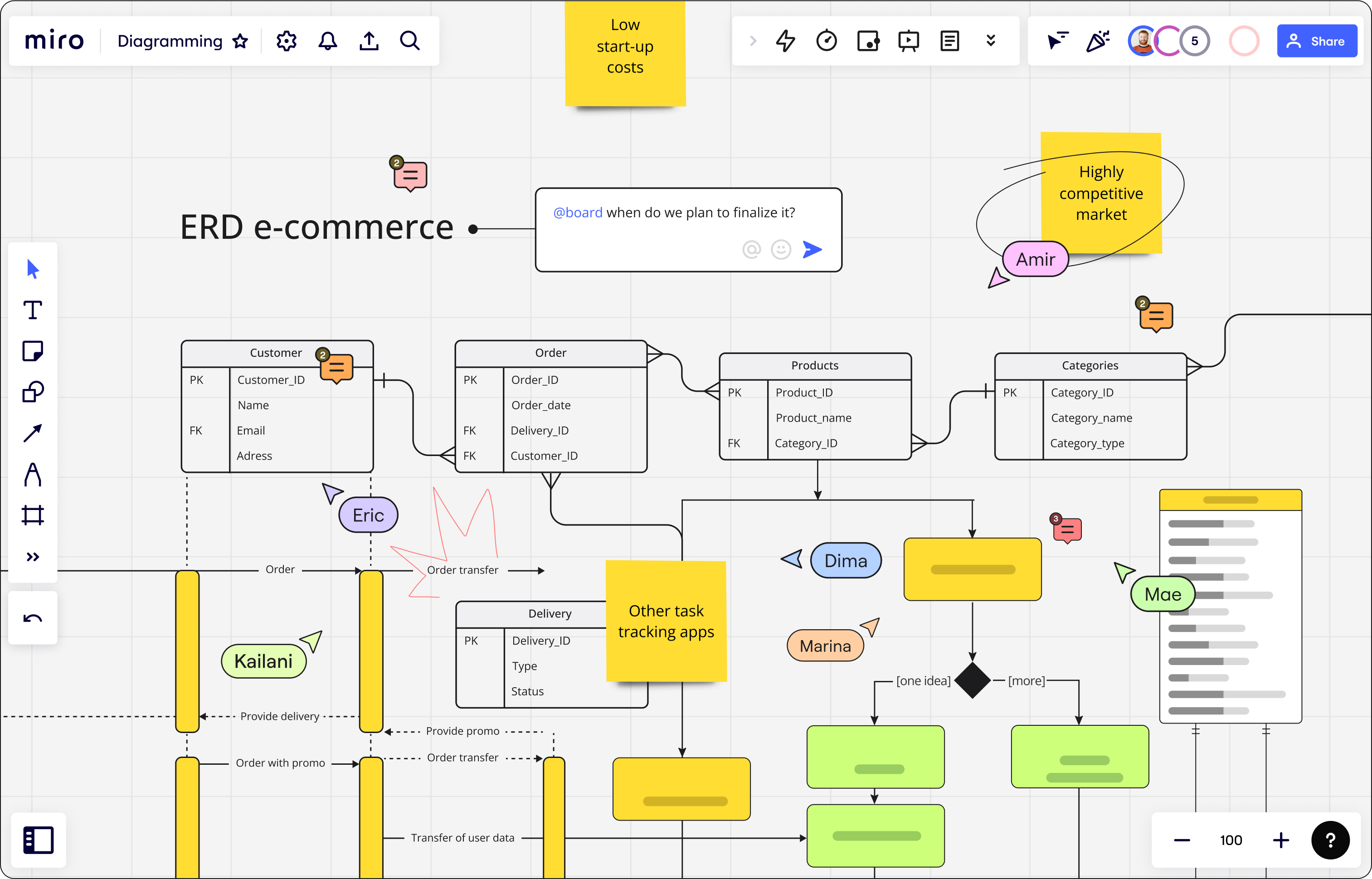
2. Including too much information
It’s tempting to cram as much detail as possible into your diagram, particularly for complex subjects. But that overcrowded approach can make it hard to look at and comprehend.
As you build your diagram, stay focused on the key points and relationships you need to convey rather than getting hung up on unnecessary or irrelevant tangents. Balance out your diagram with plenty of white space to make it more readable and less overwhelming.
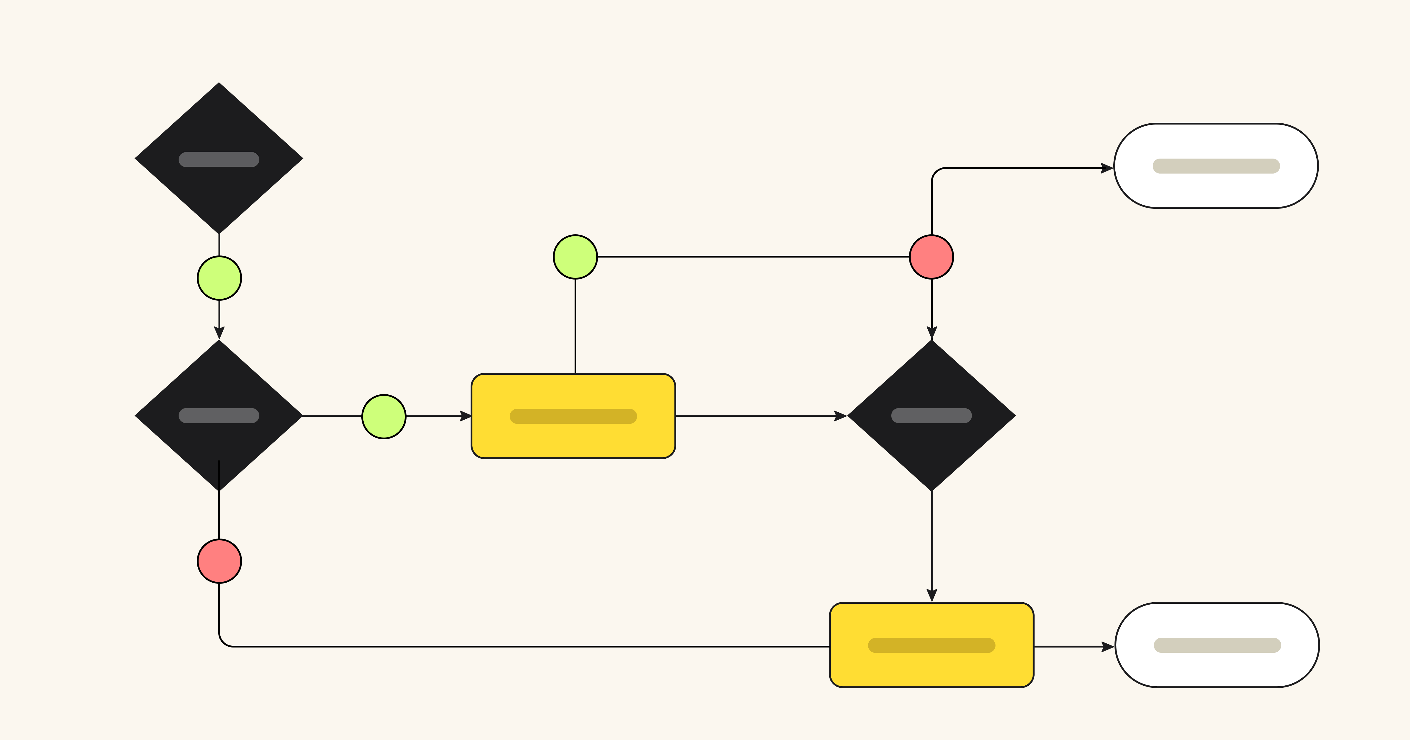
3. Using inconsistent formatting
Diagrams are a language of their own, which means you can’t always choose shapes or other elements at random because there may be existing meaning and logic to them. For example, look at a few of the standard symbols in a flowchart:
- Oval: Start or end of the process
- Rectangle: Step in the process
- Diamond: Decision point in the process
Of course, you still have wiggle room and creative license to come up with something that makes the most sense to you and your team. Just make sure to stay consistent with the elements you choose and document their meaning in a legend so they’re unmistakable.
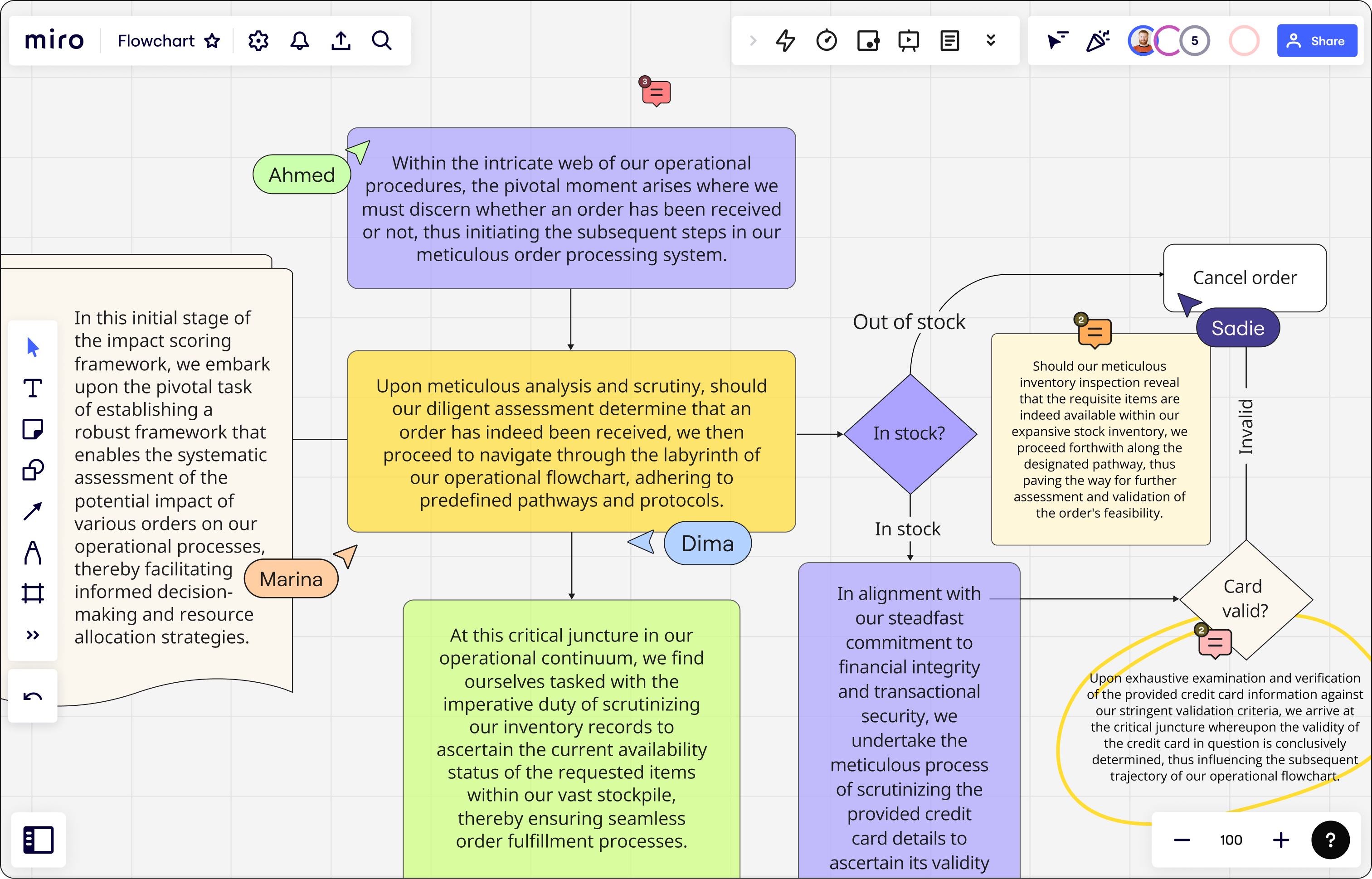
4. Relying on too much text
Remember, a diagram is a visual aid. That means stuffing it full of text defeats the purpose and makes your diagram a lot more challenging to use and understand.
If you can’t seem to avoid including paragraphs upon paragraphs of text, ask yourself this: Is a visual representation the best fit for this material? It might be better suited for something like written instructions or a video recording.
5. Getting too creative with design elements
Colors can enhance understanding of your diagram, provided you use them strategically. Using too many of them or using them indiscriminately can overwhelm and confuse the viewer.
For example, when you create a flowchart to represent a process, using a different color for each step may confuse rather than clarify the sequence of steps. Using the same color for all the steps could be less visually jarring and subtly indicate that they’re connected.

6. Skipping connections
Especially in complex diagrams with a lot of information and connections, it can be easy to forget to add an arrow or a line where you need one.
Take the time to double-check your diagram and confirm that all relevant connections are included so you don’t cause confusion or misunderstandings.
7. Using ambiguous lines or arrows
Lines and arrows indicate the flow of information or connections between concepts. However, ambiguous or incorrect ones can confuse people about how things are related. For example, in a process diagram, an unclear arrow will mislead people about the sequence of steps.
Also, you don’t have to use an arrow on your diagram. If two elements are connected but not necessarily in a specific sequence, a line is a better option.
8. Forgetting to update
Information is dynamic, so your diagram needs to be too. If and when something changes, remember to revisit your design and make the necessary updates.
That’s one of many perks of using a tool like Miro to create your charts and maps. It’s easy to change or move information on your diagram without having to make tedious, manual updates.
Knowing how to make a diagram starts with knowing what not to do
Diagramming might seem like doodling. But in reality, it’s part art, part science, and part language. It helps you convey even the most perplexing information in a clear and comprehensible way.
Avoid the eight mistakes we outlined here and you’re well on your way to diagrams that add simplicity instead of complexity.