Foreword by Miro’s Head of Design
In the not-so-distant past, collaboration for product designers was synonymous with being in-person: buzzing workshops held around conference room tables with whiteboards, dry-erase markers, and stacks of colorful paper sticky notes. When the world abruptly changed in 2020, many teams realized that they needed to transform and adapt their approaches to include more flexible tools and methods for communicating and collaborating online.

During my five years of leading product design teams at Miro, I’ve observed first-hand how the norms of design practices are shifting. Hierarchical organizational structures are flattening into a more democratized world where non-designers have opportunities to add their voice and participate in shaping human-centered products, through more-accessible tools and processes. The element of time is compressing, too, with reinvented tooling that makes co-creation in both real-time and asynchronous formats possible. And, through all these changes, product designers are leading the valuable work of problem-solving and supporting customer needs, pain points, and use cases, while unlocking creative solutions and facilitating collaboration across varied teams.
At Miro, we’re dedicated to engaging cross-functional partners early in our design process, starting with ideation and low-fidelity sketching and prototyping. By fostering an inclusive and welcoming co-creation environment, we’re able to bring more people — and more perspectives and diverse ideas — into the mix to sort out the best possible directions for new tools, features, software, enhancements, and more. But being collaborative is about more than just an influx of ideas; it’s also about building smooth, cross-functional workflows and design methods that lead to innovation and growth, while always centering the needs of the real people who use our products everyday.
As designers we have the opportunity to leverage teams’ unique experience to help build a new world of collaboration and the next generation of products, in ways that are more inclusive, connected, and flexible than ever before.
— Vlad Zely, Head of Design at Miro
Introduction
As a product designer, you’ve probably felt it: the tectonic plates of modern workplaces shifting, from in-person to fully remote to hybrid arrangements. With these changes, it can be challenging to drum up engagement and collaborate seamlessly in design meetings and workshops when stakeholders are split between different departments and time zones.
32% higher revenue for design-led companies
Find out how design teams are using Miro to create the ultimate customer experience.
Reducing friction and forging stronger partnerships within your teams in new work settings can be tricky. But solving nuanced challenges? That’s where product designers thrive. And design skills pay off: a McKinsey study shows that design-led companies increased their revenues by 32% over 5 years.
Wrapped in the challenges of emerging ways of collaborating are new opportunities for strengthening and adapting common design practices for this new era.
In the world of product design, we’re seeing encouraging trends. One is the democratization of human-centered design. In other words: non-design teams are increasingly interested in practicing design thinking.
As author Jeanne Liedtka explains in the Harvard Business Review article Why Design Thinking Works, “design thinking emphasizes engagement, dialogue, and learning.”
This is good news for designers seeking to increase connection and conversation among customers, colleagues, and other stakeholders. Liedtka writes, “by supplying a structure to the innovation process, design thinking helps innovators collaborate and agree on what is essential to the outcome at every phase.” Tools like Miro can help designers easily include non-designer stakeholders in their processes.
Another prominent trend is tapping into the collective wisdom of creative minds by using templates as starting points, like those from Miro, Figma, and Notion. Building off of patterns and templates can be a springboard for innovation — no need to reinvent the proverbial wheel (or springboard, for that matter).
In the following pages, we’ll explore challenges that often emerge in product designers’ workflows — including user research, mapping the customer journey, design workshops, and design concepting — and provide strategies and solutions that blend seamlessly into new and emerging ways of working.
Find out why design organizations of all sizes use Miro for enterprise-grade collaboration.
Chapter 1: Transform user research into actionable insights
What’s included in this chapter:
- Plan, prep, and align with stakeholders
- Uncover insights from qualitative research
- Maintain a central research hub
Think of the best product experience you’ve ever had: How did it make you feel? Did it inspire new ideas? What interactions did it encourage? And, how might you facilitate those sparkling moments for your customers?
Before you can unlock a winning design solution, it’s essential to have a thorough, clear-eyed understanding of what the problem actually is. That’s why the research and discovery processes are so important for laying a groundwork of customer-centered knowledge and understanding to set your project up for success. As you and your team uncover valuable insights along the way, it can be challenging to keep these findings organized. Building a central repository makes the discovery process easier to manage and learn from.
See how teams are using Miro to create a visual hub for teamwork
Discovery has many facets, and it can be challenging to figure out just the right moment to invite just the right collaborator — whether from your product team, engineering team, or otherwise — into the process. The methods in this chapter will guide you in bringing together collaborators from across your organization with helpful tools to make the process of interpreting your research findings as seamless as it is insightful. Let the design magic begin!
Prepare, plan, and align with stakeholders
By workshopping your initial ideas and seeking feedback from key stakeholders early in the process, you have a powerful opportunity. You can build consensus on the project’s objectives and understand the group’s assumptions. This, in turn, will help to generate buy-in and cross-team understanding that will inform future design decisions, all while empowering disparate teams to connect and collaborate — and helping your team accomplish its goals.
Welcome key collaborators
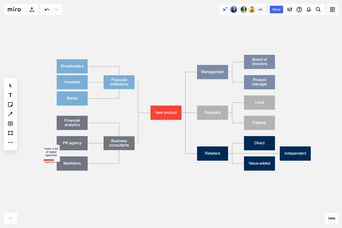
To get started, your team will want to identify and map out the people and perspectives most critical to the project. A tool like Miro’s Stakeholder Map Templates is a simple way of organizing all of the people who have an interest in your product, project, or idea in a single visual space. This allows you to easily see who can influence the project and how each person relates to the other.
Create an accessible research plan
Before putting your research plan into action, get feedback to ensure alignment. Miro’s UX Research Plan Template is helpful for presenting your team’s findings to stakeholders, including your team lead, product managers, developers, marketers, executives, and users, in plain language and in a single document. The plan includes an overview of the research project, encourages well-defined and agreed-upon goals, and acts as a written agreement that the research will meet these goals.
Help your team shine during interviews
Whether your team is conducting interviews with users to get a snapshot of how they interact with a product and to find pain points, or with internal stakeholders to gather insights and objectives, you’ll want to go in prepared. When using a well-considered interview format and thoughtful questions, you’ll demonstrate to interviewees that their input is being taken seriously. This can increase the quality of your findings and build trust within your organization, including with internal stakeholders.
Tools like Miro’s User Interview Template make it easy to capture observations, feedback, and key takeaways, as well as actions and to-dos. When taking interview notes directly on digital sticky notes, you’ll be way ahead of the game when it comes time to synthesize research — no manual transcribing needed.
For best results, keep findings clear, collaborative, easily accessible, and digestible to help shape your research and next steps.
Uncover insights from qualitative research
The research and interview process typically turns up a mountain of qualitative information. Actually turning this mass of information into powerful and actionable insights can be tricky and laborious. Too much structure upfront in the information-gathering phases can build bias into the process. But without purpose-built tools for synthesizing the collected information, you might end up resorting to a convoluted patchwork of workarounds and spending more time manually transcribing the gathered information, for example, than actually implementing the valuable insights that the data may ultimately reveal.
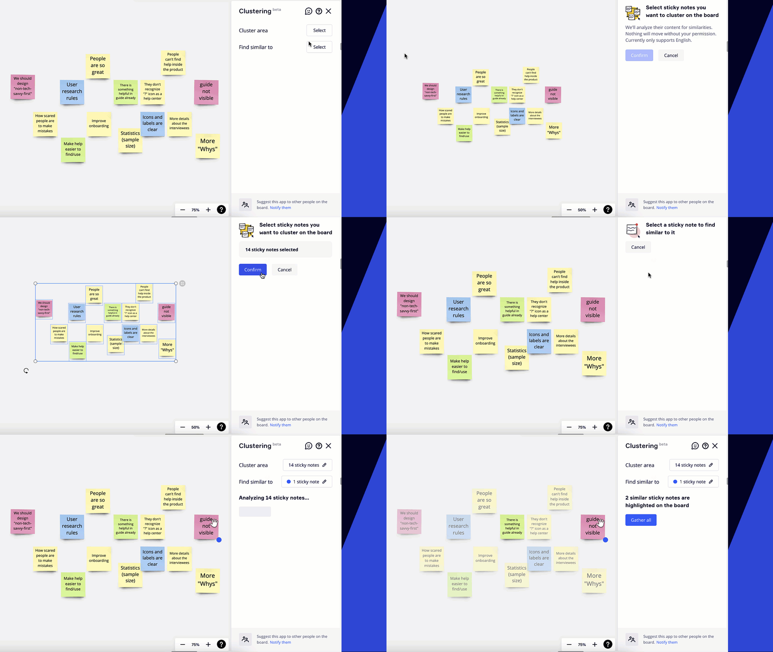
Quickly interpret qualitative research, methods like clustering and affinity mapping (or affinity diagramming) make it easy to visualize, digest, and make a powerful action plan that illustrates your design team’s value to the rest of the company.
Visualize insights with clustering and affinity diagrams
When clustering related findings — including the recommendations, ideas, and solutions uncovered through research, interviews, and brainstorming sessions — patterns and themes emerge naturally, without imposing a structure that could lead to skewed understanding.
An affinity diagram helps further refine and build more structure around these data clusters. Think of an affinity diagram as a tool to bring order to chaos. This approach makes a large amount of information more manageable and digestible — and, as a result, way more actionable. Visualize qualitative data by sorting, categorizing, and consolidating ideas and information into different groups or categories based on their relationships, hierarchy, and priority. Through this process, you’ll surface patterns and insights that promote cross-team alignment.
Diagram the analog way with a giant wall of sticky notes and transcribe them into a spreadsheet or document. Or, save time and get infinite “wall” space with Miro’s Affinity Diagram Template.
Synthesizing and working with clusters of data in Miro is quick and easy. To create sticky notes in bulk, you can paste cells directly from a spreadsheet onto a Miro board. Take data clusters to the next level with these plugins:
- Clustering automatically affinity-clusters your tagged stickies and cards
- Typeform creates a Miro card when a form is submitted
- Google Sheets, paired with the Zapier integration, automatically imports information to boards, helping you see the big picture across all the tools in your workflow
- Blossom enables you to share your user research from Blossom directly within Miro boards as playable video snippets
- Frames organize information, then you can present findings in Presentation mode
Maintain a central research hub
By streamlining and sharing all the knowledge and data related to your project in a single organized and centralized space, such as a Miro board, you and your team can browse, comment, and categorize notes together. A dedication to shared documentation can set a powerful standard at your company. By making resources simple to locate, internal collaborators can stay aligned with your design team’s work and processes, key ingredients for building an inclusive design culture.
Add every new fact, comment, and piece of information that’s discovered during your research process to your research repository, so nothing gets lost. This repository not only will be a go-to source of knowledge that makes collaboration more effective while the project is active, it will also serve as an archive of research artifacts in the future.
A visual hub has many benefits, including:
- Boosting impact: By making research and insights easy to find, understand, and share, you can extend the impact of your team’s work by making findings more accessible.
- Sharing the process: Illustrating your team’s research process not only shows off all the behind-the-scenes work, it also adds context and builds confidence in the conclusions that emerged.
- Painting a picture: Visual documentation makes your team’s research and findings more accessible and easier to understand than text-only documents, especially for visual learners. Plus it reduces the risk of crossed lines, wasted time, and misalignment.
- Staying relevant: Embedding plugins into digital whiteboards automatically keeps your team’s hub up-to-date, transforming what could be a dusty, static archive into a dynamic hive of activity.
- Presenting your research: Your hub can double as a presentation of your findings. By presenting from where you’re already working, you and your team can save time and avoid the repetitive busywork of creating a separate slide show.
Customer spotlight
Munich Re builds customer-centric products to transform the insurance industry with Miro
Miro is the heart of how the Munich Re Automation Solutions team drives product development forward and brings everyone into the same conversation. Previously, the team had to manually collect insights from across 20+ documents to bring cross-functional work together. Not only did this make it harder to tell the full story, but it slowed the project down.
With Miro, the team doesn’t need to perform this time-consuming retroactive packaging. Miro is integrated into every step of the process from the start — so the end-to-end story is built organically as the project progresses.
“The research is at the top of the board, and at the bottom it shows where we are today with the product launch,” says Philip McCusker, Product Manager at Munich Re. “I can take an exec through this board and visually explain how we did it every step of the way.
What should go in your hub?
Truly anything and everything related to your project should go in this repository. This way, your collaborators — and interesting tidbits — will never get lost. Here are a few examples of what you can file here:
Documentation
- Planning documents
- Strategies
- Comments, threads, ideas, notes
Qualitative data
- Affinity maps
- Data clusters
- User feedback
Quantitative data
- Google Docs with quantitative analytics and survey results
- Customizable tables and charts
- PDF documents
Competition analysis
- Competitors’ landing pages
- Screenshots of similar solutions
- Notes and annotations
User interviews
- Empathetic images or videos
- Photos of physical sticky notes from the wall converted into digital form in Miro
- Digital sticky notes
…The list goes on! This is just a selection, but you get the idea. If it’s relevant to this user research project, add it to your central research hub.
Chapter Checklist
Are your teams able to share findings in a clear and understandable way with cross-functional stakeholders?
Are your research insights streamlined in one place or scattered across multiple tools and repositories?
Are your researchers able to synthesize qualitative research and effectively translate it into insights?
Chapter 2: Bring focus to the customer journey
What’s included in this chapter:
- Share the full picture and uncover problems to solve
- Document end-to-end journeys with a single source of truth
- Add the customer perspective to technical discussions
- Invite the right internal collaborators
When seeking to improve the customer experience, design teams often encounter challenges with getting and sharing a true representation of customers’ voices and perspective with everyone on the squad. This process can get tangled up with tools that don’t match the task, like PDFs sent endlessly back and forth in an effort to collaborate, or key information left languishing deep in a long-lost slide presentation. When new team members join, it can be tricky to make sure they have a window into what work happened in the past. New employee or not, you might lose time with shoulder tapping and DMs to find misplaced or forgotten files when there’s not a clear place to turn to for up-to-date findings.
That’s where customer journey maps come in. By creating living documentation of current user flows, your cross-functional collaborators can gain a greater understanding of who your customers are, what they need, and how they interact with your company and products across all touch points.
Try one of our customer journey map templates right now
In this chapter, we’ll focus on helpful ways to add customer perspectives to technical discussions, improve the continuity of the design experience across internal teams, maintain a single source of truth, and uncover key problems to solve with big-picture thinking. Let’s start our own journey together, shall we?
Share the full picture and uncover problems to solve
Building customer journey maps can help your team turn a good product experience into a great one by putting customer preferences front and center. Plus, creating these maps in a shared space can help you open up the journey and flow mapping process to cross-functional stakeholders and gather all the information needed to paint a complete picture of your customer’s experiences.
You can use journey maps — whether with sticky notes on a wall, fully digitally, or a combination — to illustrate the impact of the decisions that design, product, and engineering teams have on the real people who use your product. Having a flexible visual space makes it easier to lead discussions about user needs, brainstorming improvements, and finessing the consistency of the product experience.
Choose from over 300 templates to get started
Want to find a framework that aligns internal collaborators and customer needs, with an accessible, shared vocabulary? Here’s how:
- Review your SMART goals templates for creating a customer journey map. What types of outcomes will be actionable for you and your team? How might a map illustrate user needs that transcend the siloes of your company’s teams?
- Pick a model for your map that will best help your team see the big picture and problem-solve together. For example, templates from our community like the User Journey Template or the Customer Touchpoint Map Template are both good starting points.
- Adapt the format of your journey map to capture the pieces of information that are most interesting to you and your stakeholders to help you reach your goals.
See how Miro integrations integrations with your tool stack – across every team
Document end-to-end journeys with a single source of truth
A customer journey map can also serve as a guiding light for your team. Once your team has developed a journey map, it remains a valuable and ever-evolving living document. With digital whiteboards, it’s possible to embed the map everywhere you and your team work. Creating a source of truth is only possible when you are able to connect all the different tools your team is working in. With a collaboration hub that can integrate with tools like Google Workspace, Microsoft Teams, Atlassian’s Confluence, Notion, and Monday.com you can keep updating and adapting your documentation right from your team’s editing workflows. That way, everyone can see the current version in context, since each embed is automatically synced, keeping it up-to-date everywhere.
Customer spotlight
How having a single source of truth helps Wipro Digital deliver projects faster
For Paul Harrison, a UX Architect and Designer at Wipro Digital with more than two decades of experience, having a single source of truth is essential. To deliver client services, Wipro Digital deploys cross-functional teams that include designers, engineers, and a product owner. And to bring everyone together, they create a “project wall” using a Miro board to capture the customer journey, pain points, user research, insights, timelines, a roadmap, and more.
“As part of working with both distributed and co-located teams, we’ve faced a number of challenges in communication and collaboration,” Paul writes. “How do we come together and ensure we’re all on the same page? For us, a space we call a Project Wall has been transformational, helping us align, communicate, come to a shared understanding – and ultimately, deliver projects faster.”
This space, similar to a customer journey map or a research repository, is where the company turns for up-to-date information, from start to finish during a project, serving as a central spot to learn from and improve the user experience.
Add the customer perspective to technical discussions
Help technical teams empathize with customers. Let’s say an engineering team needs to make changes to a user flow or a product feature due to technical or business requirements. With a customer journey map, you and your product design team members have a treasure trove of well-researched knowledge about the customer perspective. You can use your map to illustrate the impact that product changes, even minor ones, can have on customers, and facilitate discussions about how to move forward.
These maps also show how interconnected the user experience is with technical decisions. A customer journey map can help you navigate conversations and answer key questions about each customer moment in a flow, including:
- What did the customer do just before?
- What are they feeling?
- What do they want the outcome of this to be?
- What do they want to happen next?
- What are the downstream implications?
Compile themes and insights into user personas. Whether collaborating with colleagues in product or engineering, you’ll operate with a target audience in mind — often a whole constellation of personalities and needs that intersect in interesting ways. By distilling your teams’ collective knowledge and research, you can create a model for the person you hope to target — a user persona.
Build your own user personas with Miro’s Persona Template
Invite the right internal collaborators
When working with a cross-functional group of collaborators, it can be tricky to figure out both the perfect moment to bring product and engineering teams in and how to create continuity and alignment across your workflows. To improve handoffs between internal stakeholders, choose a slate of tools that will make collaboration seamless — even if your squad is spread across different teams and time zones.
Visual collaboration tools make it easy to zoom out to see the bird’s eye view of your project and zoom in to inspect detailed interaction points. This added visibility into the nuances of internal workflows can help you and your collaborators strengthen shared accountability, eliminate silos that can create a disjointed user experience, and keep a sharp focus on the full picture of the problems you’re solving together.
Try the Workflow Template to see your project’s status and track your team’s progress
Chapter Checklist
Are your customer journey maps understandable to your technical teams?
Do you have one single source of truth that helps all teams reference and iterate on the customer journey?
Are you involving the right collaborators?
Chapter 3: Facilitate inclusive meetings and workshops
What’s included in this chapter:
- Create an accessible space for everyone to participate
- Make meetings interactive and engaging to drive diverse viewpoints
- Visualize a united plan to move forward
Visual wizardry is one of your superpowers as a designer, and something that your design team is probably known for, and for good reason. In this new era of collaboration, tapping into these creative skills is especially important.
Meetings are taking a huge toll on us as a workforce. According to Zoom, employees are spending 252% more time in meetings than pre-pandemic levels. This screen time doesn’t necessarily foster connection and engagement.
75% of disengaged employees are actively looking for new work
In fact, the opposite can be true. And, decreased employee engagement can lead to people quitting. According to Gallup, 75% of disengaged employees are actively looking for new work.
To meet the challenges of the day, designers are increasingly fusing their visual prowess with facilitation skills, and bringing together varied voices and ideas from across the business to engage teams and unlock new solutions. One place where design and facilitation blend perfectly is the moderated and participatory realm of design workshops, where multi-disciplinary teams plan and prototype user-centered designs together.
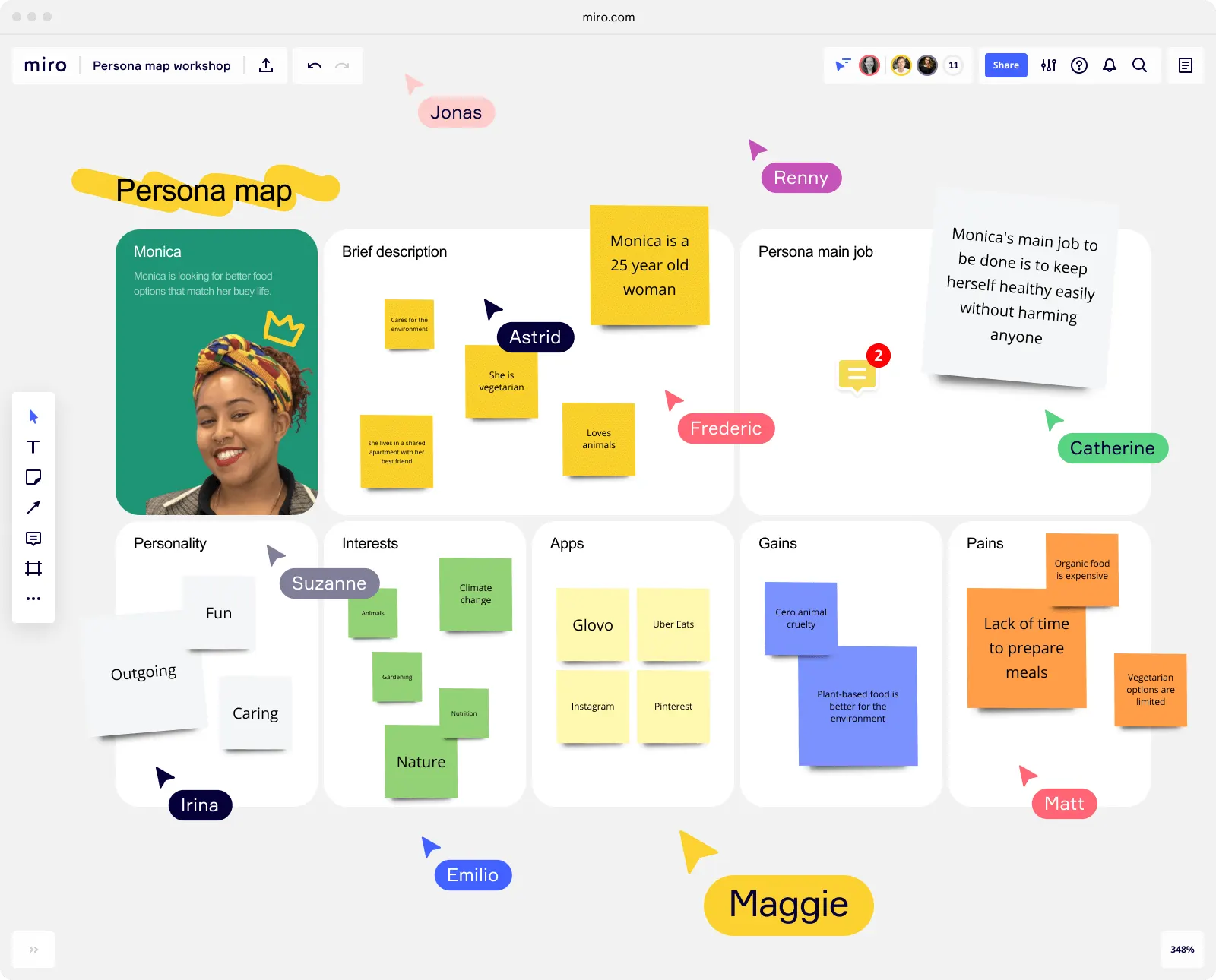
Though a cornerstone of design thinking practices, design workshops can have their challenges. It can be tough to get schedules to line up so all the key stakeholders are included. And even if everyone’s calendars do magically align, finding ways to keep the session engaging and to encourage everyone to contribute in a style that plays to their individual strengths is no easy task. Prepping for the session and getting everyone in the same physical space can be costly and time-intensive, not to mention awkward and crowded as people bump elbows trying to add to a hodgepodge of sticky notes on the wall. And, all the brilliant ideas generated on sticky notes and marker boards can sometimes be unintelligible once the moment has passed, making the notes and ideas tricky to wrangle into actionable documentation.
Luckily, in the new era of work, there are plentiful ways to facilitate design workshops that not only overcome these challenges, but also open up new opportunities. Digital whiteboards make ideating and decision-making easier and more achievable for design teams seeking to bring collaborators together from around the company and around the world to facilitate collaboration and boost participation and innovation.
Learn how to run a virtual design thinking workshop in Miro
In this chapter, you’ll find an action plan for design meetings and workshops that work — weaving together the keys to effective facilitation, tips for engaging meetings, and ways to prioritize problems, find solutions, and prevent misalignment.
Create an accessible space for everyone to participate
How your design team sets the space for collaboration with non-designers can have a big impact on the success of the end product. Whether you’re seeking input from executives, clients, or leaders from product, engineering, and marketing teams, taking care to create a welcoming space that fosters collaboration can go a long way when designing thorough and well-considered user experiences. A welcoming collaborative space can also strengthen ongoing cross-team partnership and increase buy-in at your company.
To craft an accessible design workshop for non-designers, pick easy-to-use tools and activities that are appropriate for the skill level of the participants in the session. When participants feel stressed or unskilled in a meeting, they tend to hold back — and valuable perspectives might never make it to the table. For example, as a designer you may thrive with hands-on, art-related activities, but to non-designers the thought of having to draw or sketch to communicate their perspectives might feel intimidating. By facilitating a low-stress environment focused on outcomes, your team can facilitate a workshop where participants can confidently participate, without getting hung up on unfamiliar tools or processes.
Checklist for facilitating a collaborative meeting or workshop:
- What is the primary objective? Design workshops can be used to generate anything from early strategic requirements to fully-functional prototypes. Is the goal to generate ideas or make decisions?
- What group activities will yield the best results? Consider options such as a brainstorm session, a design sprint, affinity mapping, or customer journey mapping.
- Whose input is most needed? Which teams and individuals need to be on your guest list? Whose perspectives are under-represented (or over-represented)?
- What skills do the participants have? Focus on choosing accessible and easy-to-operate tools and activities that play to the strengths of the people in the room to build confidence and a safe space to collaborate and share.
- How long does the workshop need to be? Design workshops often range from 90 minutes for brainstorming up to two weeks for design sprints centered around a certain goal. What length fits your goal?
- When in the product design process should this meeting be held? When in the timeline do ideas need to be generated and decisions reached?
- Where will the meeting be held? Do these ideas and decisions need to be made in the same time and place? Or could that Zoom meeting be replaced with asynchronous work, like in a digital whiteboard?
- How will people participate? What’s the agenda? To create a more inclusive and democratic environment, try low-pressure techniques to promote participation, like anonymous voting.
- What happens next? How will you document takeaways and next steps? Where’s your central hub for capturing all the ideas and decisions?
Get more tips on running great virtual workshops from Miro’s Head of Workshop Design
Make meetings interactive and engaging to drive diverse viewpoints
Making your meetings interactive and accessible to people with different work styles and home bases boosts participation and, in turn, better represents the collective brainpower of your stakeholders.
20% increase in team innovation with cognitive diversity
Plus, fostering different ways of thinking can have a positive, measurable impact on your team’s creative output. According to Deloitte, cognitive diversity can enhance team innovation by about 20%.
Get face time. Video calls and collaborating on digital whiteboards can happen in one place to give everyone a voice — literally — in planning and brainstorming sessions. For example, plugins for Zoom, Microsoft Teams, Webex, and Whereby mean you can meet right from the board — no context switching required.
Help virtual workshop first-timers get oriented. Many of your guests will be seasoned pros, but for others, a virtual workshop might be a new experience. No biggie. It’s easy to get your first-timers and not-so-tech-savvy participants comfortable with the whole thing with a quick tutorial.. You can introduce Miro to first-time users with these easy to use templates: Welcome to Miro, Miro Onboarding, and Getting to Know Miro.
Unleash the fun with engaging tools. Functionality like colorful sticky notes, icebreakers, and anonymous voting help everyone participate.
Make the meeting interactive. You can take hybrid meeting collaboration to the next level, with a user-friendly experience that works on any device, with a tool like Miro for interactive displays. Remote and in-person team members can join a session together, whether in a conference room or a home office via conference call, and participate in brainstorms, quick syncs, and view presentations, in real-time from the same board.
Try Miro Smart Meetings to save hours of time in prep and run engaging meetings
Visualize a united plan to move forward
Taking time to synthesize takeaways while they’re fresh in your mind after a workshop or meeting can prevent future misunderstandings with customers or internal teams. Follow these three steps to build an action plan:
- Step 1: Sync up. Keep everyone on the same page and ensure a shared understanding using visual communications, including mapping and diagramming, that show your findings, instead of trying to explain them through circular conversations that can turn into a confusing game of telephone. By going from verbal to visual, in both workshop sessions and related documentation, your team can prevent misalignment with both customers and internal teams.
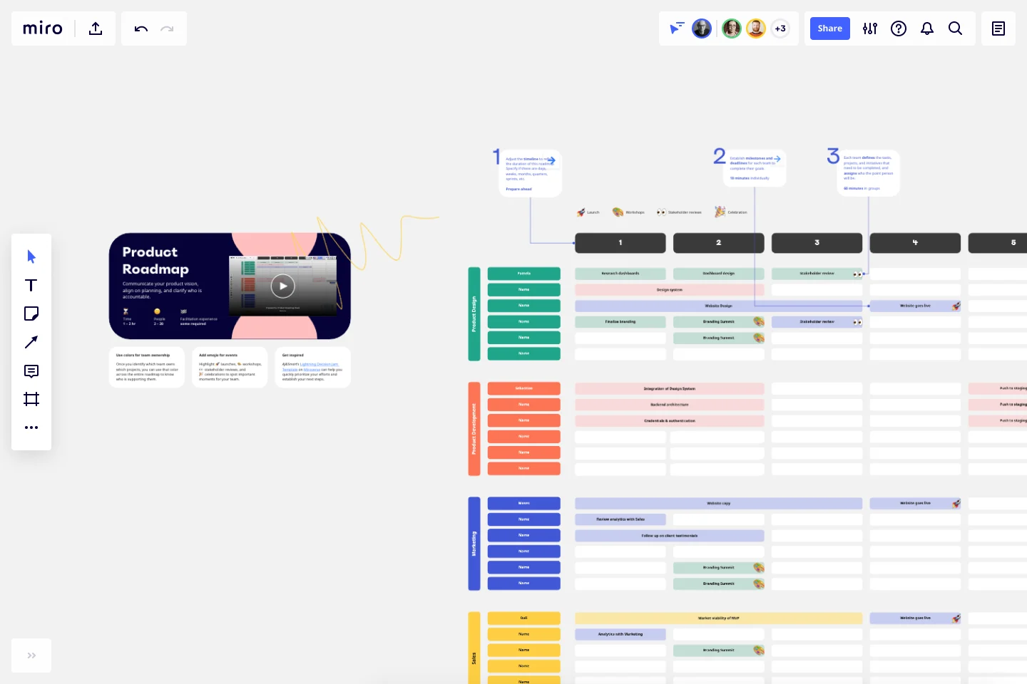
- Step 2: Define and prioritize problems and find solutions. Identify problems surfaced in user research, customer journey research, and design workshops. Use tools like sticky notes and mapping to visualize the hierarchy of problems and come up with solutions that correlate with priorities.
- Step 3: Co-create artifacts that live beyond workshops. Leave the workshop with something to show for all the work you did by quickly creating visual artifacts. Ensure decisions and their rationale are documented for future reference. You can embed Miro boards into documentation so that your collaborators stay aligned and turn ideas into action.
Chapter Checklist
Do you have a solution for hybrid workshops that allows all participants (regardless of role) to participate?
Are your meetings and workshops engaging for those who are less inclined to speak up?
Do you have a plan in place to make sure workshop outcomes are documented and actionable?
Chapter 4: Collaborate on design concepting and low-fidelity prototypes
What’s included in this chapter:
- Empower stakeholders to give constructive design feedback (on your terms)
- Turn feedback into better outcomes
- Bring your project together with all types of media
From inspiration boards to ideation, wireframing to usability testing, the collaborative work of turning requirements into low-fidelity designs is a process rich with iterative and creative problem-solving potential. But it can be difficult to capture the input of non-designers, and keeping track of all the moving parts, side channel conversations, and decision-making associated with this messy process requires a lot of wrangling. Sometimes early concepts that didn’t make it into a prototype get lost, conversations can feel repetitive and circular, and it can be hard to keep a pulse on how the project is actually progressing.
That’s why your team needs tools that make it simpler to bring perspectives from other teams into ideation and iteration, leading to more — and better — ideas, improved team culture, increased collaboration across disciplines, and greater influence in your organization.
In this chapter, you’ll find insights on helping non-designers be true participants in the concepting process, turning feedback into better outcomes, and capturing all types of media to really bring a project together.
Empower stakeholders to give constructive design feedback (on your terms)
Inviting your teammates from other departments, whether product, engineering, or marketing, into the design process for brainstorming and feedback encourages new ideas and drums up key stakeholder buy-in early in the process. It also makes space for fresh perspectives to shine. And, getting these folks from varied areas of the company to speak the same design language, using low-barrier tools like mind maps, sticky notes, and drawing tools, can lead to powerful results.
Customer spotlight
Bancolombia Boosts Design Team Productivity with Miro
Bancolombia’s Head of Design Marcela Velasquez Montoya wanted to nurture a more collaborative relationship between the designers and roles such as product managers and developers within the organization. But non-designers often lacked the necessary historical context for a project, hindering their ability to contribute at crucial points in the design process.
When the team started using Miro, workshops transformed with a mix of analog and digital. Real sticky notes could be easily digitized and added to a Miro board without having to be manually typed up. Photos of the whiteboard could be uploaded to prevent the need to track them down later in Microsoft Teams or OneDrive. Any relevant assets in Jira or Sketch could be quickly added using Miro’s native workflow integrations. With little training required, non-designers could contribute ideas, add comments, and participate in these brainstorming sessions using Miro’s collaboration toolkit.
“Miro helps us create a more inclusive and engaged culture by combining knowledge into one tool and creating a common language between designers and non-designers,” Marcella says. “As a result, we can be consistent with what we create for the customer.
Turn feedback into better outcomes
To help make sense of all the collected input, you need to centralize all the versions and comments. One way to do so is to bring in your current design elements, websites, or other assets to conduct an audit and capture feedback.
Even non-designers find digital whiteboards easy and approachable to navigate. Unlike a design-focused tool like Figma, which non-designers may not have access to or experience using, Miro’s tools are accessible.
Check out the top three integrations Miro users love
Let internal stakeholders review all versions side-by-side and add in-context comments, in one central spot, regardless of file type. You can also invite collaborators to interact with designs and provide valuable feedback during user testing interviews, with digital whiteboard tools.
Take your team’s feedback sessions to the next level with some of Miro’s design plugins:
- Adobe XD for Miro enables designers to share and collaborate on Adobe XD designs and prototypes in Miro boards. You can embed the specific artboards you want to share, set link sharing permissions to embed public and private links, and easily sync any updates made in XD.
- The Miro plugin for Sketch is a easy and quick way to get images from Sketch right to the board. Send your artboards to Miro and easily update them in one click. Sync all your images whenever you make a change without having to upload them again.
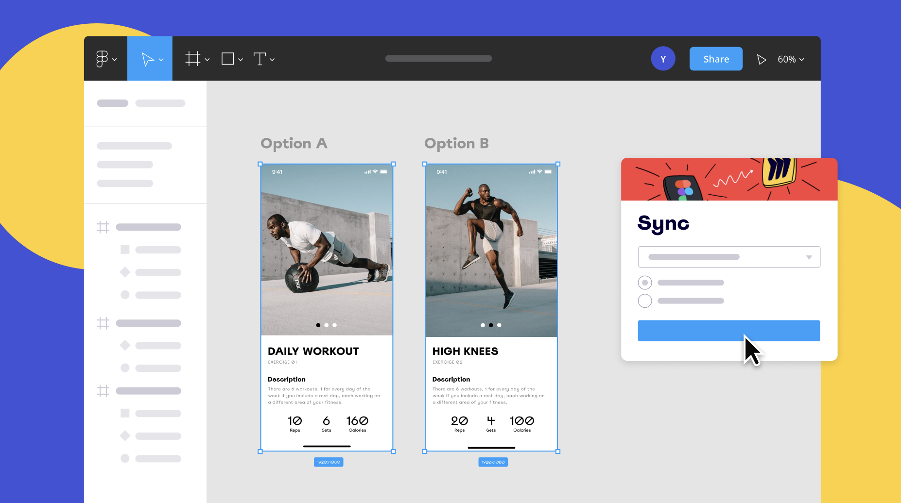
- The Miro plugin for Figma enables your team members who don’t have access to Figma — or experience using it — to provide feedback and stay up-to-date with the latest design changes.
Bring your project together with all types of media
From initial sketches to final versions, create a living project hub to organize your team’s notes, brainstorms, sketches, prototypes, and files all in one place. Easily draw, diagram, and wireframe early design concepts and retain all versions on a digital whiteboard. Embed design files from your favorite apps and capture feedback to show the evolution of your design and process.
Visual thinking. Whether you’re designing a diagram with shapes and lines, a sketch using the drawing tools, embedded videos, or some combination, whiteboarding tools like Miro make it simple to ideate in many formats
Mood boards. Capture inspiration, references, or competitive examples in mood boards with images, videos, websites, and more. Digital whiteboards are the perfect online mood board makers. You can create digital boards as large as you need and include a lot of details. Zooming in and out will help you to see the big picture or home in on important details.
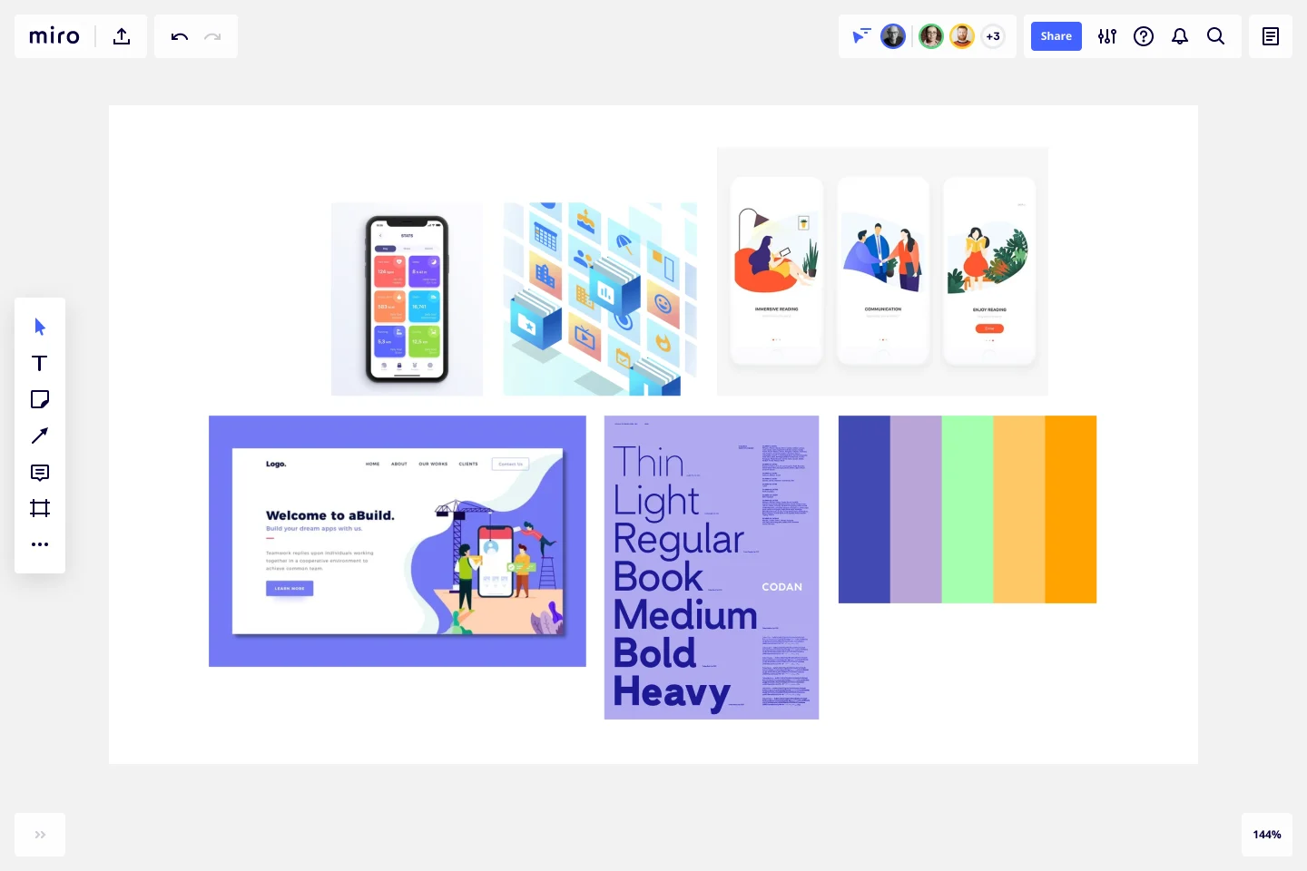
Wireframes. It’s important to be able to draw, diagram, and wireframe early design concepts and retain all versions on your digital whiteboard of choice, giving your collaborators a shared visual language to work from. You can embed design files from your favorite apps and capture feedback to show the evolution of your design and process. The clarity of this approach can also help reduce the number of iterations required.
With collaborative features (like video chat and commenting) and integrations with icon and image libraries (including Unsplash and IconFinder), Miro’s wireframing tools support collaborative low-fidelity wireframing from start to finish:
- Product managers can create simple wireframes and get quick feedback from developers and designers, taking advantage of comments with @-mentions
- Designers can share their initial proposals with the rest of the team without the need to invite them to UI design applications
- Consultants can run workshops to wireframe together with clients in real-time using the built-in video chat
- Marketers can show wireframes to project stakeholders without switching between tools using Miro presentation mode
Chapter Checklist
Do your non-design teams have an easy way to provide feedback on designs?
Are your product development applications integrated for a more seamless, less siloed workflows?
Are you able to create simple wireframes and integrate with design programs?
All together now: The future of product design in an aligned, inclusive workplace
As your design team enters a new era of work, with all the challenges and collaborative possibilities that accompany hybrid collaboration, there’s plenty of room for experimentation and imagination. Finding the ideal alignment of people, process, and tooling can alleviate common challenges and help you create an inclusive design culture.
To help you strategize, we’ve summarized key takeaways:
- Transform research into insights
- Bring focus to the customer journey
- Facilitate inclusive meetings and workshops
- Collaborate on design concepting
Transform research into insights
- Plan, prep, and align with stakeholders: Set user research projects up for success by workshopping ideas and seeking feedback early in the process. To set the groundwork, identify who key stakeholders are, draft a product design research plan, and prepare for interviews with both users and internal collaborators.
- Uncover insights from qualitative research: Turning the mass of information the discovery process yields into powerful and actionable insights can be tricky and laborious. Using methods like clustering and affinity mapping make it easy to untangle this information and translate it into insights.
- Maintain a central research hub: Store anything and everything related to your project in a streamlined visual repository. That way, your collaborators and — and interesting tidbits — will never get lost.

Bring focus to the customer journey
- See the full picture and uncover problems to solve: Building customer journey maps can help you and your team turn a good product experience into a great one, by visualizing the complete picture of your customer’s experiences and preferences. These tools also illustrate how decisions from design, product, and engineering teams have real impact on the people who use your product.
- Document end-to-end journeys with a single source of truth: Once you’ve developed a customer journey map, it remains an ever-evolving living document to learn from and improve the user experience. By embedding it everywhere your teams work with a tool like Live Embed, collaborators can see the current version in context, since each embed is automatically synced, keeping it up-to-date.
- Add the customer perspective to technical discussions: Help technical teams empathize with customers using customer journey maps and user personas. Personas are a helpful tool for communicating customer needs, motivations, and behaviors. By adding detail and humanity, your internal collaborators can build a shared understanding of your customers.
- Invite the right internal collaborators: To bring product and engineering teams into the design process and create continuity and alignment across your workflows, visual tools like Miro’s Workflow Template help you and your team zoom out to see the bird’s eye view of your project and zoom in to inspect detailed interaction points. This can help strengthen shared accountability, eliminate silos that can create a disjointed user experience, and keep a sharp focus on the full picture of the problems you’re solving.

Facilitate inclusive meetings and workshops
- Create a space for non-designers to be heard: Choose accessible and easy-to-operate tools and activities that play to the strengths of the people in the room to create a safe space to collaborate. When participants can contribute with confidence, without getting hung up on unfamiliar tools or processes, you’ll get the best feedback and insights. In turn, you can increase the quality of your findings and deliver better products.
- Make meetings interactive and engaging: Improving your meetings for people with different work styles boosts participation and better represents the collective brainpower of your stakeholders. Plus, fostering different ways of thinking can have a positive and measurable impact on your team’s creative output.
- Visualize a united plan to move forward: After the meeting is over, define priorities and set clear next steps. Retain documentation and keep everyone on the same page by using visual tools. Map out problems and solutions with mapping and diagramming. By going from verbal to visual, your team has the chance to speak everyone’s language and keep contributors aligned.

Collaborate on design concepting and low-fidelity prototypes
- Empower non-designers to give design feedback: Getting teammates from different departments, including engineering and product, to speak the same design language, using low-barrier tools, like mind maps, sticky notes, and drawing tools, generates useful feedback from a variety of perspectives, leading to powerful results and reducing risk of miscommunication.
- Turn feedback into better outcomes: Bring in your current design elements, websites, or other assets to conduct an audit and capture feedback. Let internal stakeholders comment on and critique all design iterations. To hear more than just the loudest voice, try brainwriting, a quiet ideation technique that encourages more original ideas by every individual — not just the vocal few.
- Bring your project together with all types of media: Capture inspiration, references, or competitive examples in mood boards with images, videos, websites, and more. Draw, diagram, and wireframe early design concepts and retain all versions on something like Miro’s infinite canvas, giving your collaborators a shared visual language to work from.
Conclusion
When you empower designers and non-designers to work together with shared language and vision, you create the conditions to achieve the best outcomes for your customers. Fine tuning your team’s workflows helps facilitate clear communication and an environment where innovation thrives. Capturing your research and findings — from problems to solutions — in a central hub fosters a culture of continuous learning, rich with possibility.
At Miro, we’re on a mission to empower designers to collaborate effectively to solve customer problems and design delightful experiences. Our visual collaboration platform helps you bring in team members from any part of your company to advocate for the customer voice, evangelize design thinking, and generate more — and better — solutions than ever before.
As you begin to navigate your team’s workflows and tailor your approach to the hybrid era, remember that you’ve already got the keys in your pocket: Collaborative problem-solving is your superpower. How you apply these strengths just might look a little different going forward. With a slate of powerful, collaboration-ready tools, what big thing will you build next?
