Burnup vs burndown: which chart is right for your project?

Summary
In this guide, you will learn:
- Burnup charts track work completed; burndown charts track work remaining.
- Burnup charts offer a comprehensive view with scope changes; burndown charts provide a simpler countdown.
- Burnup charts start at zero, for flexible scope/timelines; burndown charts count down, for fixed deadlines.
- Burndown charts monitor sprint progress and identify early delays.
- Burnup charts uniquely show a scope line for task additions/removals.
- Use burndown charts for short-term tracking and burnup charts for long-term project progress/scope management.
In project management, metrics are your best friend. They help you understand where you are, where you’re going, and how to get there. Burnup and burndown charts are two of the most popular metrics for tracking project progress. But what exactly are they, and how do they differ? And which one should you use? Let’s dive into the details.
What is a burnup chart?
A burnup chart is a visual tool that shows the amount of work completed over time. It’s like a roadmap that highlights your progress and the total scope of the project. Imagine you’re climbing a mountain. The burnup chart shows how far you’ve climbed and how much further you have to go. It’s perfect for tracking progress and scope changes, giving you a clear picture of your project’s trajectory.
For example, if you’re managing a software development project, a burnup chart can show the total number of story points completed versus the total number of story points planned. This helps you see not only how much work has been done but also how the project scope has evolved. If new features are added, the total scope line will rise, providing a clear visual of scope changes.
What is a burndown chart?
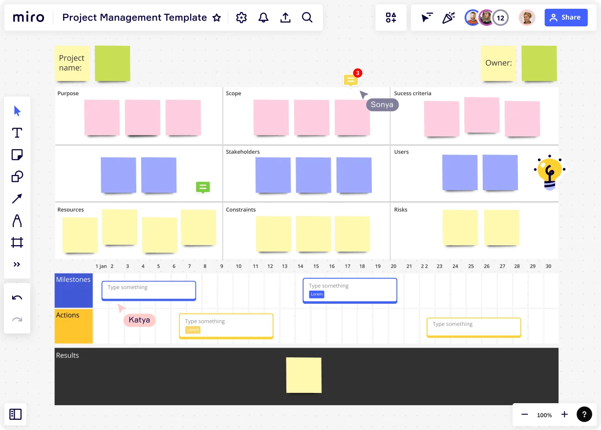
A burndown chart, on the other hand, focuses on the amount of work remaining. It’s a simple, straightforward way to see how much work is left to do. Think of it as a countdown timer for your project. As tasks get completed, the line on the chart goes down. It’s an excellent tool for monitoring work completion and ensuring you stay on track. Below, you can see the burndown chart template from Miro's library – get started now with this template.

For instance, in a sprint planning session, a burndown chart can help your team visualize the amount of work left in the sprint. If you start with 100 hours of work and complete 20 hours each day, the burndown chart will show a steady decline, ideally reaching zero by the end of the sprint. This helps teams stay focused and identify any potential delays early on.
Key differences between burnup and burndown charts
While both charts are valuable, they serve different purposes. A burnup chart shows both completed work and total project scope, making it easier to track scope changes. A burndown chart, however, focuses solely on the remaining work, providing a clear view of what’s left to do. Burnup charts offer a more comprehensive view, while burndown charts are simpler and more focused.
For example, if your project scope is likely to change, a burnup chart will help you track these changes and their impact on progress. Conversely, if your project has a fixed scope and you need to ensure timely completion, a burndown chart will help you monitor progress towards that goal.
When to use burnup charts
Burnup charts are ideal for projects where scope changes frequently. If you’re working on a project with evolving requirements, a burnup chart can help you keep track of these changes and understand their impact on your progress. They’re also great for visualizing overall progress and ensuring everyone on the team is on the same page.
For example, in a large-scale software development project, new features or changes in requirements are common. A burnup chart can help you visualize these changes and communicate them effectively to stakeholders. This ensures that everyone understands the current state of the project and any adjustments that have been made.
When to use burndown charts
Burndown charts shine in projects with a fixed scope. If your project has a clear end goal and you need to monitor progress towards that goal, a burndown chart is your best bet. They’re perfect for sprints in agile development, where the focus is on completing a set amount of work within a specific timeframe.
For instance, in a two-week sprint, a burndown chart can help your team track daily progress and ensure that all tasks are completed by the end of the sprint. This helps maintain focus and provides a clear visual of whether the team is on track to meet their goals.
Advantages of burnup charts
Burnup charts offer several benefits. They provide a clear view of both progress and scope, making it easier to manage changes. They also help teams stay motivated by showing how much work has been completed. Plus, they’re great for communicating progress to stakeholders, as they offer a comprehensive view of the project’s status.
For example, if your project scope increases due to additional requirements, a burnup chart will show this change and help you understand its impact on the overall timeline. This makes it easier to adjust plans and communicate these changes to your team and stakeholders.
Advantages of burndown charts
Burndown charts are all about simplicity. They provide a clear, straightforward view of the remaining work, making it easy to see if you’re on track. They’re also great for identifying potential bottlenecks and ensuring the team stays focused on completing tasks. Their simplicity makes them a favorite in agile environments.
For instance, if your team is falling behind schedule, a burndown chart will quickly highlight this issue, allowing you to take corrective action. This helps ensure that the team remains focused and that any potential delays are addressed promptly.
Common misconceptions
There are a few myths about burnup and burndown charts. One common misconception is that one chart is inherently better than the other. In reality, the best chart depends on your project’s needs. Another myth is that these charts are only for agile projects. While they’re popular in agile, they can be used in any project management framework.
For example, some people believe that burnup charts are too complex for small projects. However, even small projects can benefit from the comprehensive view provided by a burnup chart. Similarly, burndown charts are often seen as too simplistic for large projects, but their simplicity can be a strength, providing a clear focus on remaining work.
Ready to take your project tracking to the next level? Try Miro’s innovation workspace. Our AI-powered visual canvas makes it easy to create and share both burnup and burndown charts, supporting real-time and async collaboration. Explore our 300+ templates library and start quicker your project.
Author: Miro Team Last update: August 13, 2025