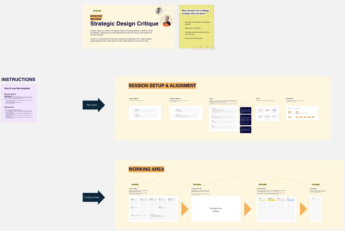
What is a Design Critique Template?
A design critique template is a structured framework used to gather feedback on a design in progress. Unlike a "complaint session," a critique is a formal process where designers present their work and reviewers provide feedback based on specific User Goals and Business Objectives. It separates "Personal Taste" from "Functional Success," ensuring the design actually solves the problem it was meant to address.
The "Objective" Audit: 3 Ways to Ensure High-Quality Feedback
A critique is only useful if it results in a better product. Before starting your session on Miro, apply these three expert "health checks":
1. The "Goal-First" Presentation Audit
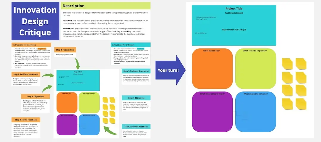
The Audit: Is the designer presenting "what they made" without explaining "why they made it"? The Fix: Audit for Context. A professional critique template must start with the Problem Statement and User Personas. If the reviewers don't know the goal, their feedback will be subjective. Force the presenter to state: "I am showing [Feature] for [User] to help them [Goal]."
2. The "I Like" Elimination Test
The Audit: Are your reviewers using phrases like "I like this" or "I don't feel this"? The Fix: Audit for Objective Language. Use the "What, Why, How" method in your template. Instead of "I don't like the button," the reviewer must say: "I am concerned that the button color (What) doesn't stand out enough (Why), which might prevent users from completing the checkout (How)." This turns an opinion into a logical argument.
3. The "Silent Review" Guardrail
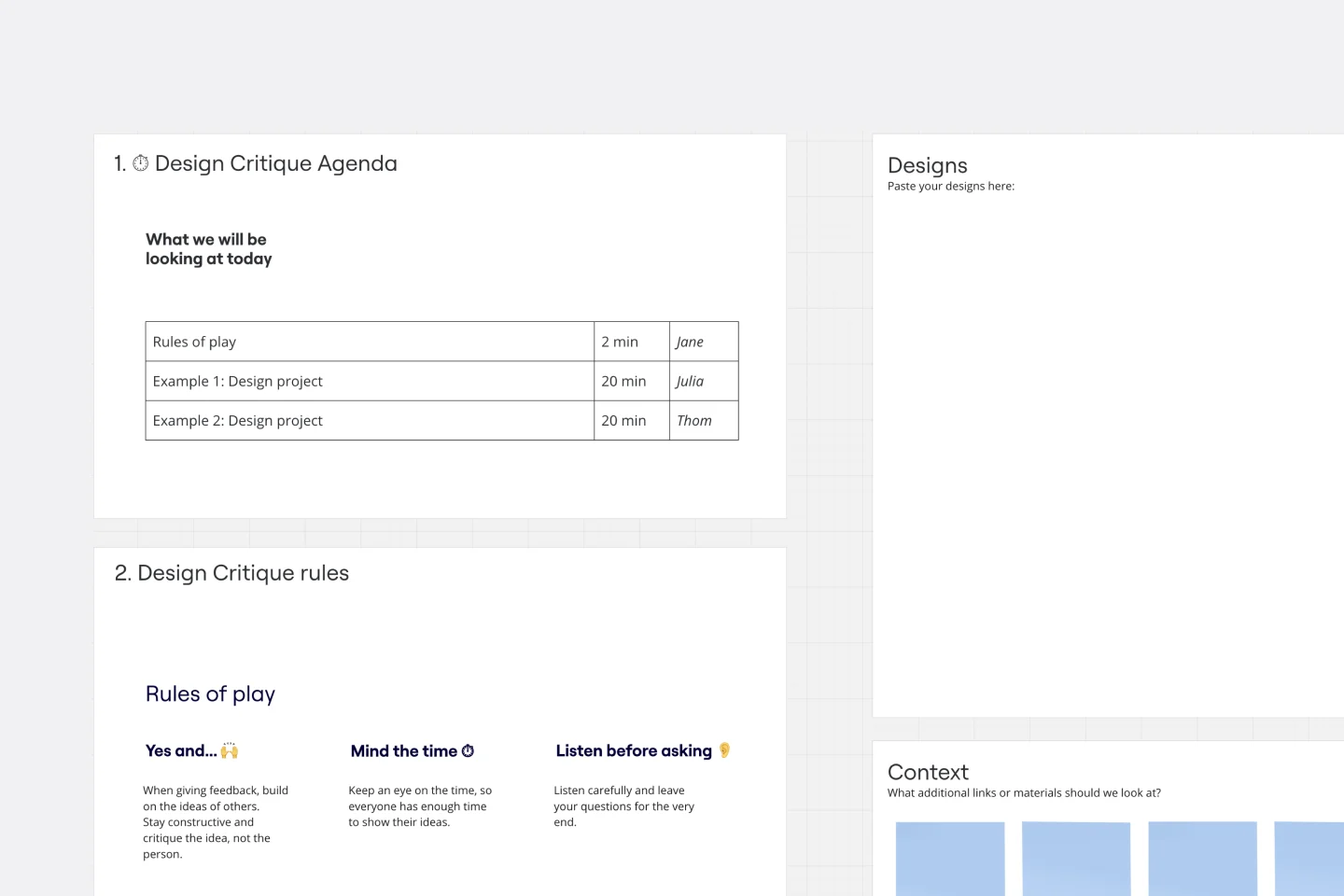
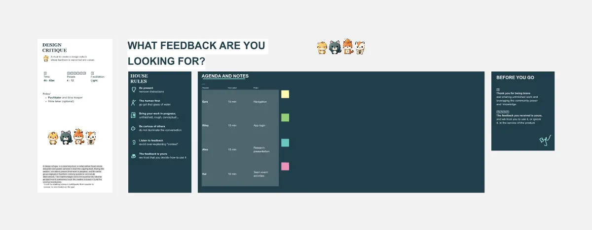
The Audit: Is the most senior person in the room dominating the feedback? The Fix: Audit for Equal Participation. Use "Silent Sticky-Noting" for the first 10 minutes of the critique. Let everyone place their feedback on the design before anyone speaks. This prevents "Groupthink" and ensures that junior designers can share critical insights without fear.
Strategic Frameworks: Which Critique Template Do You Need?
Select the Miro template that matches your design’s "Maturity Level":
The Concept (Lofi) Critique:
Best For: Early wireframes and sketches.
The Goal: To check the Logic, Flow, and Information Architecture. Don't talk about colors or fonts here; focus on the "Bones."
The High-Fidelity (Hifi) Critique:
Best For: Finished mockups and prototypes.
The Goal: To check Visual Hierarchy, Brand Alignment, and Accessibility.
The "I Like, I Wish, What If" Workshop:
Best For: Collaborative, high-energy team reviews.
The Format: A positive, constructive way to frame feedback: "I Like" (What works), "I Wish" (What’s missing), and "What If" (Wild ideas for the future).
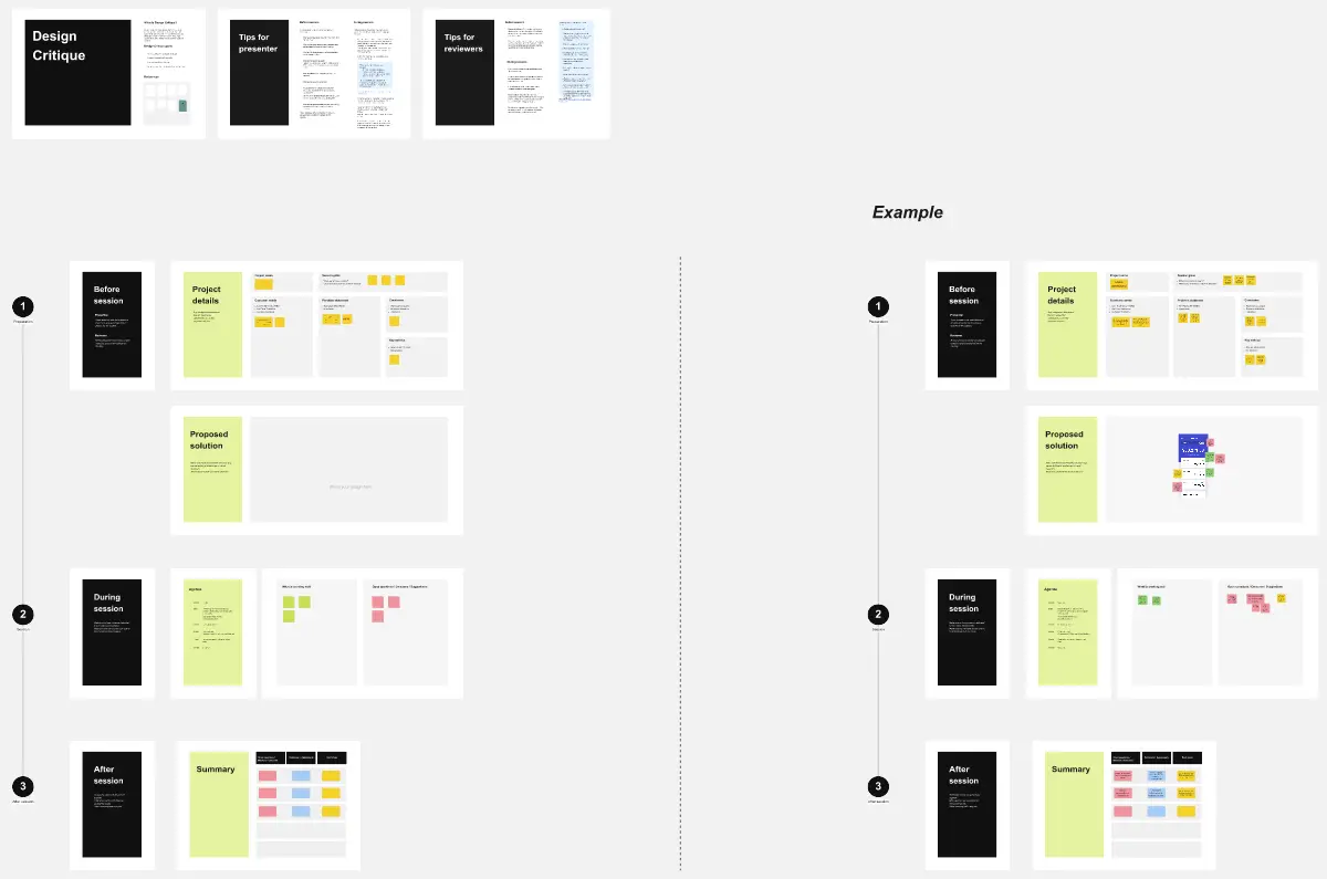
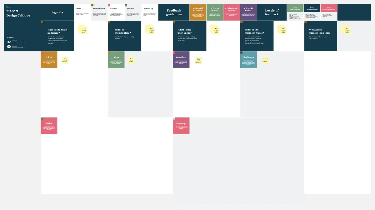
Key Components of a Design Critique Template
A high-performance Critique Board requires these five core elements:
The Persona & Context Card: A pinned note showing who the user is and what device they are using.
The "Current Status" Indicator: Is this a "Work in Progress" (rough feedback) or "Ready for Dev" (polishing)?
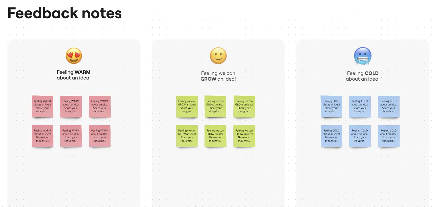
The Feedback Zones: Specific areas for Positive Reinforcement, Clarifying Questions, and Critical Concerns.
The Accessibility Checklist: A small sidebar to remind reviewers to check for contrast, text size, and tap targets.
The Next Steps Table: A place to turn feedback into a To-Do List with assigned owners.
Common Pitfalls in Design Reviews