Table of contents
Table of contents
How to create a website mockup

Summary
In this guide, you will learn:
- How to transition from basic wireframes to detailed website mockups with visual elements.
- Best practices for refining mockups, including finalizing design and ensuring readability.
- The importance of using real or realistic content in mockups for better visualization.
- How to incorporate brand personality through consistent use of visual elements.
- The value of sharing mockups with team members and stakeholders for feedback using Miro's features.
- Tips for using Miro’s tools and templates to streamline the mockup creation process.
What's a website mockup? And why do you need one?
Simply put, a website mockup is a mid-to-high fidelity visual model of a website's layout. Creating a website mockup is a critical phase of the website design process. It plays an instrumental role for designers, developers, and other professionals as it effectively represents and finalizes the website design before stepping into the development arena.
What you need before creating a website mockup
Before you embark on your mockup journey, it's vital to clear the ground first. Start by defining your website's goal and understanding its target audience. This will shape your website's structure, aesthetic and interactive elements. For instance, a news portal for young adults will have a different feel and functionality than a website for a luxury fashion brand.
Secondly, you need a clear view of your website's content and functional elements. Knowing the critical content and features that must be included is paramount to designing a mockup that accurately depicts the end product.
Overview of the mockup creation process
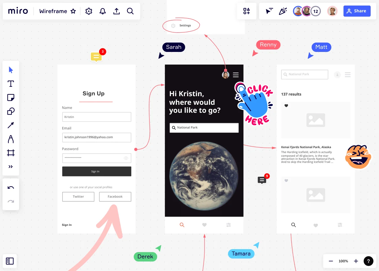
Creating a website mockup typically begins with a wireframe - a basic sketch that defines the barebones structure of your website. From here, you'll add visual flair to transition the wireframe into a mockup, carefully incorporating your brand identity.
Step-by-Step guide to creating a website mockup
Crafting a website mockup is an exciting process that brings your ideas to life. It's a journey from abstract concepts to a tangible design that visualizes your website's final look and feel. Let's walk you through the steps.
Creating a wireframe
A wireframe serves as the architectural blueprint of your website. It's a simplified sketch that outlines your website's basic structure, focusing on space allocation, content prioritization, functionalities, and intended behaviors. Think of it as your website's skeletal framework.
To create a wireframe quickly, follow these steps:
- Define your website's main components: These include the header, footer, navigation bars, content areas, and any other functional elements specific to your site, such as forms or sliders.
- Sketch the layout: Draw boxes to represent each component using a digital tool. Start with more prominent structural elements, like the header and footer, and then move on to minor details within these sections.
- Add content placeholders: Denote text areas, images, or other interactive elements using lines, boxes, and universally recognized symbols.
Transitioning from wireframe to mockup
A mockup takes the basic structure of a wireframe and adds skin to it, bringing the design closer to reality. It's more detailed and gives a better visual representation of the final product.
- Adding visual elements to the wireframe: Start by adding your color palette to the different elements of the site. Choose fonts for your headers and body text, and place your images or use placeholders where images will be. Consider other design elements like shadows, textures, and animations if they're part of your design.
- Incorporating brand identity: Apply your brand elements consistently across the mockup. If your brand is playful and creative, reflect that in your choice of colors, fonts, and images. If it's more professional and sleek, choose a more minimalist design with clean lines and a neutral color palette.
Refining the mockup
After you've created your initial mockup, it's time for refinement. This is where you'll iron out any design kinks and ensure your mockup aligns perfectly with your website's objectives.
- Finalizing the design elements: Take a critical look at your mockup. Are there any elements that feel out of place? Does the color scheme work as you envisioned? Is the typography readable and aesthetically pleasing? Don't be afraid to tweak elements as needed.
- Checking the mockup for alignment with the website's goal and functionality: Every element of your design should serve a purpose. Consider removing it if it doesn't contribute to the site's goals or enhance its functionality. This is also a good time to walk through the user's journey on your site, ensuring the design facilitates a smooth, intuitive experience.
With your refined mockup, you're one step closer to bringing your website to life. The iterative nature of the process allows for continuous improvement, so don't be afraid to test, tweak, and test again!
Collaborative aspects and feedback integration
Don't work in isolation; share your mockups with teammates, stakeholders, or even a test audience. They can provide insightful feedback, identify potential hitches, or suggest improvements. It's important to remember that creating a mockup is an iterative process. Embrace the feedback, and don't hesitate to refine your designs based on it.
Tips and tricks for an effective mockup
Creating a compelling mockup is both a science and an art. Here are some quick tips for creating an engaging and persuasive mockup:
- Keep it clean and simple: Avoid clutter and unnecessary elements.
- Stay consistent: Use consistent design language, including colors, fonts, and styles.
- Prioritize usability: Make sure the website is easy to navigate and has clear calls to action.
Also, be wary of common pitfalls like ignoring responsive design, skipping user testing, or sticking rigidly to your first ideas. Flexibility and adaptability are key in the design process.
Conclusion
And that's it - your quick guide on how to create a website mockup. It's integral to the design and development process, bridging your ideas and the final product. So, start your mockup, and watch your vision transform into a tangible design. Remember, this process is iterative, and each revision brings you closer to a website that resonates with your audience and fulfills its purpose. Happy designing!
Author: Miro Team Last update: August 14, 2025