What is a T-Chart and how to use one
Summary
In this guide, you will learn:
- What a T-chart is and how it visually organizes information for easy comparison
- How T-charts help in contrasting pros/cons or related categories
- The structure of a T-chart: header and two distinct columns
- Practical uses of T-charts in education, business, and problem-solving
- How to create a T-chart using simple tools or digital platforms like Miro
- Tips for maximizing T-chart effectiveness: concise and focused content
What is a T-Chart?
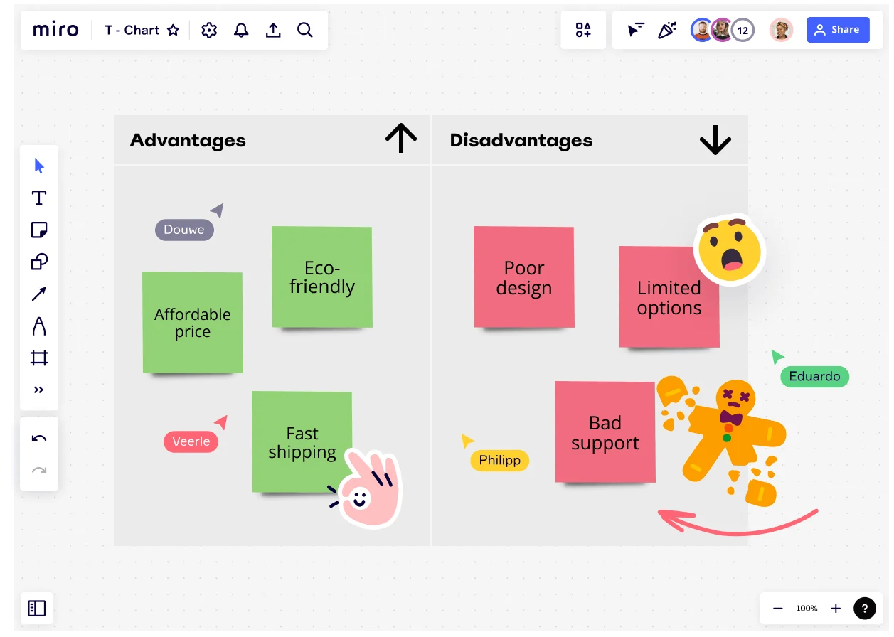
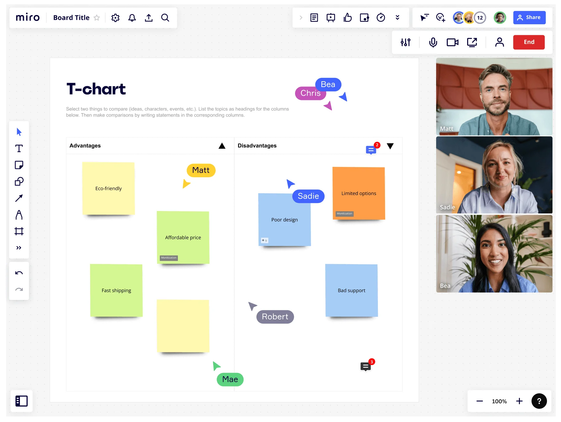
A T-Chart is a two-column table used to organize information, particularly when comparing or contrasting two different sets of data.
It consists of a table with a vertical or horizontal line in the middle, creating two distinct columns, each labeled with a heading that describes the information being presented. One side is typically used for listing or categorizing items, while the other provides corresponding details, examples, or explanations.
Collaborative AI Workflows
Make stunning charts with Miro’s graph maker for clear data presentation.
There are two main types of T-Charts: Vertical and horizontal.
Vertical T-Charts, such as the one found in this T-Chart template, are the most common and are used when presenting information in a top-down format. They are set up with the vertical line in the middle, dividing the chart into two columns.
The left column is labeled with the item or category being compared, while the right column provides the corresponding details or examples. Vertical T-Charts are often used for comparing two different options or choices side-by-side, such as in a pro/con list or a decision-making process.
Horizontal T-Charts, on the other hand, are used when presenting information in a left-to-right format. They are set up with the horizontal line in the middle, dividing the chart into two rows.
Here, the top row is labeled with the item or category being compared, while the bottom row, as you might have guessed, provides corresponding details or examples. Horizontal T-Charts are often used for comparing two different variables or attributes, such as in a before-and-after scenario or when tracking progress over time.
T-Chart uses
T-Charts are useful tools for organizing information and comparing a topic’s different aspects. Here's how you can use them in various scenarios:
Comparing two items
T-Charts can be used to compare two items side by side, such as two products, services, job candidates, or solutions to a problem.
The left column can list one item’s details or qualities, while the right column can list the other one’s corresponding features. This way, you can make an informed decision after easily seeing the similarities and differences between the two.
Listing pros and cons
T-Charts can also be used to list the advantages and disadvantages of a particular option or decision. The left column can list the pros, while the right column can list the cons. This helps you make a more informed decision.
Identifying cause and effect
Use a T-Chart to understand the root causes of a problem and develop effective solutions faster by identifying the cause-and-effect relationships between different variables. The left column can list possible causes, while the right column can list corresponding effects.
Tracking progress
Track progress over time using T-Charts, such as a project timeline, a student's academic progress, or a company's financial performance. The left column can list the dates or milestones, while the right column can list the corresponding progress or achievements. This lets you stay on track and identify areas where you need to improve.
Analyzing data
By analyzing data and comparing different variables using a T-Chart, you can identify patterns, trends, and correlations in the data and draw meaningful conclusions. The left column can list the different variables, while the right column can list the corresponding data points or measurements.
Brainstorming ideas
Brainstorm ideas and organize them into categories with the help of a T-Chart. The left column can list the different categories or themes, while the right column can list the corresponding ideas. This way, you generate more ideas and organize them into meaningful groups.
Examples of T-Charts
T-Charts are versatile tools that can be adapted to many different purposes, depending on business needs. For example, a T-Chart maker can be useful for conducting a market analysis by comparing the strengths and weaknesses of different competitors.
The first step is to identify the main competitors in the market. This can be done through research, surveys, or industry reports. List the names of each competitor in the left column of the T-Chart.
In the right column of the T-Chart, list each competitor’s strengths and weaknesses. This information can be gathered through a variety of sources, including customer reviews, competitor websites, and industry reports.
Once you have listed the strengths and weaknesses of each competitor, compare and contrast them. Look for patterns and trends, such as which competitors have the strongest customer service or the most innovative products. This information can be used to identify areas where your business can improve or differentiate itself.
As you conduct your market analysis, you can also identify opportunities for your business to expand or enter new markets. List these opportunities in a separate column to the right of the T-Chart.
Advantages of using T-Charts
T-Charts offer several advantages when it comes to organizing information and enhancing critical thinking. Here are some of the key advantages:
Easy to create
T-Charts are simple and easy to create. All you need is an online whiteboard with two columns, and you can start organizing your ideas and data.
Easy to understand
T-Charts are also easy to understand, even for those who are not familiar with the specific topic being discussed. The clear structure of the chart makes it easy to see the similarities and differences between two different ideas or data sets.
Have multiple purposes
T-Charts are versatile and can be used for many different purposes. They can be used to compare and contrast different ideas, concepts, or data sets, and can be applied in a wide range of contexts, from business to education.
Help in organizing information
T-Charts provide a simple and clear way to organize information, making it easier to identify patterns and trends. This can be particularly useful when dealing with complex or large amounts of data.
Enhance critical thinking
T-Charts can help to enhance critical thinking skills by encouraging people to analyze and compare different ideas or data sets. By asking people to consider multiple perspectives, T-Charts can help to promote a deeper understanding of the topic being discussed.
Disadvantages of using T-Charts
While T-Charts offer many advantages, there are also some disadvantages to consider. Here are some of the key limitations of T-Charts:
Limited space
T-Charts have a limited amount of space, which can make it difficult to include all the relevant information, particularly if you are comparing complex or detailed data sets.
Limited complexity
T-Charts are designed to compare two different things, which can be limiting if you need to compare more than two data sets or if the data are particularly complex. If you need to compare multiple data sets, you may need to use a different tool, such as a matrix or a spreadsheet.
Oversimplification of information
T-Charts are designed to simplify information by highlighting the key similarities and differences between two different ideas or data sets. However, this oversimplification can sometimes lead to a loss of nuance or complexity, particularly if the topic being discussed is particularly complex or if there are many different factors to consider.
How to create a T-Chart
While a T-Chart is easy to draw by hand, creating one on an online whiteboard offers several benefits over making it on paper. With an online whiteboard, you have unlimited space to add information and can easily add, delete, or move items around as needed.
Additionally, collaboration is easier as multiple users can access and work on the same T-Chart in real-time from different locations. Online spaces also allow for the incorporation of multimedia elements such as images, videos, or links, which can enhance the chart's visual appeal and overall functionality.
Finally, an online T-Chart can be easily saved, shared, and exported, making it easier to work on and present to others, no matter where you or they are based.
Follow these steps to make one of your own:
1. Select the T-Chart template
Add the T-Chart template onto a blank board, or incorporate it onto an existing board you’re already working on.
2. Customize the T-Chart
Once you have added the template to your board, you can customize it to fit your specific needs. You can change the labels of the columns to reflect the ideas or datasets you want to compare, and you can change the colors or fonts to match your branding or personal preferences.
3. Add your data
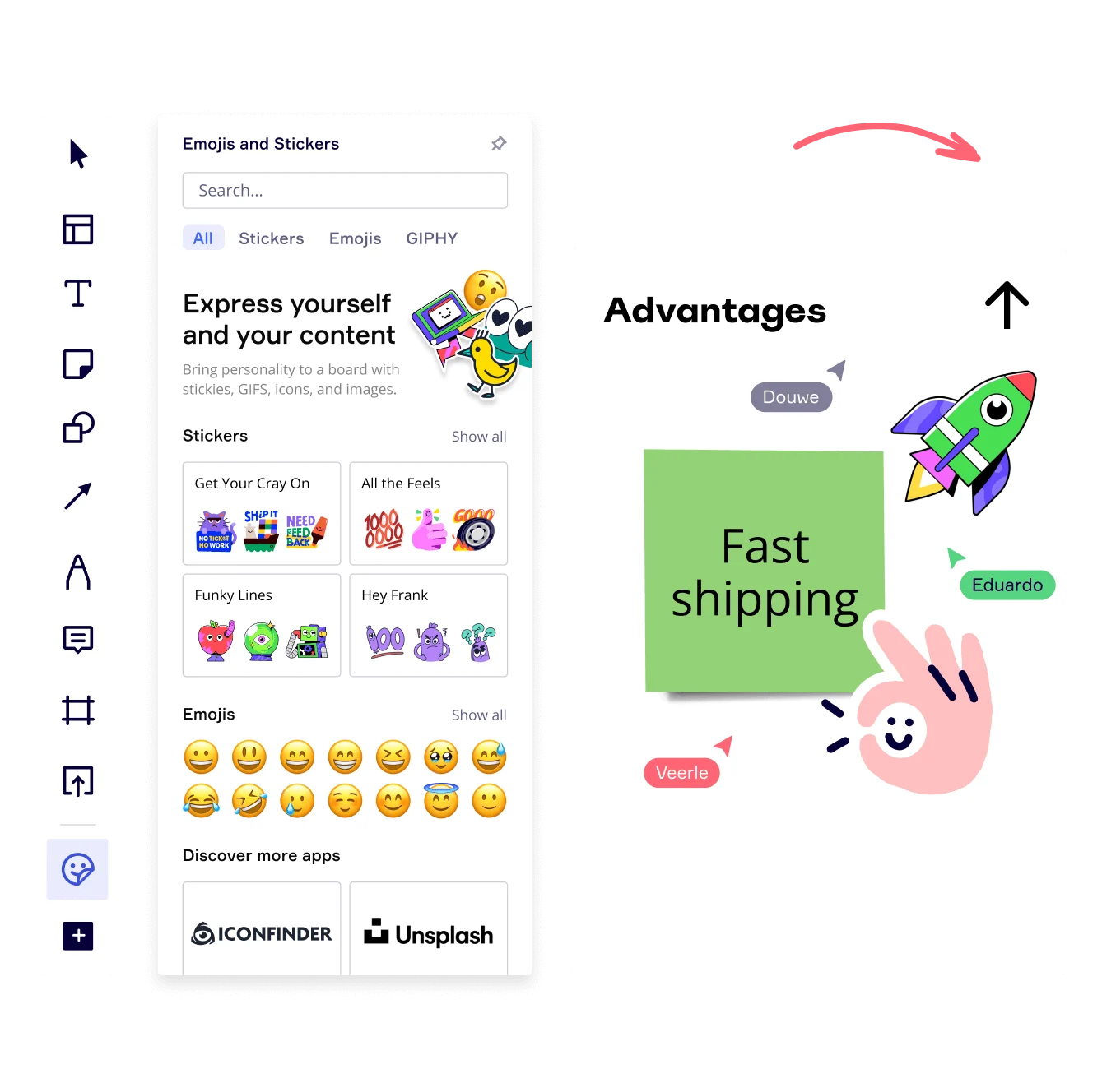
With your T-Chart template customized, you can now start adding your data to the chart. Simply add sticky notes to the appropriate column in the chart. You can add text, images, or even videos to each column, depending on what you are comparing.
4. Collaborate with others
Miro is designed for seamless collaboration, so you can invite others to join your board and contribute to the T-Chart. Simply share the link to your board with your colleagues, and they can start adding their own data to the chart.
5. Share and export your T-Chart
Once you have added all of your data to the T-Chart, share it with any team members who may need to reference it. You can also export the chart as a PDF, image, or other file format, depending on your needs.
Author: Miro Team Last update: August 14, 2025