Presentations are an integral part of our workplace experience. Whether you’re presenting a project at an all-hands meeting or giving an informal presentation during a weekly check-in, presentations are a cornerstone of how we work.
Despite how often we give presentations, designing one can feel pretty daunting. After all, we’re under pressure to create something informative, to-the-point, and visually appealing — and we have to deliver it in front of an audience!
In this blog post, we’ll go over some basic principles of presentation design, including tips for designing a great presentation and layout designs you can use for your own work. By the end of the blog, you’ll have the confidence and ability to design presentations that shine.
Presentation design principles
Designing a presentation can feel overwhelming. When you have a lot to say but a short amount of time to say it, deciding what to include (and how to present it) can be a daunting task. Here are three principles to think about when you’re designing your next presentation.
Know your audience
Everything about your presentation — what you include, what you don’t, how to lay it out — will depend on your audience. As you start planning your presentation, ask yourself a few questions. Who is your audience? How much do they know about this topic? What is the context in which they’ll be listening to your presentation?
For example, let’s say you’re a content marketing manager giving a presentation about an editorial calendar. If you’re designing that presentation for a product marketer, it’s going to look and sound differently than if you were designing it for an engineer; you might choose to emphasize or explain different elements with fonts or graphics. Let your audience drive your design.
Employ a visual hierarchy
When you sit down to create a presentation, you have a lot of creative tools at your disposal. It’s easy to get carried away with colors, fonts, animations, and builds. That’s why it’s important to employ a visual hierarchy for each slide.
A visual hierarchy is how you choose to arrange the information on your slide so that its importance is immediately clear to your audience. Visual hierarchies impact your font sizes, titles, the colors and animation you use, whether your text is bold or italic, whether you use images, and more.
For your first slide in your deck, start by jotting down what you want people to get out of this part of your presentation. Then arrange the elements on your slide to emphasize those key points.
Design accessibly
It’s important to remember that not everyone in the audience will consume information in the same way. Some people are auditory learners, while others are more visual. Some audience members might have visual or hearing impairments. And some simply might not be able to see the presentation very well from where they’re sitting. An important part of designing good presentations is designing accessible presentations.
Fortunately, there are a couple of rules of thumb that can help you design more accessible presentations. For one, don’t use color as the only method for distinguishing information. That makes it harder for visually impaired participants to follow your presentation. Use bold typefaces, different fonts, or larger text to highlight that something is important.
In general, use large, simple, san serif fonts like Arial, Verdana, and Helvetica, and minimize the amount of text on each slide. When presenting charts or graphs, be sure to make the graphics as digestible as possible. In addition to showing the charts or graphs on a slide, take the time to explain them orally, as well. If your slides contain videos, make sure to caption them and describe the audio.
Tips for designing a great presentation
Now that you have a foundation, here are a few quick tips that will help you design your next presentation with ease.
Start by brainstorming
Before you even open up your design tools, it’s a good idea to begin with a quick brainstorm. Even if you already know what you want to talk about, use your brainstorming session to figure out specifically what you want your audience to come away with. Do some freewriting, bounce ideas off of your collaborators, or use a brainstorming technique like mind mapping, brain writing, or random word picker.
Treat your presentation like an essay
Remember those five-paragraph essays you used to write in high school? There’s a reason that format is so enduringly popular. It’s a clear, intuitive way for your audience to absorb information. Think of your presentation as an essay, with an introduction, a thesis, three to five supporting points, and a conclusion. That way, you’ll get right to the point, present your evidence, and wrap up efficiently.
Get creative with the visuals
Part of our goal when we design a presentation is to keep our audience engaged. Don’t be afraid to dress up your presentation with fun photos, icons, charts, and other visuals. Make sure your slides are easy to read but remember to have fun with it too!
Share your slide deck with collaborators for feedback
Just as you would with any project, gather feedback on your slide deck before delivering your presentation. Ask your teammates whether it’s clear, engaging, and easy to follow.
Practice your presentation in front of an audience
There’s no substitute for practice. To build your confidence and work out any snags in your presentation, be sure to do a practice run in front of an audience at least once before the real thing.
Best presentation layout designs
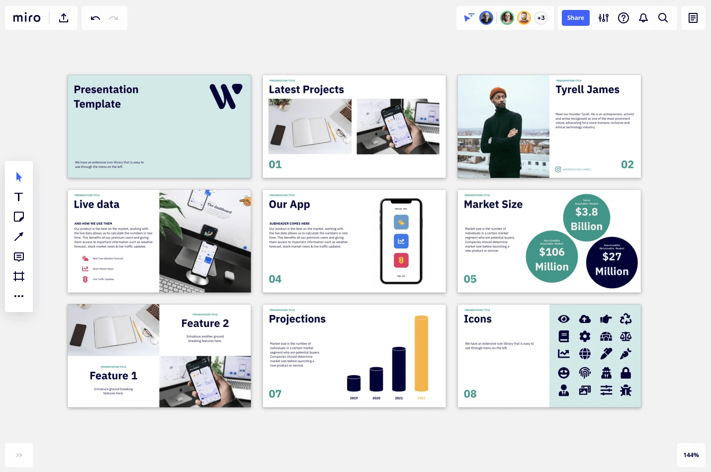
Here are a few presentation layout designs to get your creativity flowing. Don’t be afraid to customize them to your own needs. Be sure to check out Miro’s free presentation template, or browse our library of presentations created by the Miroverse community.
Try Miro’s free presentation template


