Rebranding is not a task for the meek.
By design, brands are created to build strong, emotional connections. Making the decision to update a brand requires opening people’s minds, preparing for risk, and deep conviction around what makes your brand relevant and compelling. You want to be in the position to push boundaries to create distinction and resonance, all while staying true to the core value proposition.
At Miro, we found ourselves in the position to ask these very questions when we realized it was time to evolve our brand. Our company and our product have changed so much in the past few years —we wanted a brand system that feels evolved and sets a distinctive spark in the world.
This was the task set before AKQA and the Miro Brand team. How do we reimagine the brand’s presence in a way that really showcases the product’s purpose and power? How do you invoke a workspace where teams enter with a dream and exit with the next big thing?
Together, Miro and AKQA worked to answer central questions about how a visual identity system dedicated to celebrating innovation and collaboration would come to life in everything from colors, shapes, buttons, strokes, illustration language, typography, and animations. They worked carefully, balancing bold decisions and subtle adjustments, while stress-testing the assumptions and design applications to create this unique new system.
To introduce the world to the new, evolved Miro, we’re walking through three key elements of the new design to share the thinking and approach that guided our development process.
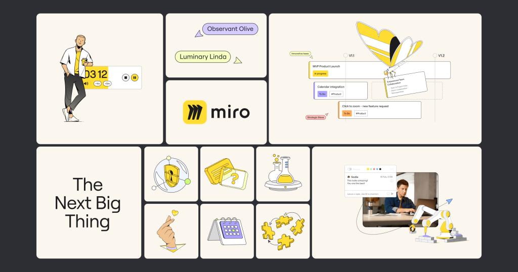
Our Miro hero yellow
One of the most powerful assets a brand can possess is its choice of color. At the same time, color represents one of the most challenging associations for a brand to establish. When executed effectively, a mere glimpse of a particular color can instantly evoke a universe of brand-related associations. Just consider the recent phenomenon of the Barbie movie and its unmistakable claim to the color pink.
Since our beginning, yellow has been an iconic color for Miro. It is central to our logo — bold, full of optimism and energy — but it has the power to overwhelm.
This awareness led us to explore ways to unleash the essence of “yellowness” within our visual language, in a way that balanced its energy and expanded its utility. To achieve this, we undertook the task of refining the original yellow hue and harmonizing it with a complementary color palette that would elevate its prominence.
Our goal was not merely to “paint everything yellow,” but to establish a system that would cast yellow as the central protagonist in our brand identity.
Over the course of development, we iterated on several concepts with yellow at the center but found that moderation was key. We use yellow sparingly, always in a manner that highlights the most crucial aspects of our narrative. Through experimentation, it was finally paired as a hero spot color with a sophisticated cream, as well as Leapfrog Lime and Next Level Lilac, keeping things fresh and surprising. These other colors serve the purpose of enhancing the impact of yellow, adding depth and texture to our brand’s universe.
Our ultimate aim is to transform yellow into an instantaneous gateway to understanding who Miro is, so that whenever people encounter the color Miro Hero yellow, they will invariably associate it with Miro.
The iconic “M”
What is in the logo? More than just an interesting shape or a decorative mark, our logo serves as a symbol of who we are, representing our mission and our commitment to the world. Beyond being a symbol of a product, our logo invites people to believe in the promise of who we are and what we offer.
Through user research we discovered the “M” is iconic to Miro. “M” is not just a design element; it’s a centerpiece. So, we sought to elevate it. Our goal was to ensure that the “M” logo stands as the crown jewel of our visual identity, representing the bridge that transforms potential into reality, and today’s ideas into the force of tomorrow.
To refocus attention on and maintain the integrity of this symbol, we made several refinements. First, we optimized the size of the “M” within the yellow square to ensure consistency across all channels. We also separated the elements of the “M” slightly, allowing it to breathe and imparting a sense of freedom within the yellow square. We also softened the edges of the yellow square to capture the tender energy of round shapes, conveying the human and compassionate aspect of the product experience. This transformation helps our logo resonate on a deeper level, aligning it with our brand’s values and the emotional connection we aim to create.
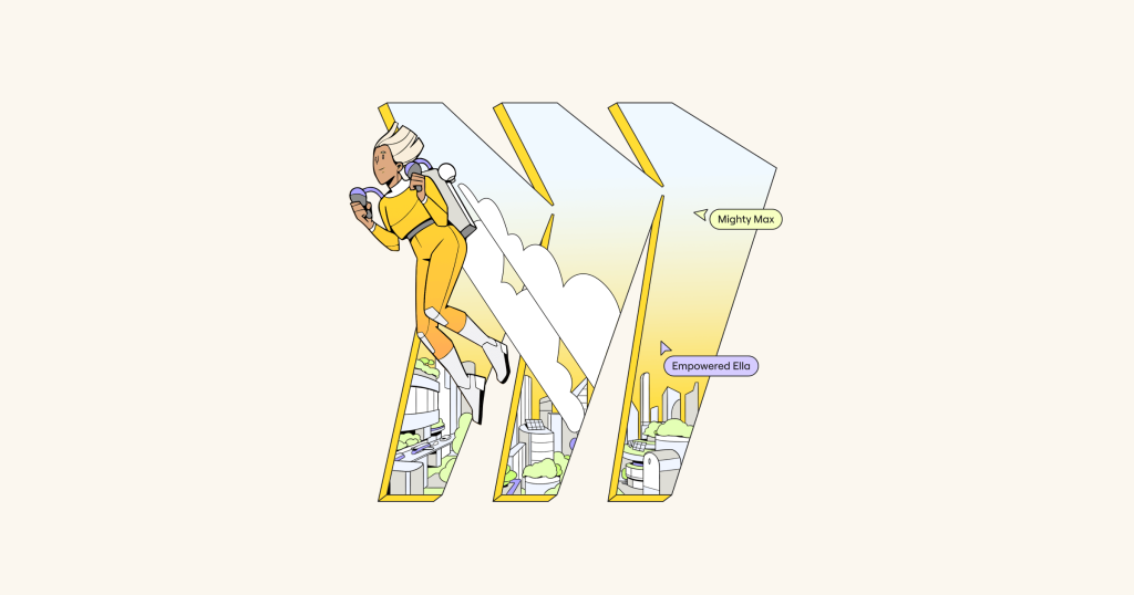
To further bring it front and center in the design, we brainstormed the idea of the “M,” and other product shapes, as portals into the future. The idea was to create imagery that clearly links the brand and product experience more closely, and serves as a symbol of transformation. The portal concept allows users to imagine a world benefiting from the fruits of innovation, watching raw materials and ideas go in one side and come out as the next big thing.

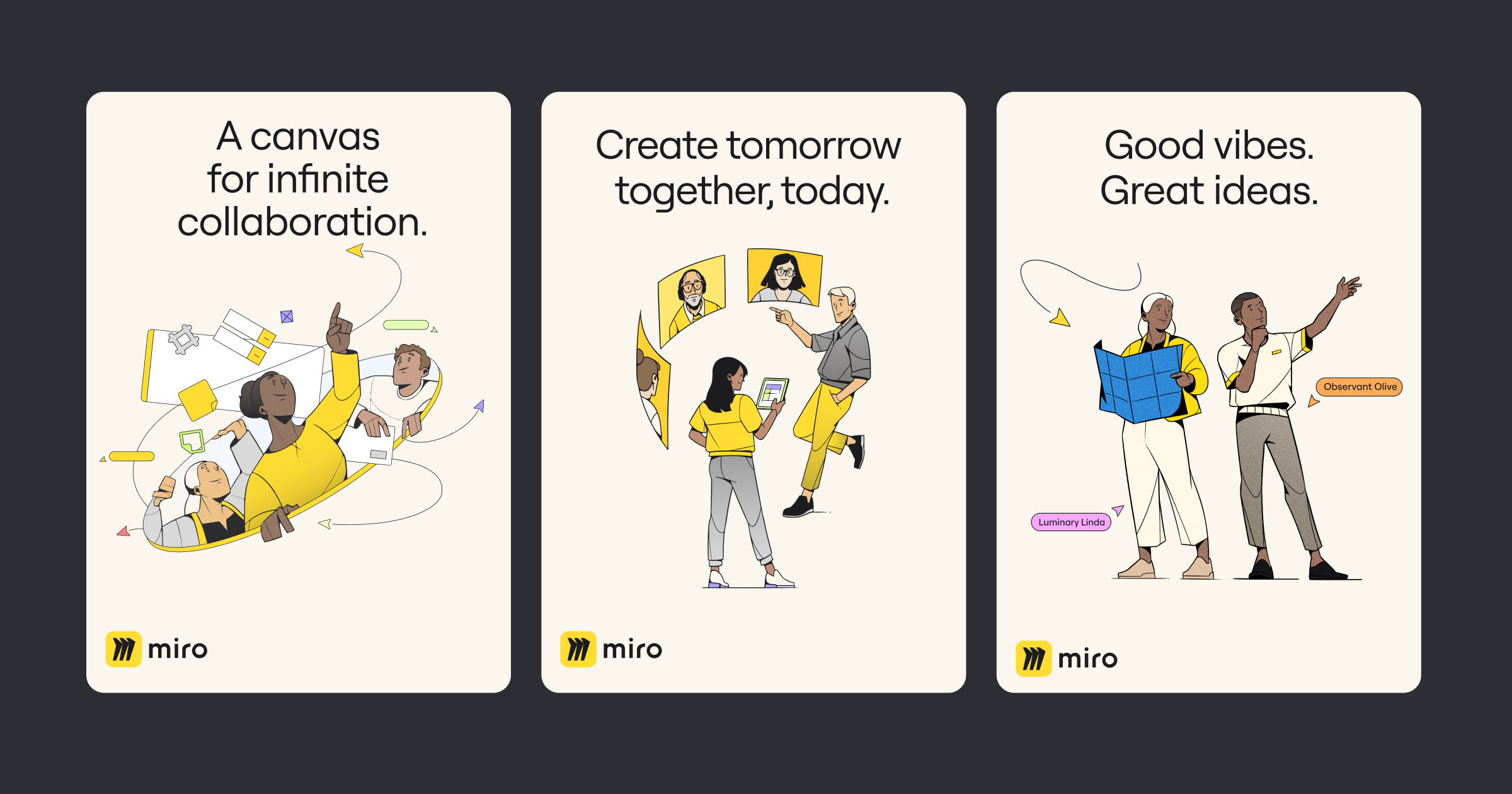
Celebrating creators
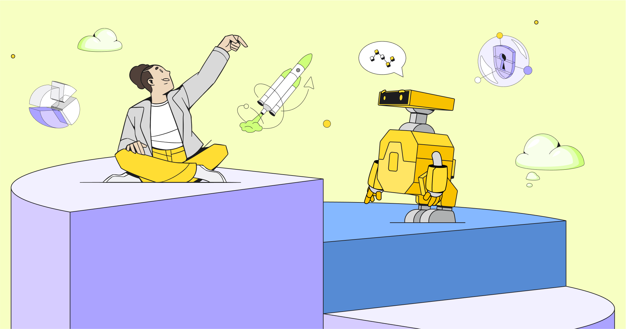
The center of everything we do at Miro is our users — the visionaries, innovators, and creators of the future who dream, create, and build in Miro every day.
To celebrate this innovation, our team wanted to craft a world that is always one step ahead of today’s: a realm of tomorrow’s inventions influenced by our users and their creations.
To breathe life into this world, the team devised a unique illustrative style that could capture the energy of creation and be as diverse and inclusive as a Miro board. In our search for the distinctive style, we looked for the aesthetics that separate us from the commoditized Corporate Memphis style that dominates the tech landscape today.
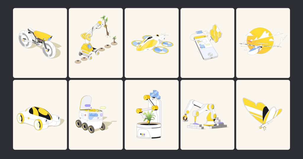
The new illustration style strikes a balance between realism and futurism. We considered every detail from the style, color, and weight of the stroke, perspectives, body shapes, clothing, facial expressions, etc.
We employ clear, bold outlines, unusual perspectives, and sharp features to exemplify individualism while maintaining relatability and universal appeal of our characters. While we maintain consistent characteristic strokes and a restricted color palette for consistency, our characters proudly showcase a wide range of ethnic, gender, age, and body shape diversity.
The illustrations were conceived as hand-drawn sketches and have been brought to life through a 3D model workflow, infusing even more personality and freedom into our characters, while also enabling faster delivery and design iteration.
We are really excited to welcome you to get a first experience of this new Miro brand system at miro.com. You will also see many of these elements show up in our product — changes to illustrations in the dashboard and adjustments to a few branded surfaces — but the experience will remain very much the same.
TO SEE ANOTHER SIDE OF THE THINKING AND PROCESS THAT BROUGHT THIS NEW IDENTITY TO LIGHT, VISIT AKQA’S CASE HERE.