Whether you’re an executive who just expanded your team or a designer embarking on a new project, change—while it can be exciting—is hard. One of its biggest hurdles is aligning multiple stakeholders on evolving goals, messaging, and strategy, a challenge so formidable that it often halts change right in its tracks.
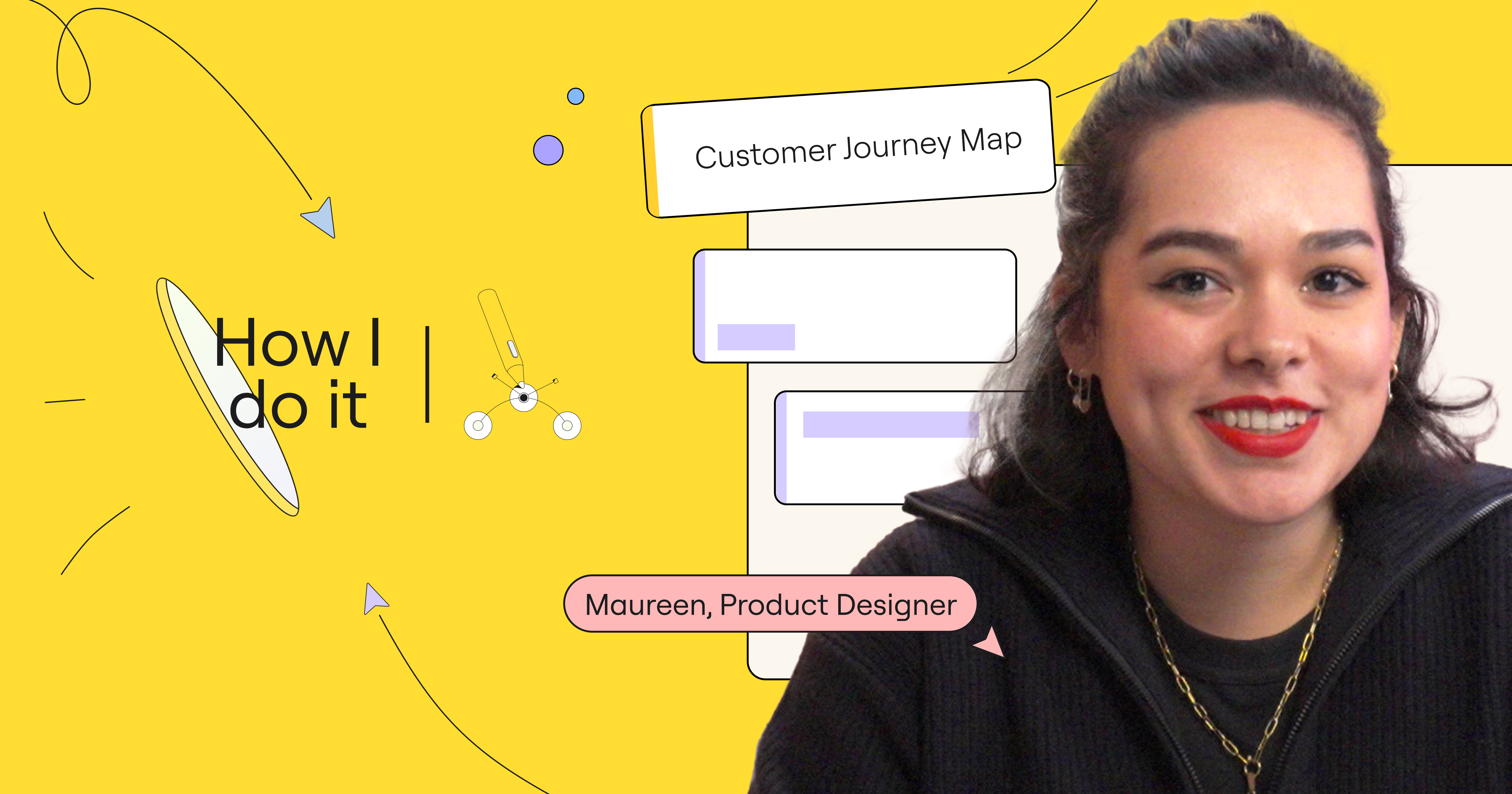
That’s why we sat down with Matt Anderson, the founder of ThinkStartup, a strategic design collective that helps organizations innovate and adapt. Matt’s 3D Innovation and Change Journey Map Template helps teams visualize what he calls, “the Dante’s Inferno of change,” with a journey map — a storytelling tool that illustrates what a person does, thinks, and feels at each stage of interaction with your company. Once you create this 3D map that shows the reality of your users (or customers or even employees), you’ll have a much easier time aligning all your stakeholders, paving the way for change and innovation.
Below, we learn what inspired Matt to create this template and dive into how you and your teams can make the most of it to jumpstart, navigate, and bring about meaningful change at your organization.
The following interview has been edited for length and clarity.
What inspired you to create a 3D journey mapping template?
Across the industry, journey mapping has always been the default tool for human-centered design, but since it’s just a wall of text, it’s hard to get stakeholders to actually engage with it. It’s a lot of information to take in all at once.
So we asked ourselves, how do we get stakeholders to lean in and take an interest in what’s going on in their customers’ lives? The answer: Make it more fun! This template in particular was inspired by old-school Commodore 64 games. The isometric images used in games like “The Last Ninja” and “The Great Escape” captured my imagination as a child, so I injected that sense of play into our journey maps.
When I shared this idea with the team, everyone got excited — and when you see the whole team get excited, you know you’re onto something! So we drew up a new 3D layout and printed it on massive posters that took up an entire wall. The visual impact alone drew stakeholders right in, and there was palpable energy and engagement from those participating in the workshop.
Then Covid hit. That’s when we discovered Miro, and transferred our physical artifacts to a digital whiteboard. First, we built a 2D journey map and layered a static 3D map onto that. Then we thought, what if we made this more like building-block toys, where we can move each of the pieces around and really play? That opened up a whole new world, and it’s how the 3D Innovation and Change Journey Map Template was born.
How does 3D journey mapping support innovation?
The template layout encourages visual thinking, allowing stakeholders to better imagine the journey, empathize with customers, and think creatively. It brings the story to life. I notice that when we use the 3D journey map, stakeholders tend to be more engaged and ask more questions, which is what you want — to get them involved in owning the story. You also have to pull on emotions to get buy-in. A transactional lens, focused only on data, doesn’t spark an emotion. Instead, we use visual storytelling and play to get stakeholders over the line.
A lot of people are bored at work. Trust and engagement are low. If the workshop setup looks similar to what they’ve always done, you’ll get rote responses. But when you have an opportunity to create a fun atmosphere, where people feel safe to share their opinions and ideas, you’ll unlock innovation. By disrupting typical ways of thinking with a creative environment to explore and play, you change the energy of the room and encourage more imaginative ideas.
At the end of the day, we’re asking people to change, which is scary. Innovation is risky. You have to create a safe, playful environment where people can find the courage to reimagine new worlds.
When should an organization use a 3D journey map?
3D journey maps are for leaders, innovators, and experience designers who want to use a journey map to build empathy and understanding for customers, but need to take it to the next level to gain buy-in. By bringing the story to life, you’re more likely to get stakeholders aligned on what changes need to take place in order to truly improve customer experience.
We always start with a 2D journey map first. The 2D version is very detailed and grounded in qualitative evidence. You’re getting the raw intel and information up on the wall, so it’s not as structured or immediately clear what the opportunities are — but that’s part of the process; it’s still discovery at this point.
If your stakeholders are already bought in at this stage, you can move on to identifying and prioritizing opportunities. You may not even need to use a 3D model every time.
If we still need to win hearts and minds, require more support and backing, or really want to dial up ideation, we create a 3D map, which enables us to visualize insights very clearly and allows for deeper discussions.
Ultimately, a traditional 2D journey map focuses on doing, thinking, and feeling, whereas a 3D journey map focuses on synthesizing information and identifying where change needs to happen — which helps to focus stakeholders’ attention.
The following questions can help you determine if 3D journey mapping is right for you:
- Are stakeholders already bought into the concept of the change they want to embark on?
- Do stakeholders already have empathy for the customer?
- Do you need to get teams better aligned on transformation efforts?
Whether you’re a designer who wants to revamp the user experience of your software, a hotel manager looking for ways to improve guest experience, or a leader who wants to transform your organization’s ways of working to create a more engaged employee experience, 3D journey mapping can help your stakeholders immerse themselves in the customer experience — so you can get the buy-in needed to implement change.
How can changemakers get the most out of a 3D journey map?
Empathize with your customer. Make sure you clearly articulate who your audience is and whose journey you’re trying to celebrate. This will keep workshop discussions focused on customer needs, allowing you to uncover opportunities that will ultimately lead to better customer experiences.
Make data-driven decisions. Ensure your journey map leverages both quantitative and qualitative data based on interactions with customers. The more evidence you collect, the more rich the story will be.
Craft a clear narrative. When you assemble a 3D journey map, draw an outline first, showcase the key opportunities and insights, and then determine what details are going to celebrate the story vs. distract from it. This will make your narrative easy to follow, leading to a more productive workshop.
Leverage AI tools. A common concern I hear is that creating a 3D journey map is too much work. It used to take us eight weeks to build, but now it takes only five days using the AI image generator Midjourney, which allows us to open up the tool to more clients. The template includes a primer on how to design isometric images in Midjourney — it’s easier than it looks, and they’re a lot of fun to create! We still use illustrators where possible, as they always produce a more interconnected and high-quality journey map, but AI tools can be a great supplemental resource.
The whole purpose of journey mapping is to create empathy for other human beings, to understand their world and their reality — so take the time to get to know them. Once you do that, the rest falls into place.
Thanks for sharing your insights and 3D journey map template, Matt!
Check out this template and more on Miroverse.


