Here at Miro, we empower team-driven companies to create outstanding products and experiences while we turn the challenges of distributed work into competitive advantages. That’s why we are always curious about the ways leading companies from around the world build a strong foundation for a sustainable business. Today we are excited to share a guest post by Kyle Chipman, who coordinates process and brand content management at Chipman Design Architecture, a leading architecture and interior design firm whose clients include Ulta Beauty, Chick-fil-A, Shinola, Fusion Academy, Kerasotes, Senior Lifestyle, Mendocino Farms and many other national brands. As one of the early adopters of Miro, Kyle shared some of the techniques that help him create a dynamic visual hierarchy for great-looking boards.
Balancing consistency and fluidity for org-wide planning
First, I’d like to say that Miro has refined the way I plan and conceive, developing stronger visual thinking while giving abstract concepts more defined, spatial relationships. It is the best.
Over the past five years, I’ve used the platform to map out various facets of my family’s architectural firm. From platform infrastructure and move planning to org charts and dashboards, the platform has proved invaluable in providing simpler reference to process-based ideas. All my time spent in Miro has borne out a wealth of (personal) best practices and time-saving techniques, built to give one’s workflow ease and elasticity.
This post focuses specifically on the ways that shape defines visual hierarchy, along with time-saving mechanics in Miro that significantly speed up diagramming and documenting. An examination of a project infrastructure planning methodology is covered at the close of the post, employing these shape-centric visual techniques.
Profile
Chipman Design Architecture
(CDA) is a third-generation nationally licensed architecture and interior design firm servicing restaurant, retail and hospitality clients. With over 140 team members across five offices and four time zones, CDA has run flagship, prototype and rollout programs that leverage innovative project management methodologies alongside visualization services and experiential design.
Founded: 1952
Founders: Albert Chipman, John + Debbie Chipman
Team: 141
HQ: Des Plaines, IL
The sequence of cognition
I picked this method up in Alina Wheeler’s book Designing Brand Identity, and it’s proven invaluable when creating layouts and visual hierarchies. Shape, color, and content – these three categories build the sequence of cognition or the order in which we perceive information through visual perception. If you’re only using content (words) to convey meaning, you’re losing a ton of terrific opportunities for more nuanced and dynamic definitions.
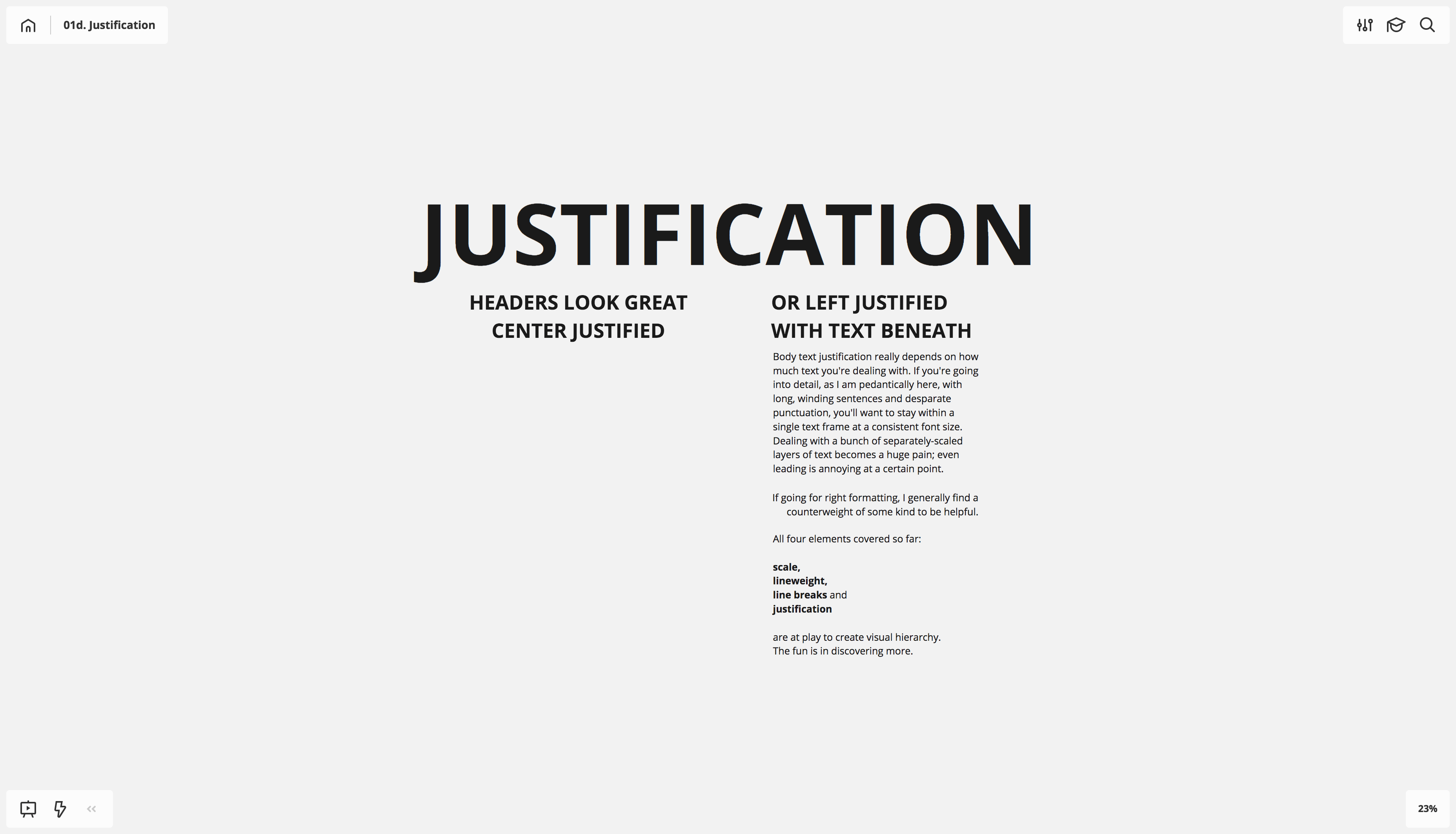
When you read shape, your thoughts might jump to circles and squares, but words and type provide a ton of shape opportunities all on their own, predominantly when placed in relationship to one another (e.g. you only see large by making small). The simplest shape differentiators for words and type include scale, line weight, line breaks and justification.


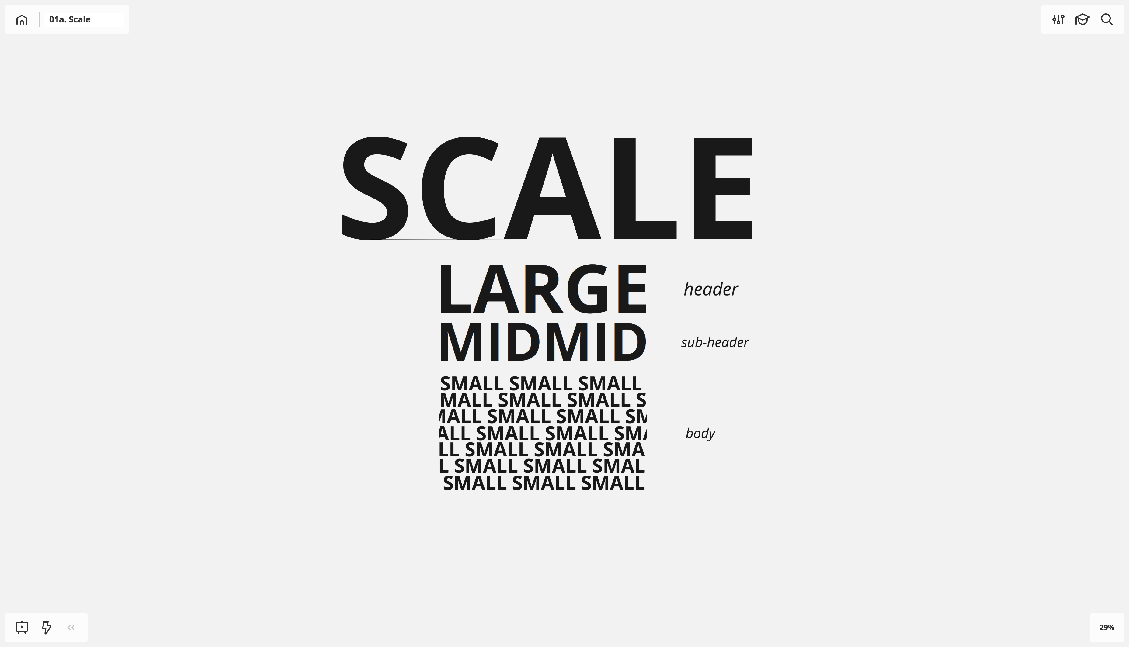
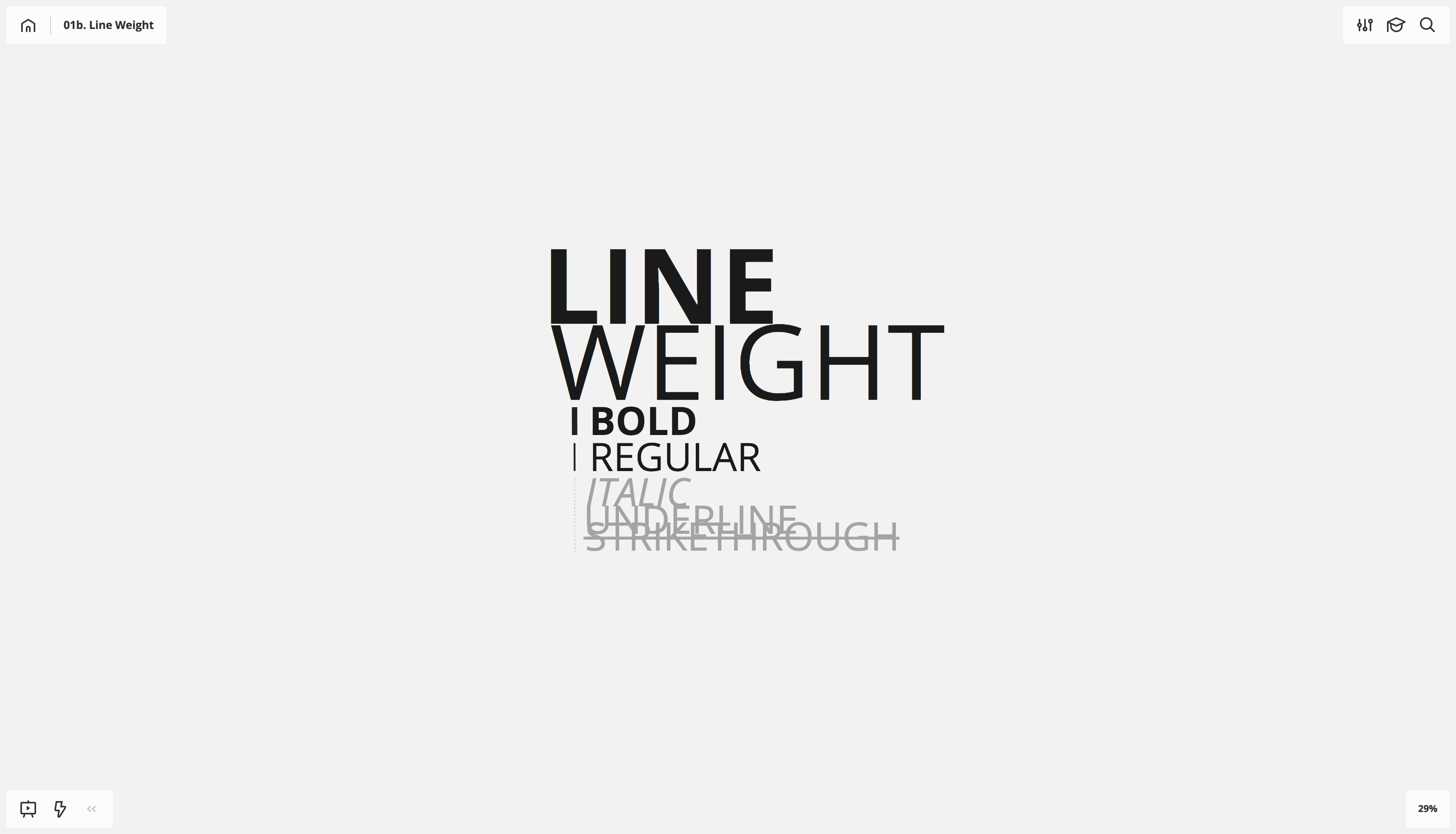
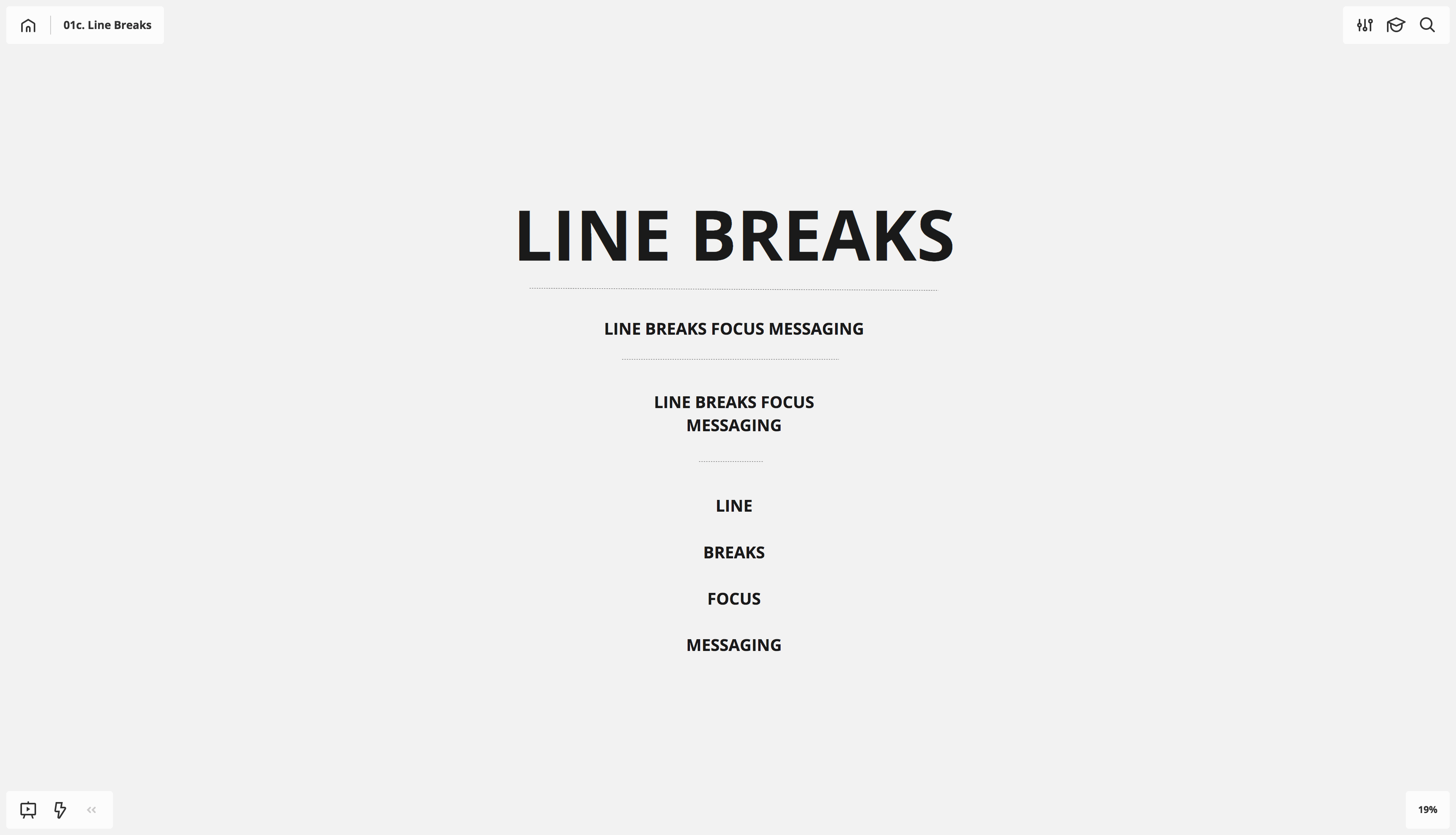
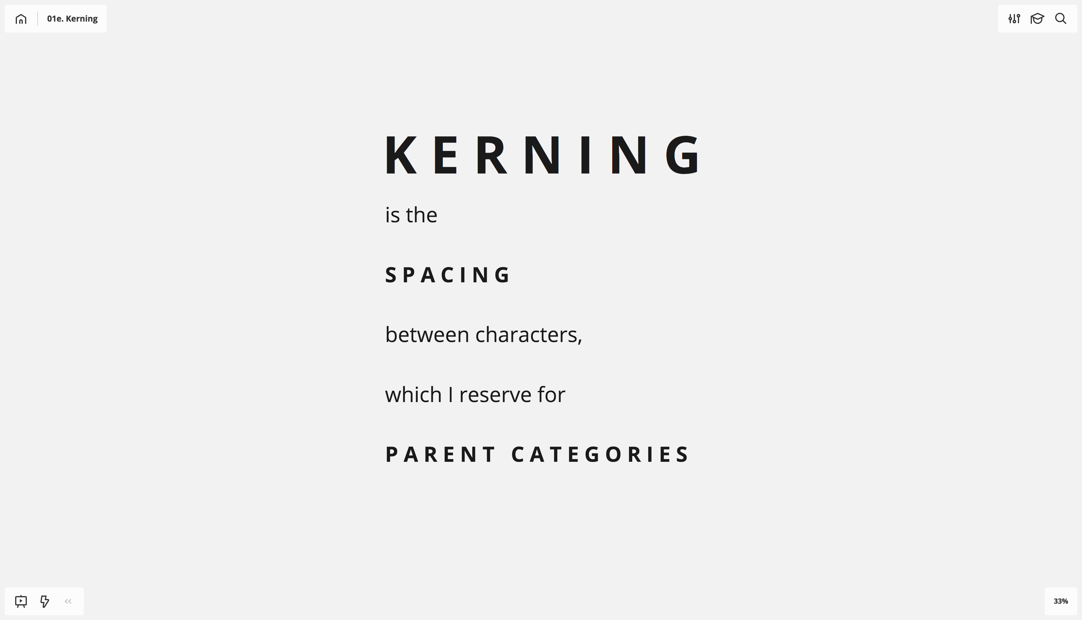
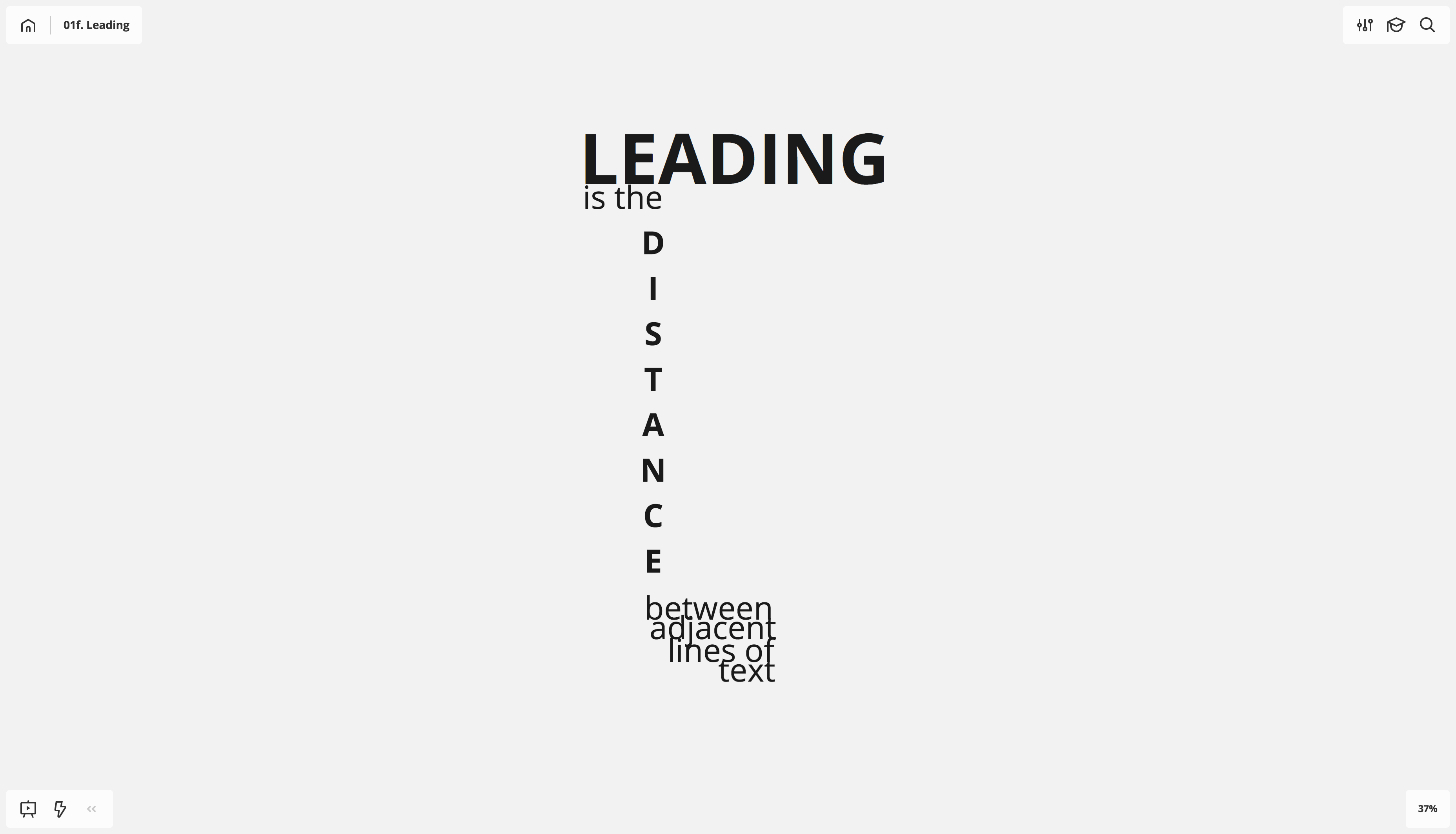
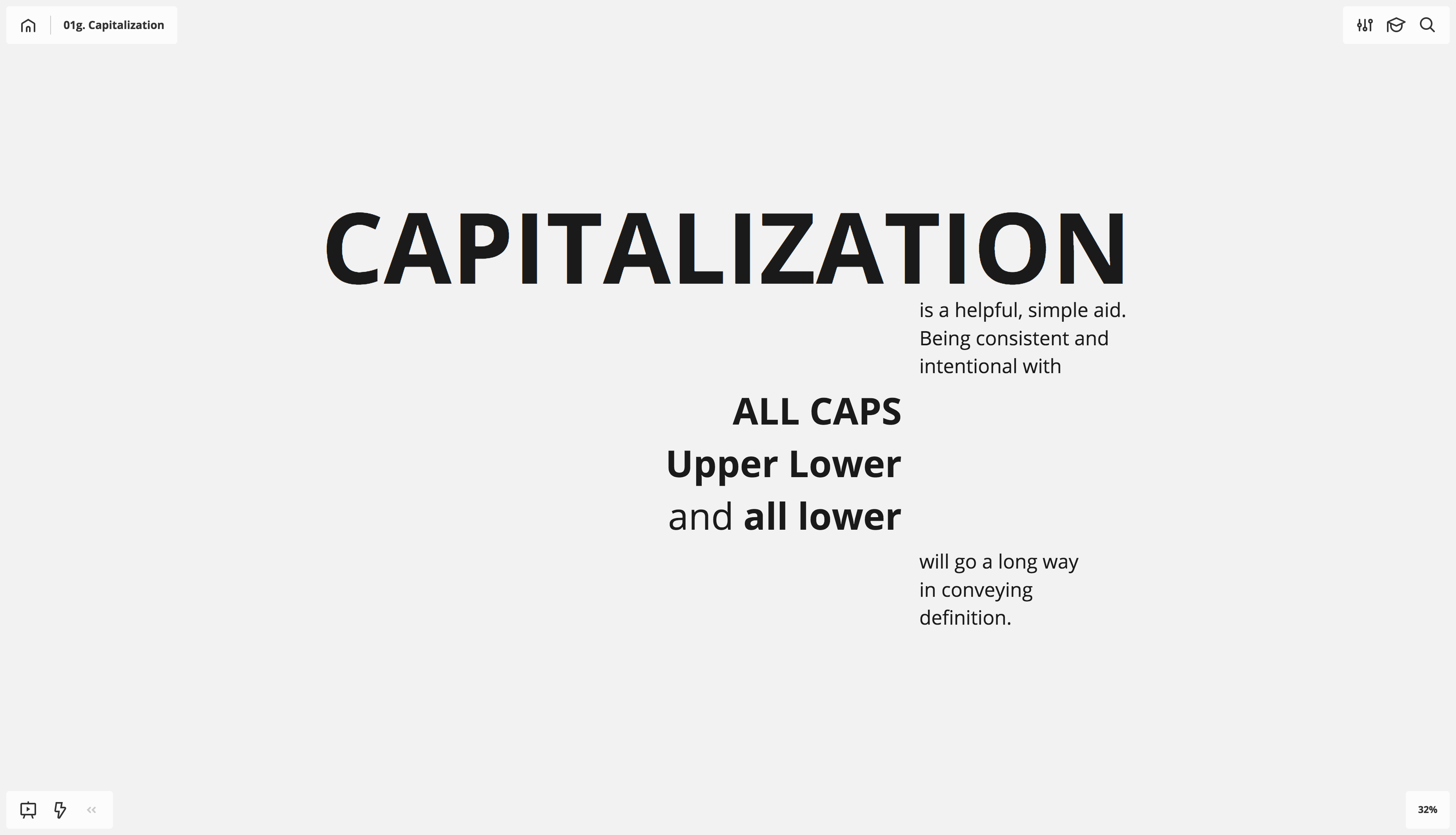
More nuanced elements include kerning, leading and the hiding-in-plain-sight technique of capitalization standards.
However, before you really start to flex with the techniques listed above, you’ll want to create a board template.
Board templates
Formatting presets
Creating a board template is a great first step in leveraging shape with words and type. If you start with the default 100%-zoom 14pt font, you’re left with very little zoom room to become more granular in your mapping and thinking. Your zoom can’t pull any closer than 400%, and the buttons that adjust size don’t go any lower than 10pt. So, 100% 14pt font just barely lets you go one layer deeper in thought and conceptualization.
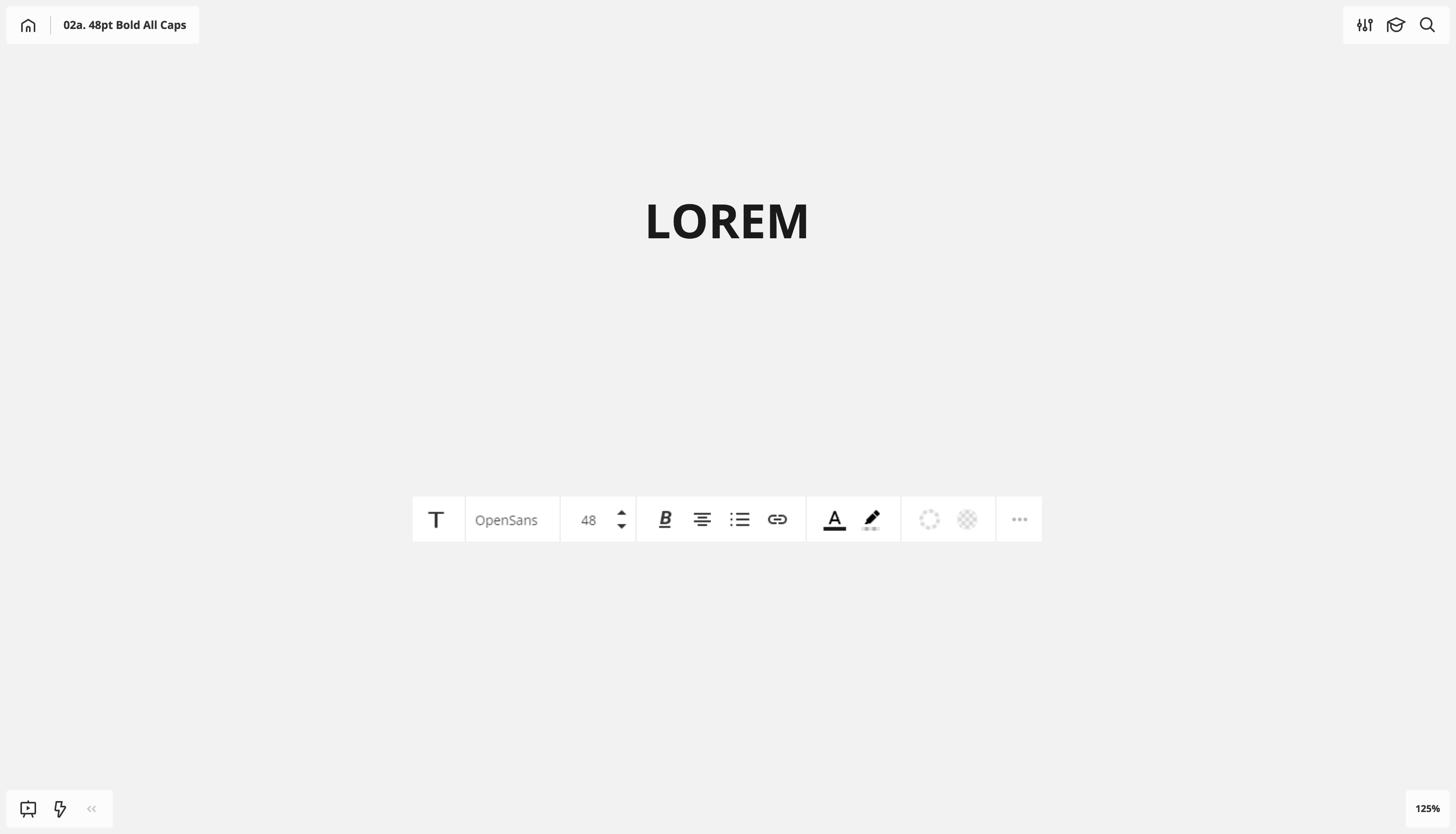
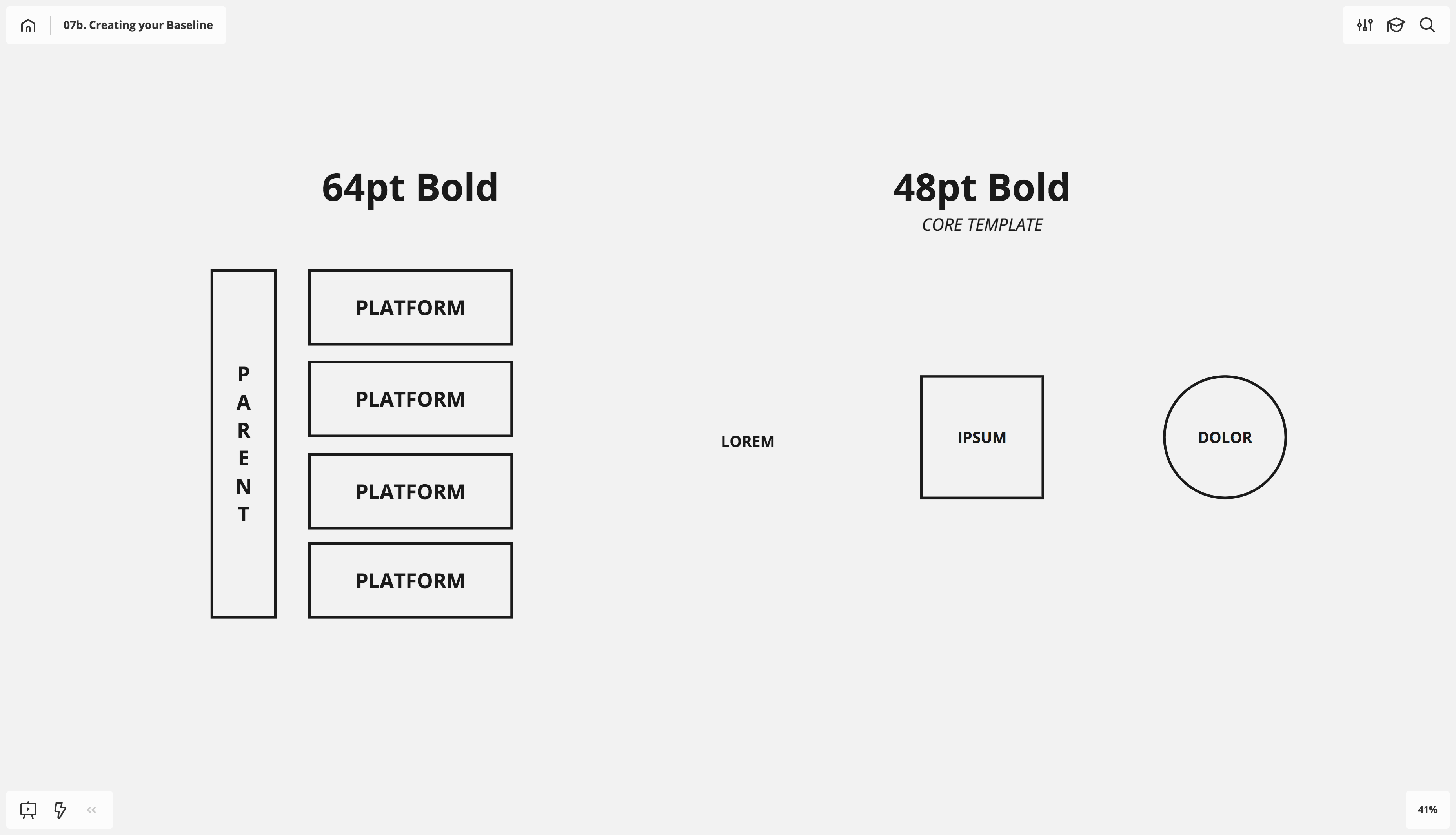
Instead, I start my text at 48pt bold, centered and all caps.
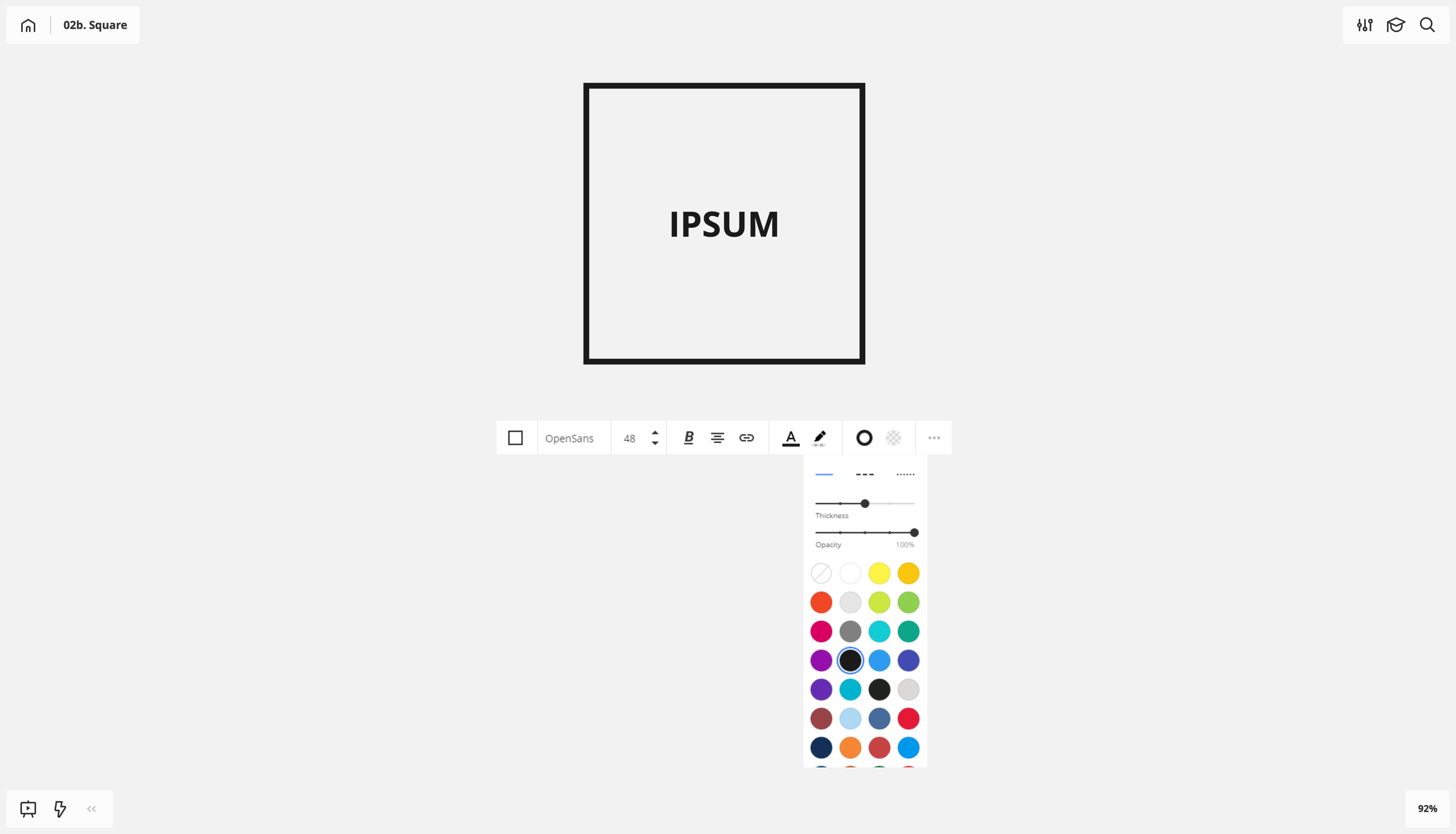
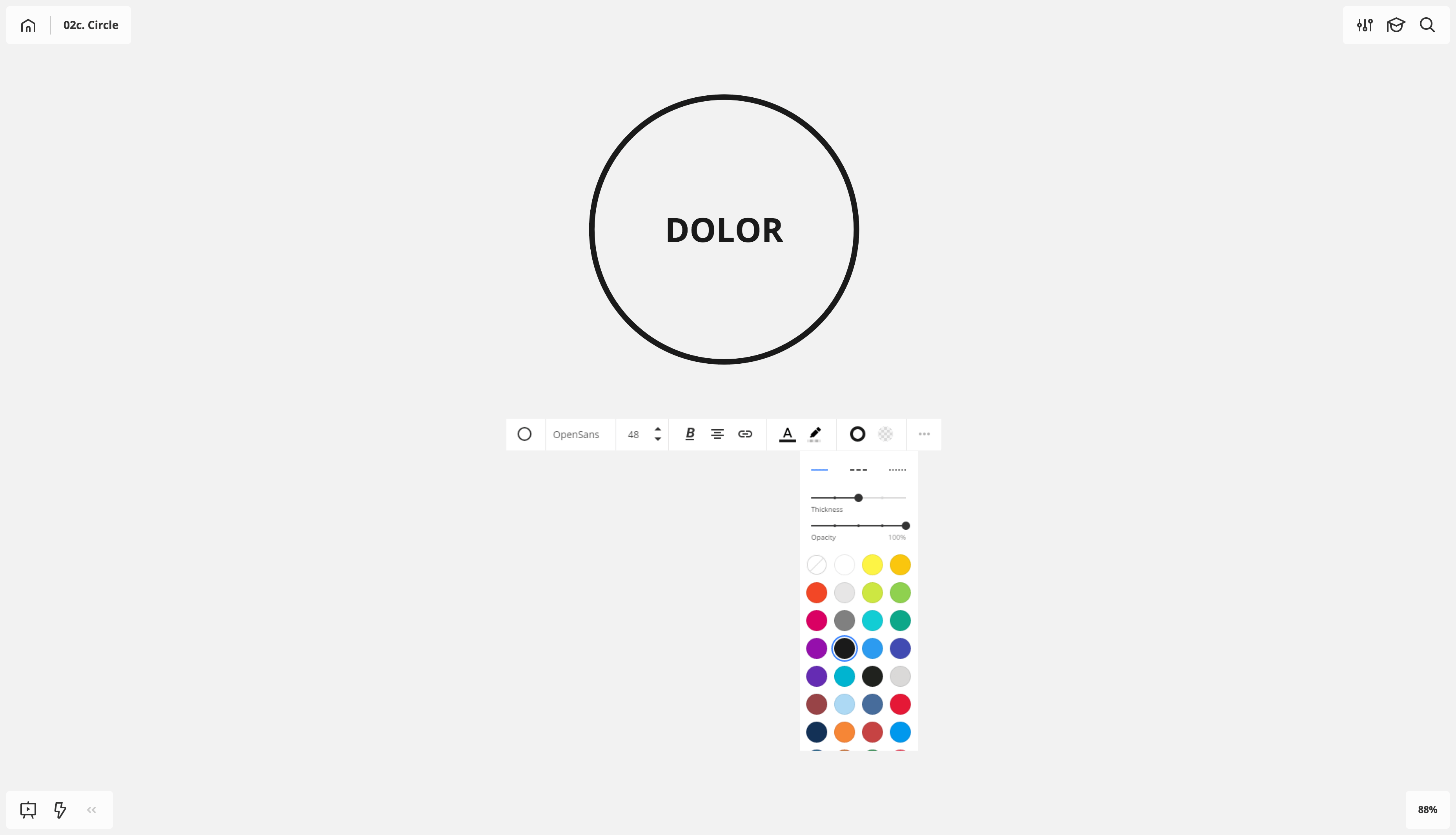
Then I create a square and a circle (rectangle tool, hold shift, click and drag to keep consistent aspect ratio) each with 48pt bold and a stroke at mid-mark line weight for thickness.
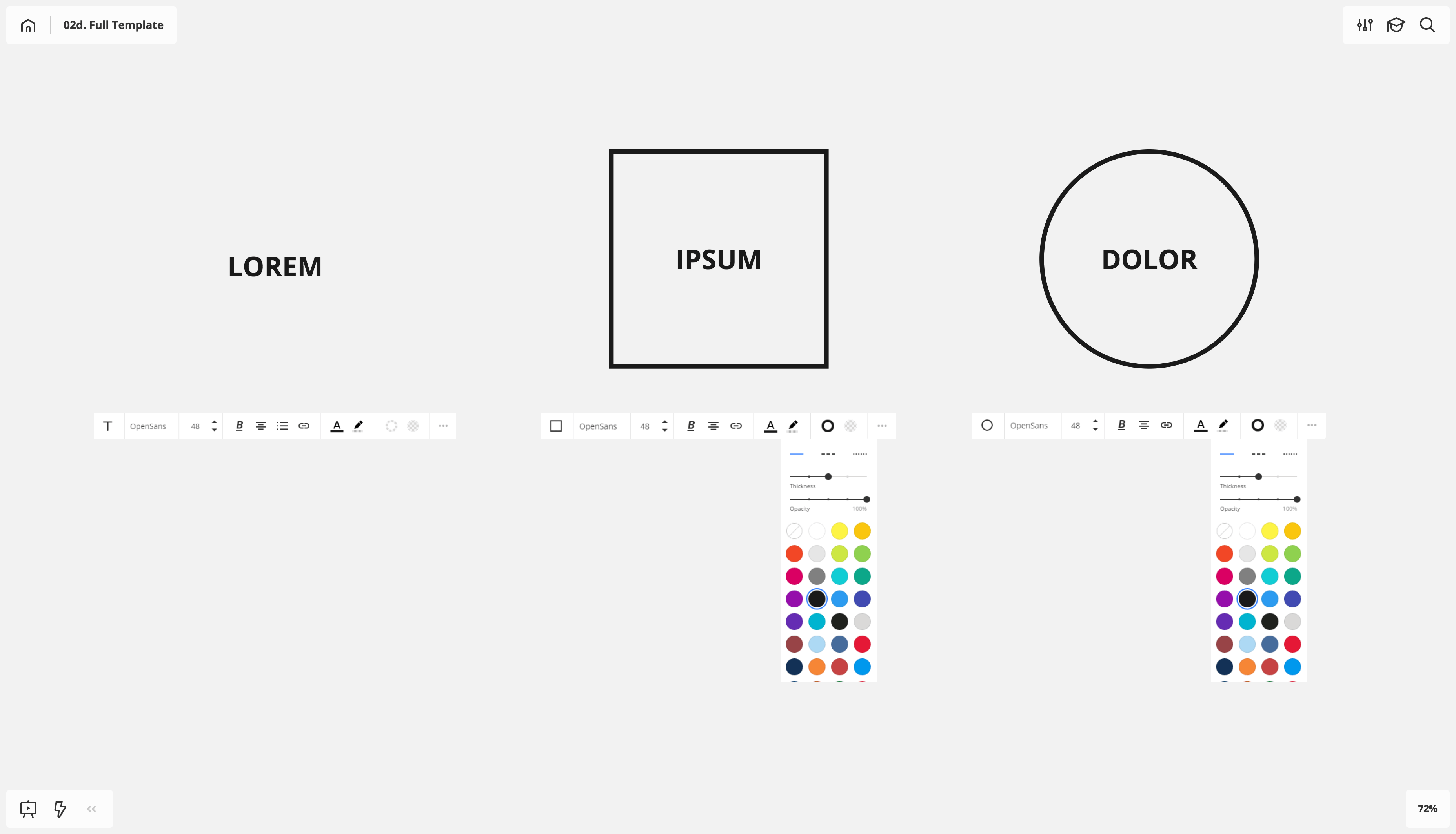
By starting with these settings, I’m able to zoom in to smaller ideas should my board require more granular definition, while retaining the ability to zoom out to macro ideas or definitions with big, impact-sized words and type. Just be careful not to zoom out too far. Plunging to the depths of 3% and 2% is like the bottom of the ocean; you don’t know what you’re going to find down there.
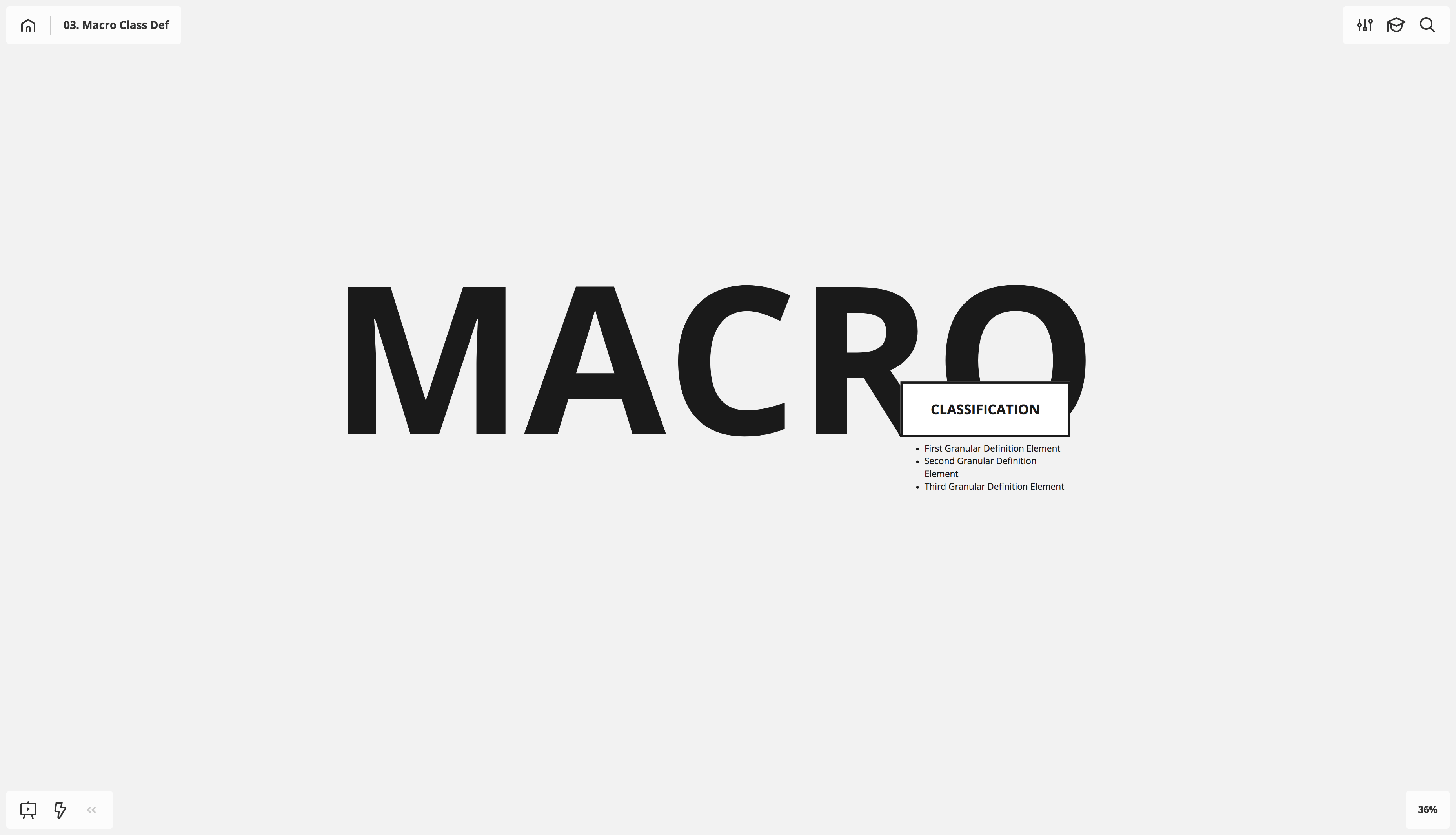
I’ve also used 36pt bold and 64pt bold as starting points. See which one works for you.
Creating a template
Now that you have your text and object elements built, you’ll want to save them as a template for quick access when creating new boards.
The first time you load up Miro, you’ll see the Template Library pop open at new board creation. If you’re like me, you immediately uncheck the “Show when creating a new board” button early on, then feel like an idiot for ignoring it for years before realizing how useful it is. Good news: re-opening access to this template selection pane is a straightforward process.
While in a board, press the three dots at the bottom of your left-hand toolbar, then click the “Templates” button.
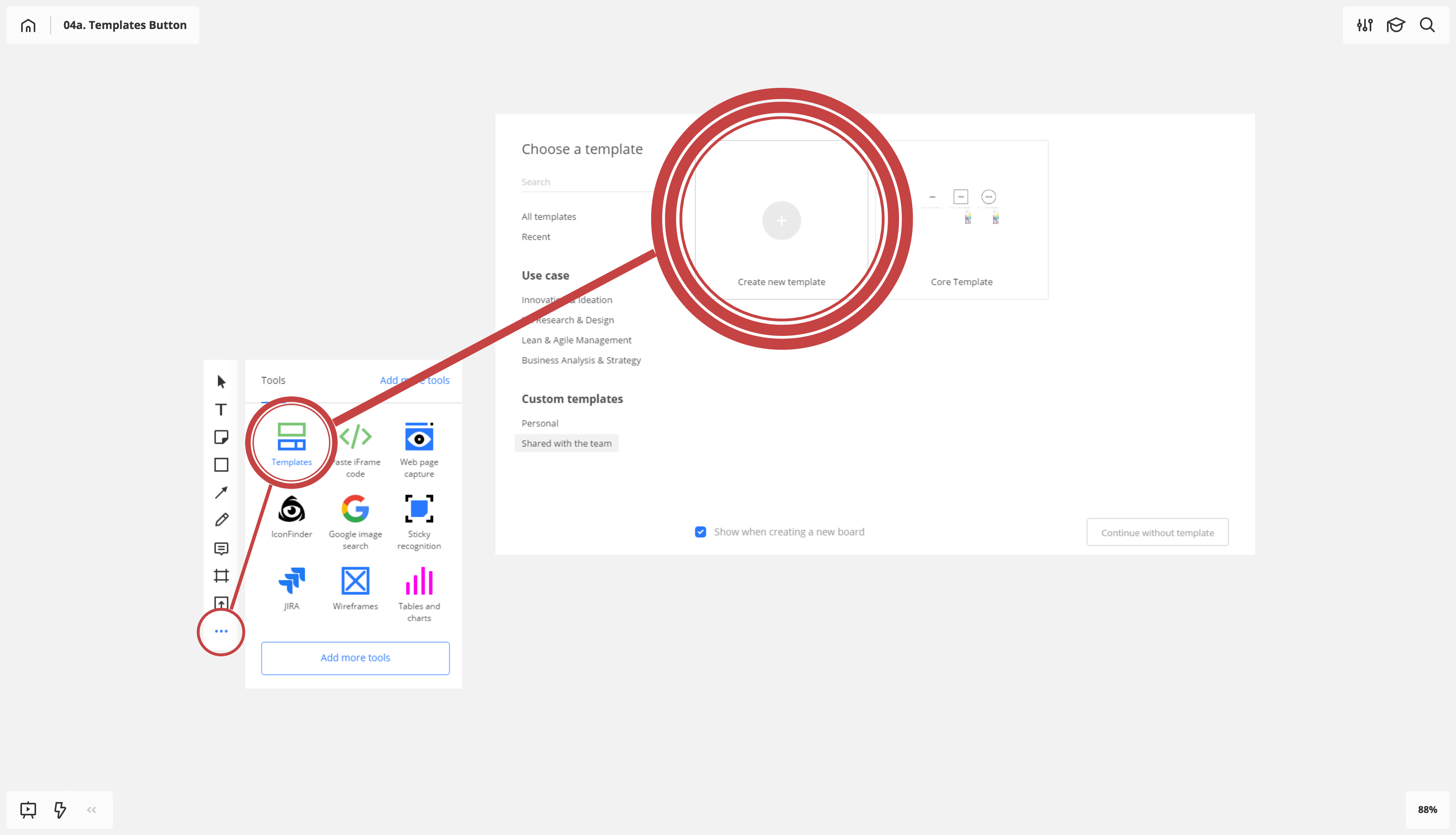
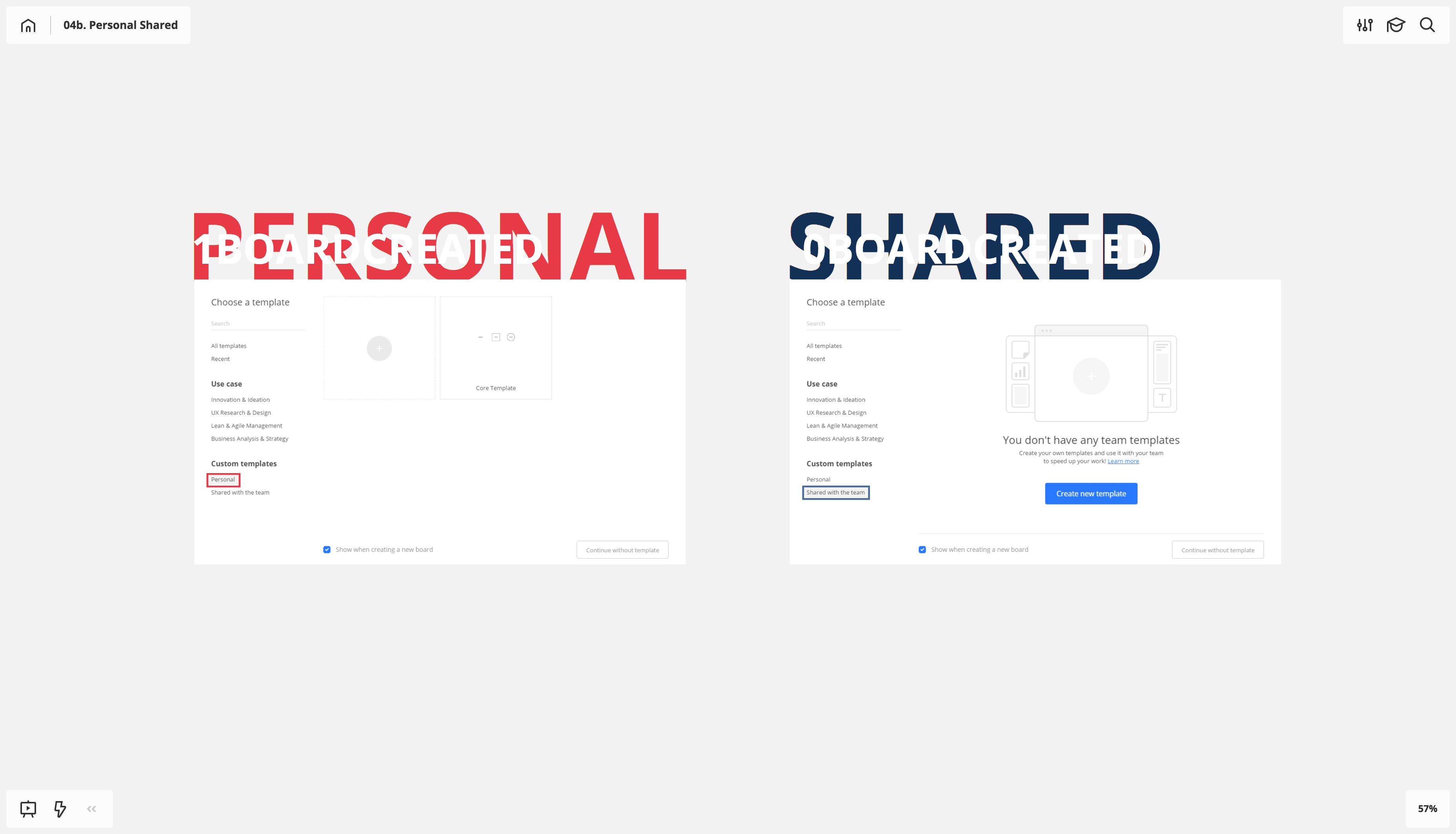
From there, choose either “Personal” or “Shared with the team” under “Custom Templates” and then click the “Create New Template” button (if no templates exist) or the plus sign to create a new template.
You can also create a new template by pressing the up-arrow symbol next to the board name in the upper-left corner and choosing “Save board as Template.” This approach has the added benefit of auto-capturing the board content. You can still choose to set this template as either “personal” or “shared with team.”
An important note about creating templates: it will only capture and load the graphic elements, not the scale of zoom at which you save the template. I find it useful to zoom out 50% on all new boards to better accommodate 48pt bold and mid-weight stroke.
Scaling techniques
Quickly and effectively scaling text has become indispensable to my Miro workflow.
Because the intervals of the font-size counter jump dramatically once you pass the 80pt mark, you’ll want to start manually adjusting the 80pt+ scale of the type by dragging the corner of the text frame.
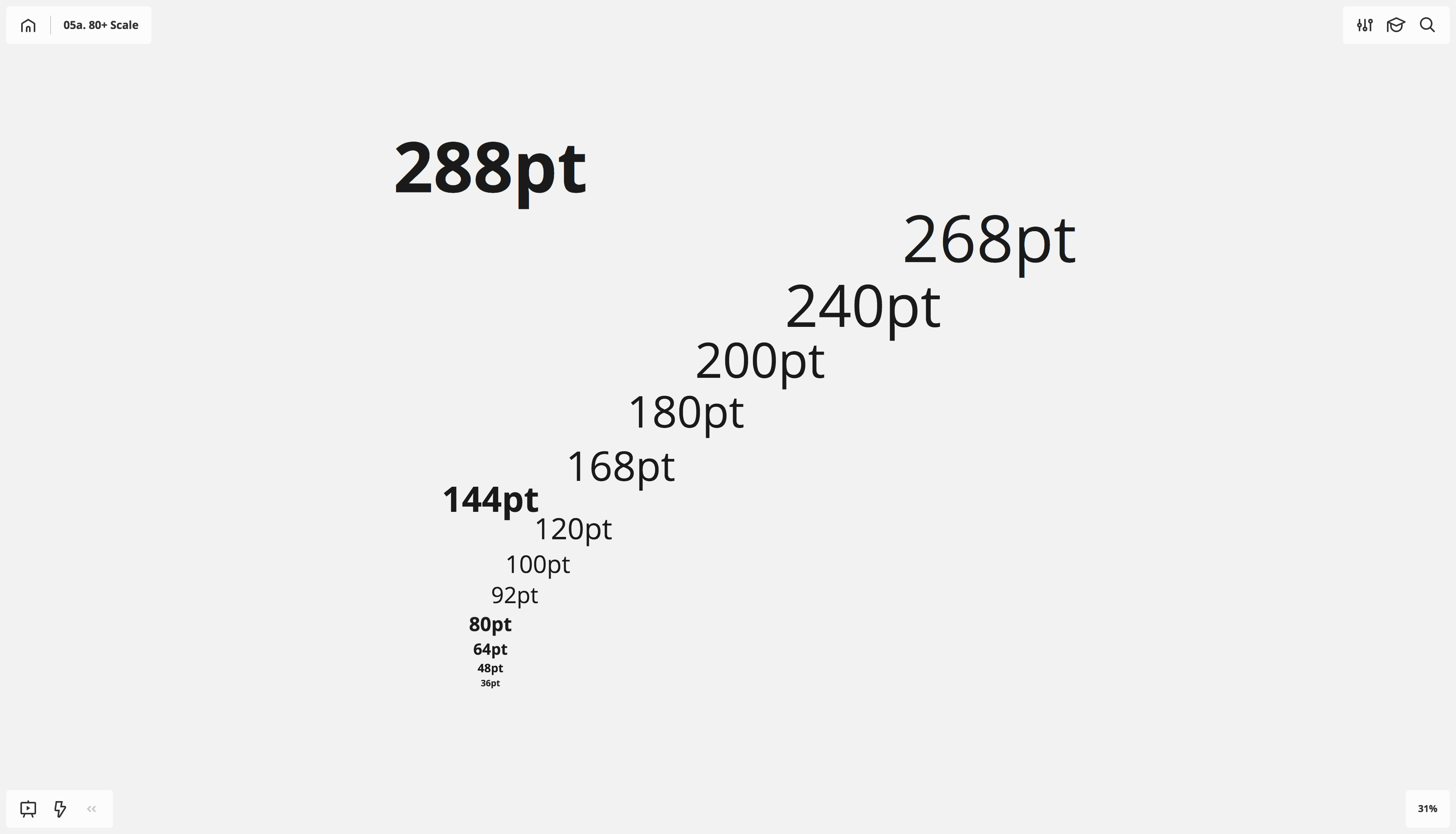
The ratio of change under the 80pt mark scales quite well; I find it a lot easier to keep these at 80, 64, 48, 36, etc. Keeping that scaling stock will help you combine boards down the line, should the need arise.Super important, long-term technique: Text frames (without shape) are the only frame type where dragging a corner resizes the text.
Super important, long-term technique: Text frames (without shape) are the only frame type where dragging a corner resizes the text.
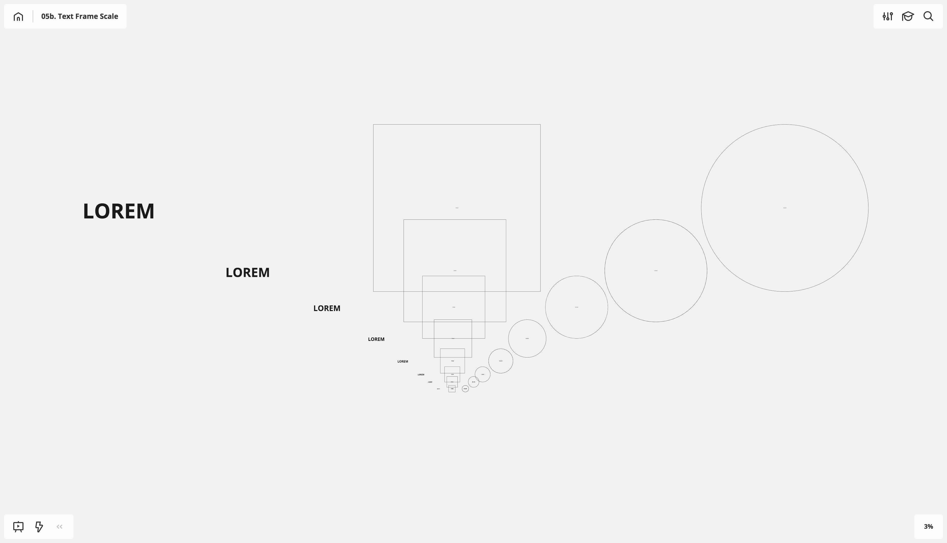
Nearly as important long-term technique: Holding down the alt key when dragging the corner of an object scales around the object’s center point. This is true for type, shapes, images, anything. This technique also applies to Adobe CC platforms.
Combining this technique with the shift key provides a consistent aspect ratio when scaling. This is particularly helpful for perfect squares and circles.
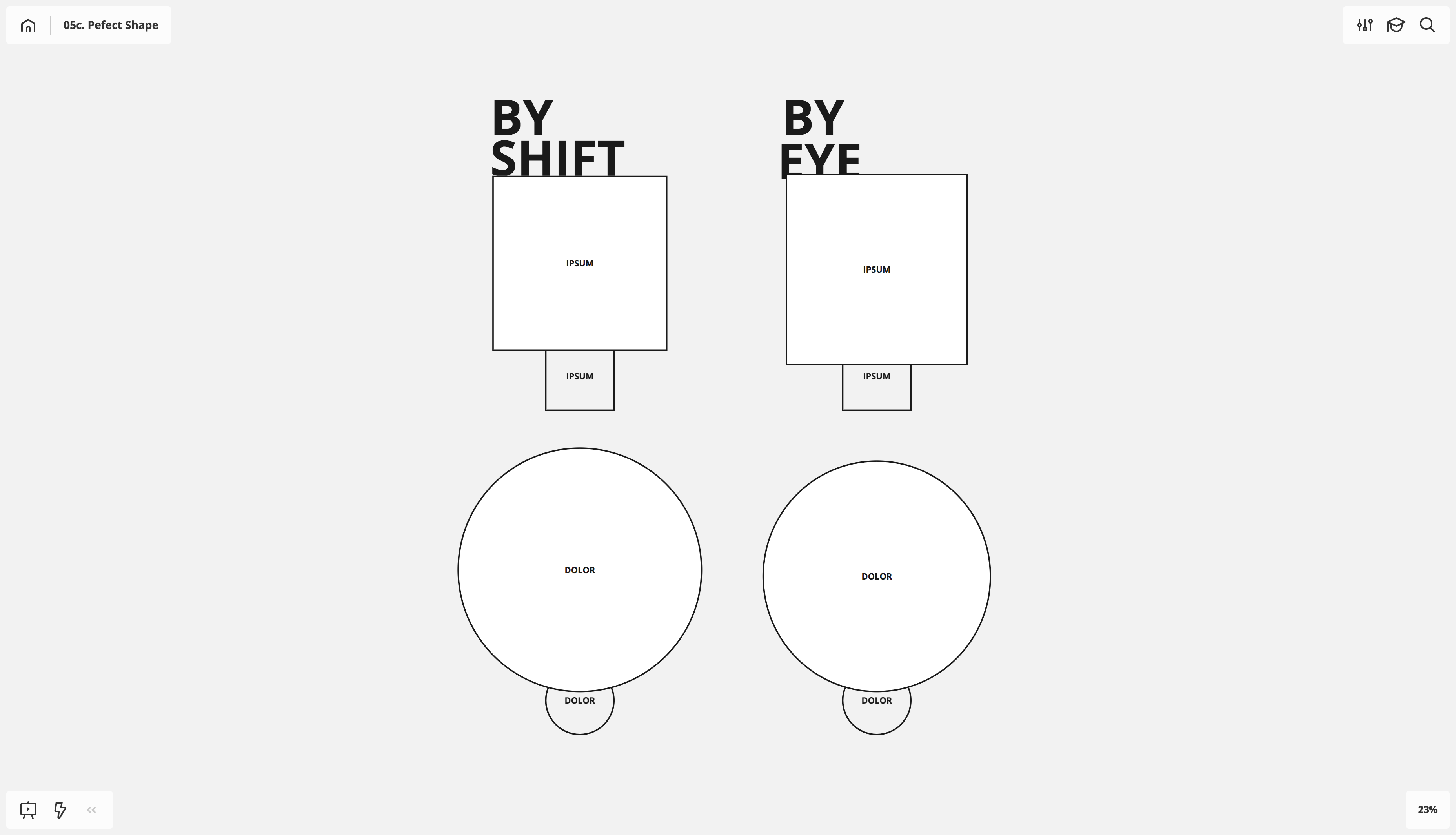
Choose your starting shape from the toolbar, holding the shift key before dragging the form.
Axis scaling
For this next technique to be most effective, you need to define your center line, or axis of focus. These two axes are the X (horizontal) and Y (vertical) axes.
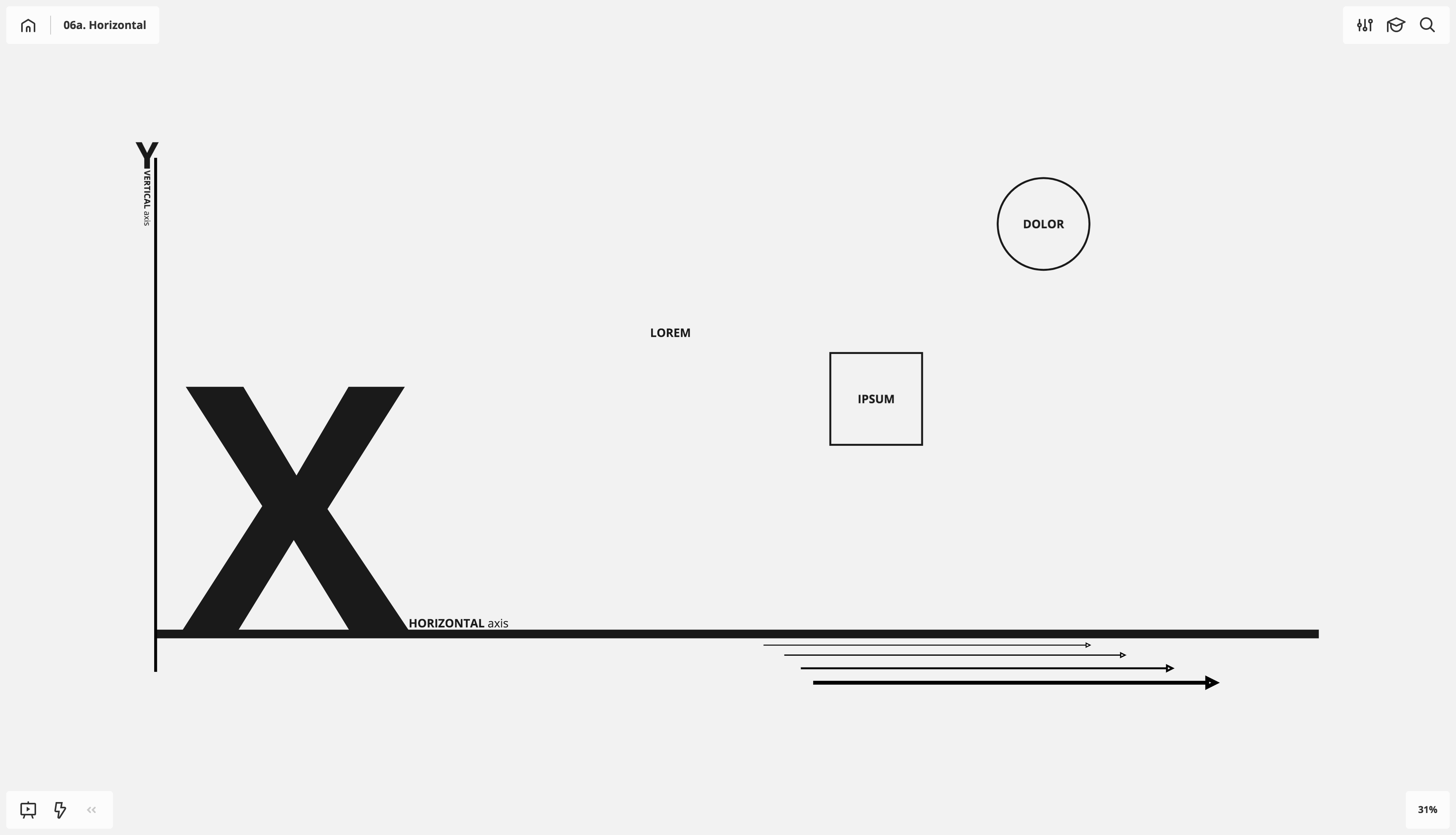
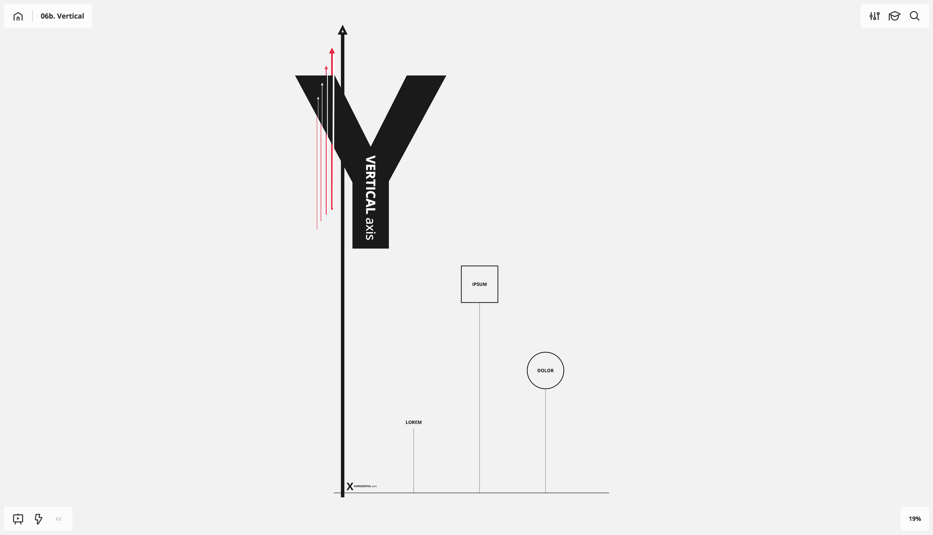
Deciding on an axis of focus (X or Y) before center-point scaling (alt + text frame corner drag) allows you to more easily pinpoint the appropriate scale of your type.
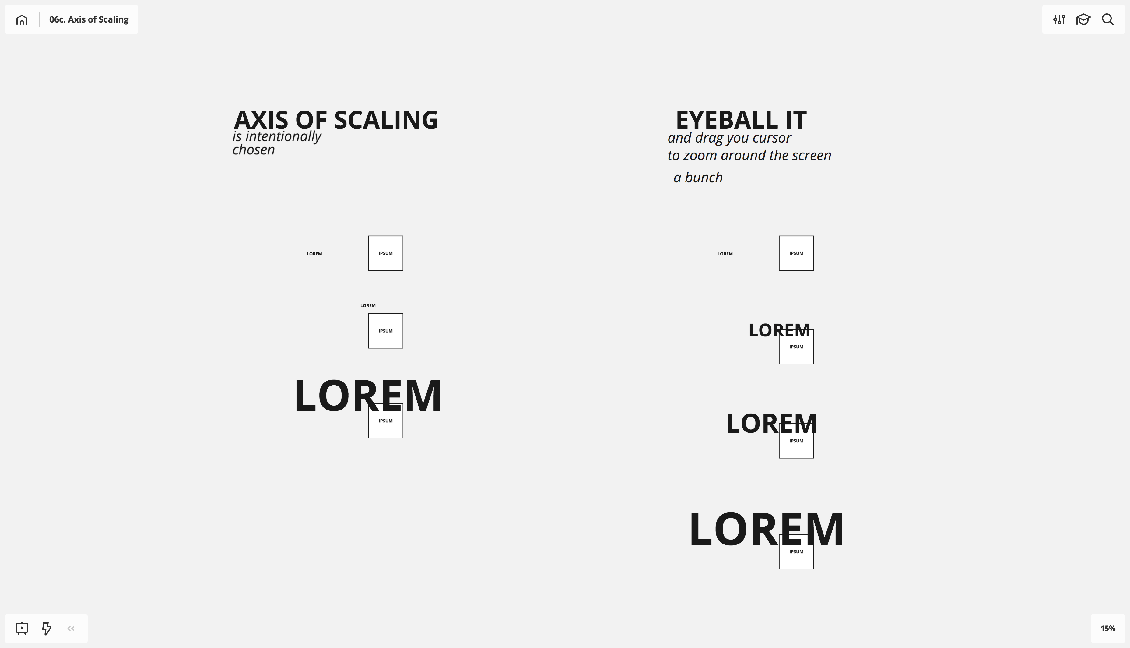
Once the preliminary scale is locked down, you can make large tweaks by dragging orthogonally (left–right or up–down) along the axis of focus then dragging orthogonally along the opposite axis.
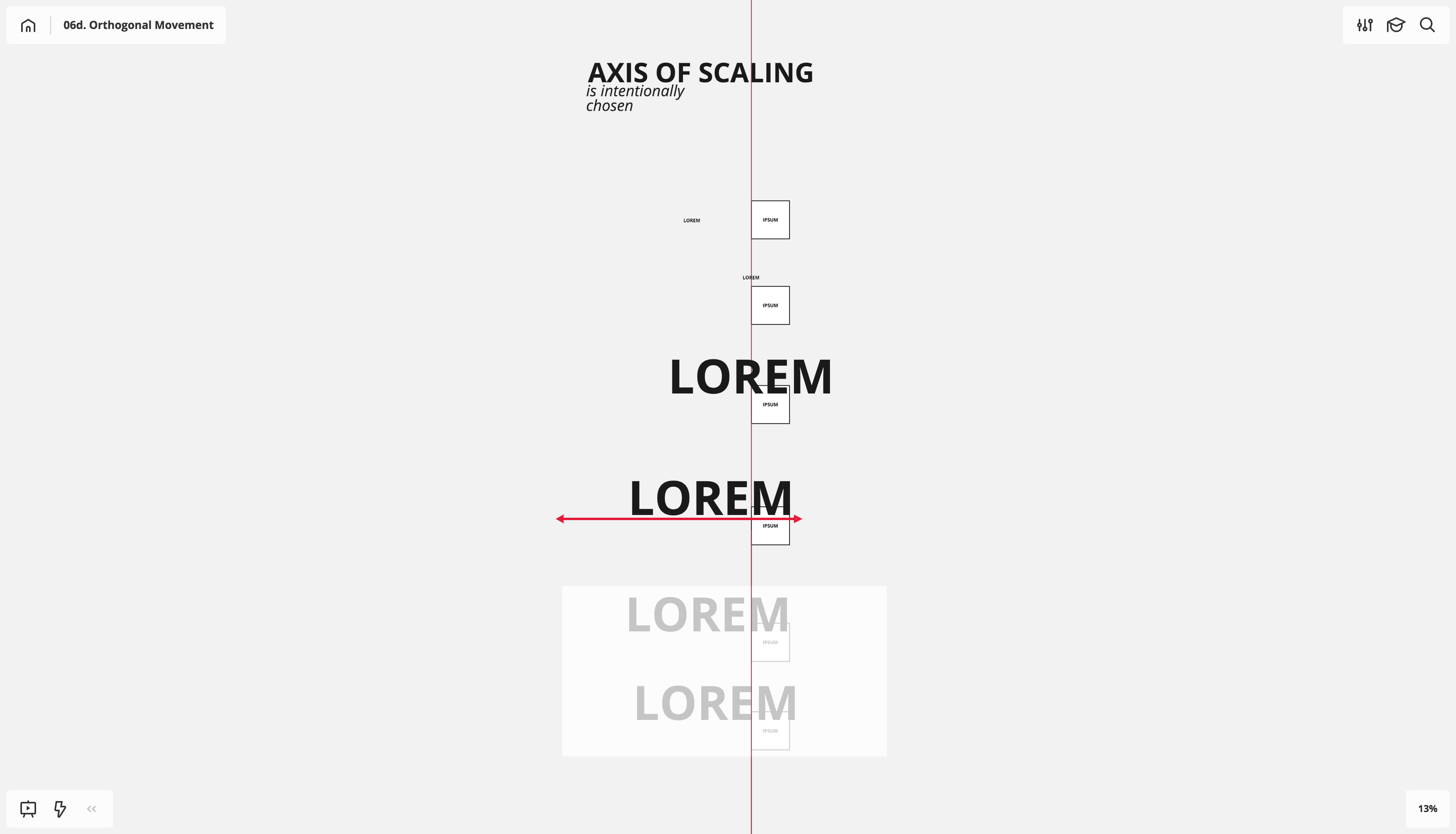
Shout out to the auto-snapping built by the Miro team. It’s awesome and critical when it comes to this kind of center-line alt scaling work.
Looking for a convenient tool for org-wide planning?
Case study
Project infrastructure planning
Whenever a new client or account kicks off, one of the first steps I take with both leadership and project managers is to map out the basic platform infrastructure and workflow. Before Miro, these sessions would be scattershot, based only on the past work experience of the people in the room. Whole swaths of workflow could be omitted if none of the players had dealt with it before. Furthermore, the lack of a shared visual reference point meant that the workflow relationships between platforms were often overlooked or oversimplified (for instance, Schematic Design Package: use InDesign, as opposed to the Design Associate generates text inside InCopy to be reviewed by the Design Manager, then transferred over to InDesign by the Graphic Design Associate).
The feature set of Miro has been tremendously helpful in focusing these planning sessions, with many of the fundamental techniques detailed above coming into play.
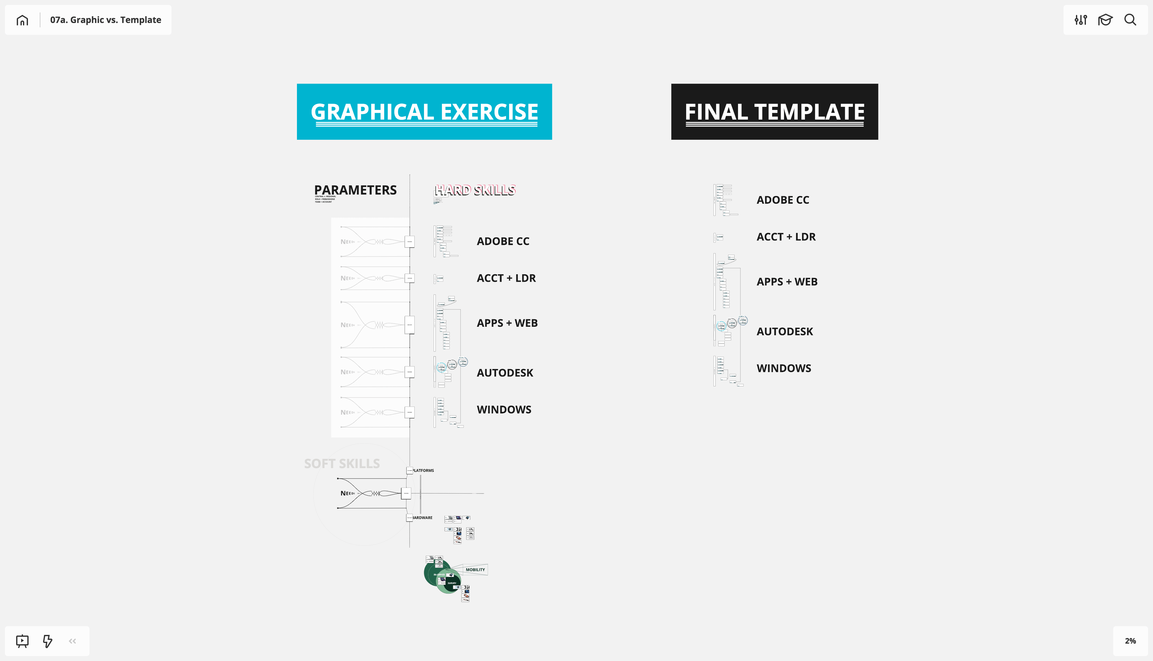
The first step is to perform the internal due diligence and assemble all platforms into a single board to serve as a platform infrastructure kick-off template. I’ve included both the preliminary assembly I performed along with the final platform template to highlight the difference between boards made for initial/personal reference and boards made for general company use. When setting up a board for personal reference, I don’t censor myself that much or worry about being explicit in definition. I fully flex my visual and conceptual thinking to give abstract concepts basic form, which in turn creates groupings of objects and allows those groups to be placed in relation to one another.
For instance, take the bonkers graphic element on the PARAMETERS half of the diagram. This emerged from an exploration of needs drivers, and while it wasn’t useful in template rollout, it served as a great framing element when grouping like platforms and programs.
The first thing I want to note is that the text size for all platform names is set to 64pt. This scaling was chosen deliberately from the 48pt text size we established in our core template. As I knew that the platforms would require more detailed flows (responsibilities, information transfer, etc.), I wanted to scale these names one notch higher than the core. That way, I could both my core template and my platform infrastructure template into a new board; my basic visual hierarchy would then be pre-established. This is why it’s so important to discover your core template settings using the techniques listed above: to build use cases around the baseline.
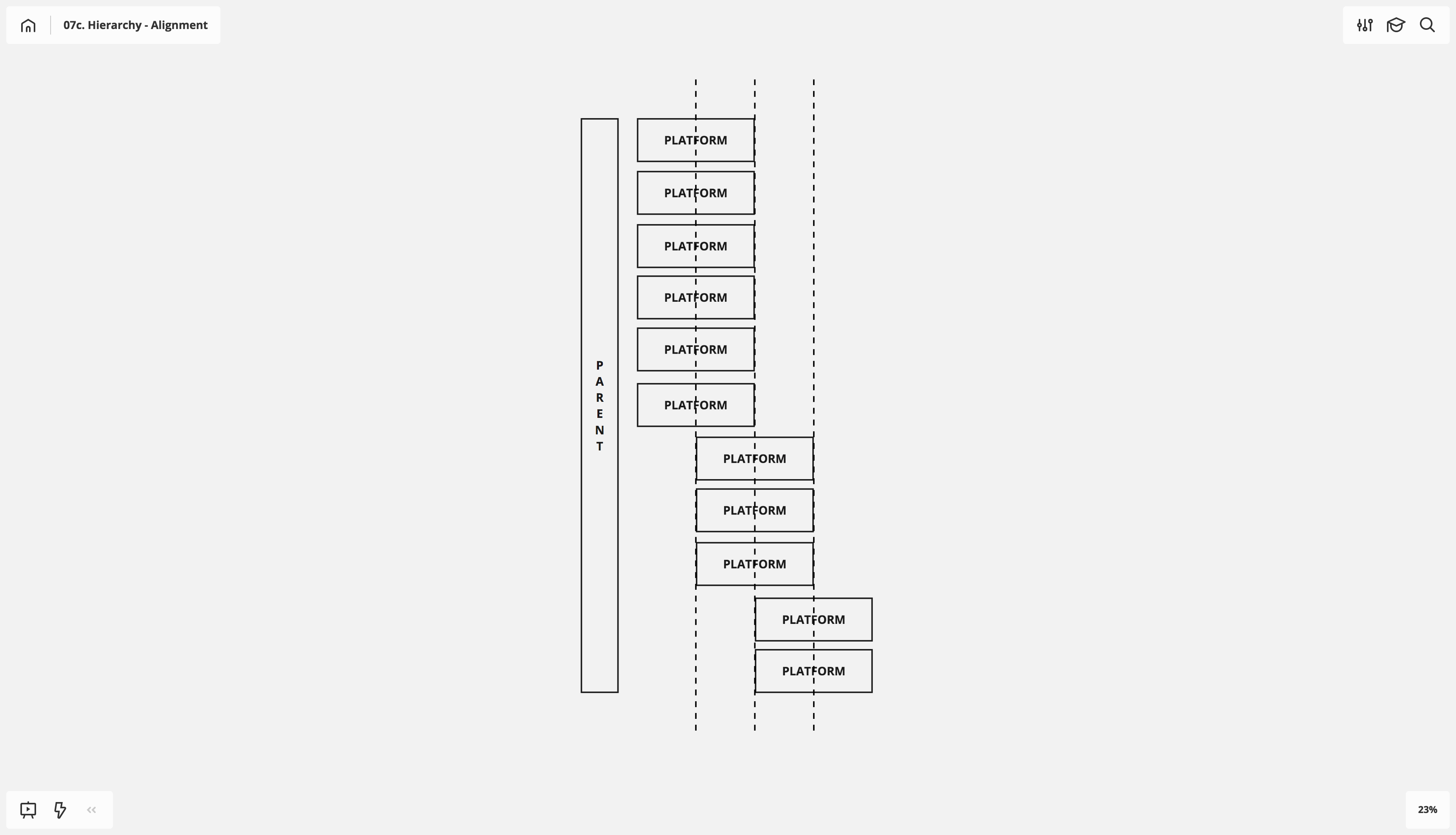
After establishing basic text and frame sizing, the next step is to create priority or importance of platform use. Our exploration into shapes earlier offers some great, simple solutions for this, with a particular focus placed on platform/rectangle alignment.
After stacking platforms in importance from top to bottom, indentation creates a helpful secondary prioritization. When working with indents and uniform shapes, I make sure my indents always fall at half-shape width; this imbues the hierarchy with an easy-to-update standard.
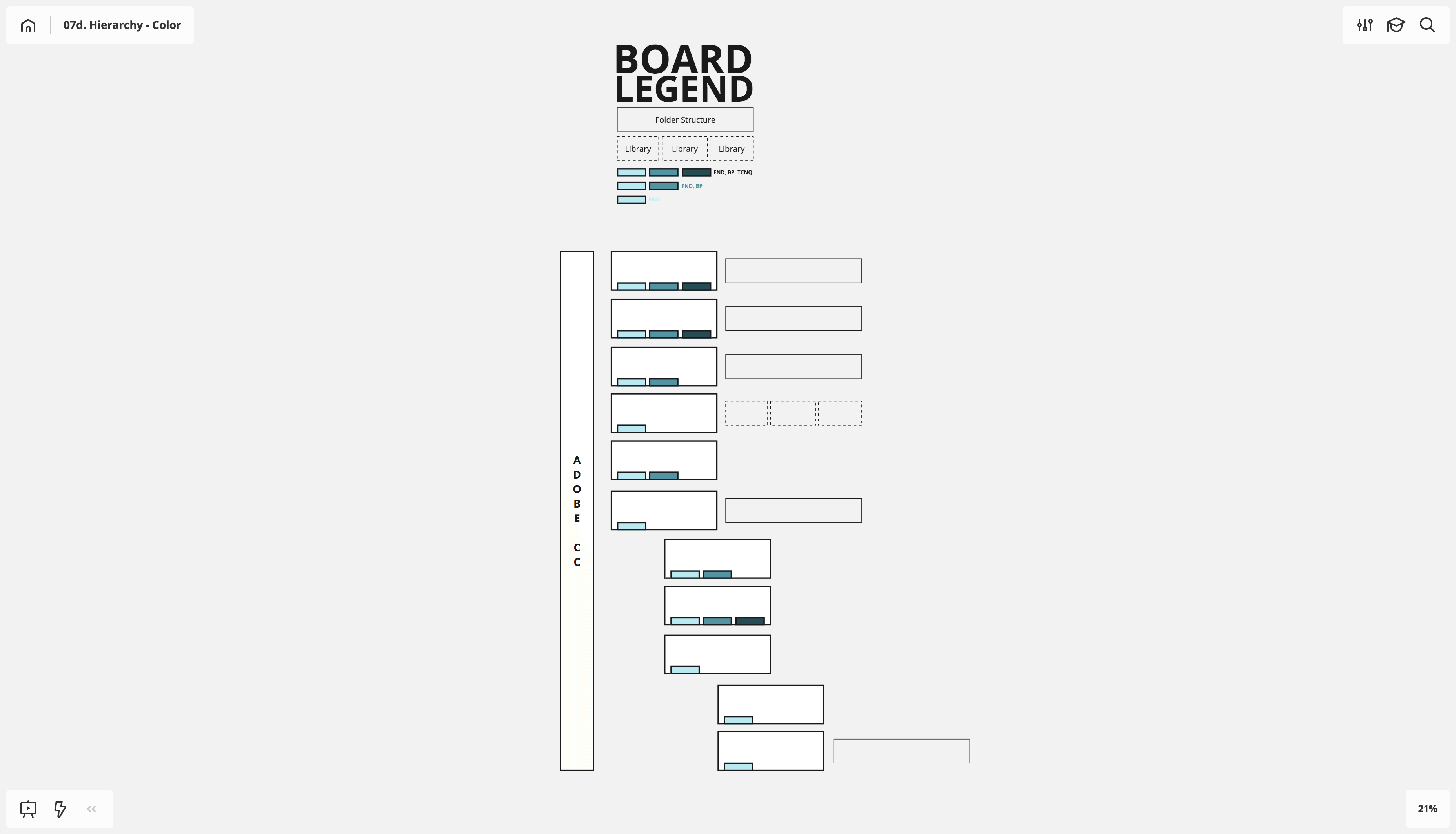
Following the sequence of cognition mentioned above, my next opportunity was to lean on color to create definition. I wanted this color prioritization to be tied to something more concrete and tangible, so I associated small rectangular blocks within the platform names to define available platform documentation. One block meant we had fundamentals, two blocks meant we had fundamentals and best practices, and three blocks meant fundamentals, best practices and techniques (advanced). We’ll cover color theory more at length in future posts, but I based the gradient off our brand-standard blue.
There’s another great Miro technique at play in the image below: using a white background for shapes gives greater focus and importance. Even though this technique changes nothing on image export (the shapes will export with white backgrounds, regardless of whether it’s selected as the shape’s background color in the underlying board), it really helps to punch and focus content in the board itself.
Once you begin to stack up board-specific color and shape definitions such as these, legends or keys become essential, particularly when the intention is to create a template for general use.
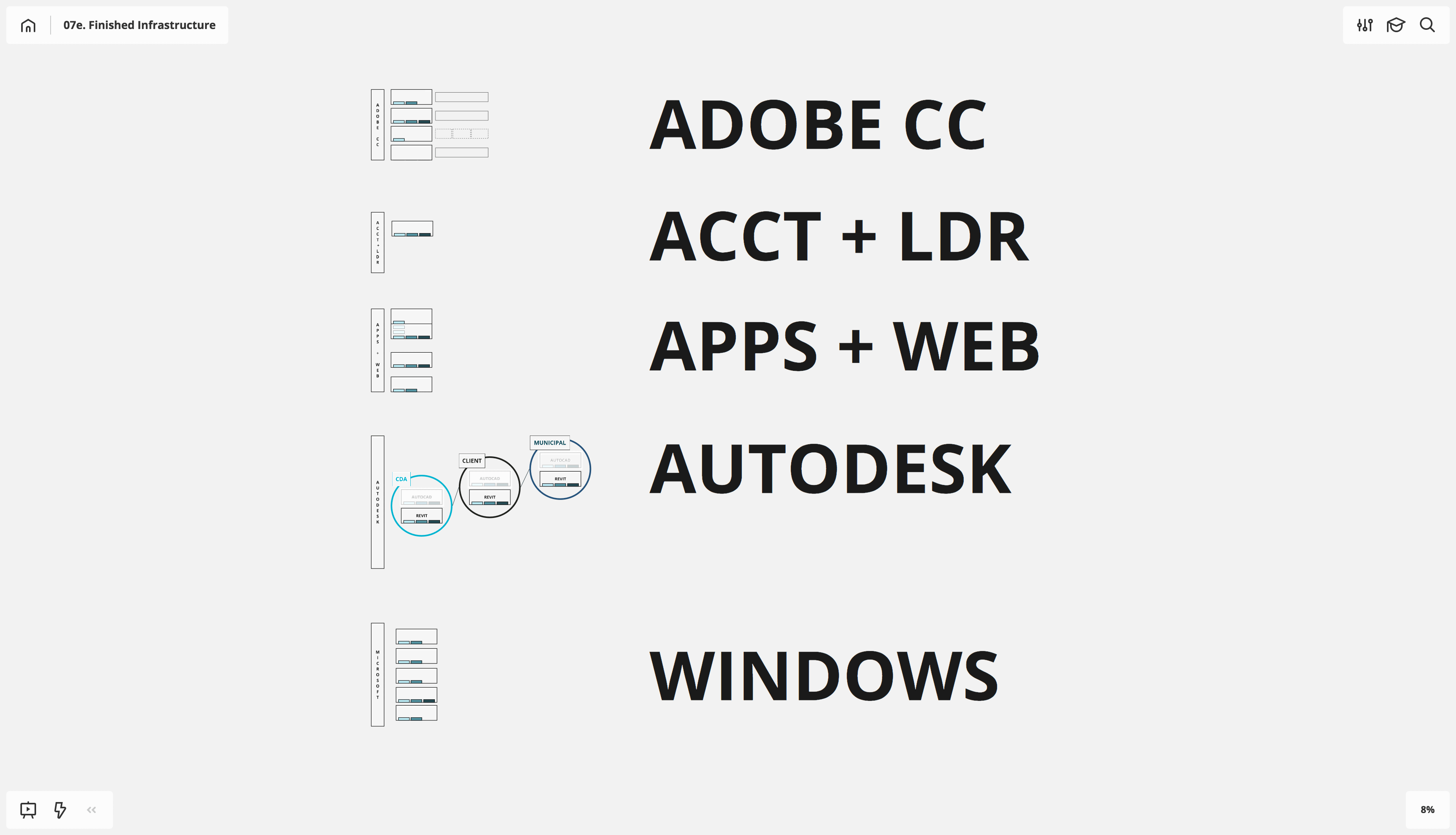
Pictured below is the finished project infrastructure, created from a core template with all non-applicable platforms removed. A Miro project was created with the account name and this board dropped in, ensuring that all team members would be able to quickly reference the core. We were also able to determine who had received training in fundamentals and best practices based on our color-coding association and quickly get everyone on the same page, saving countless unnecessary questions within the project lifecycle.
These visual hierarchy methodologies based around shape are only the beginning. More advanced techniques, such as grouping and layers, object links and color will be covered in future posts. A firm grasp of these techniques and mechanics will significantly enhance the speed with which you can create boards and allow for more expansive and robust visualization.
ABOUT THE speaker
Kyle Chipman
Kyle Chipman is a Chicago-based designer who specializes in providing workflow solutions for national accounts, with particular focus placed on how the principles of graphic design can create organizational standards and illustrate abstract ideas. You can follow Kyle on LinkedIn.
