Data Flow Diagram Template
Model processes and map data flows efficiently with the data flow diagram template. Improve internal processes and lead development teams with more clarity.
Trusted by 65M+ users and leading companies


About the Data Flow Diagram Template
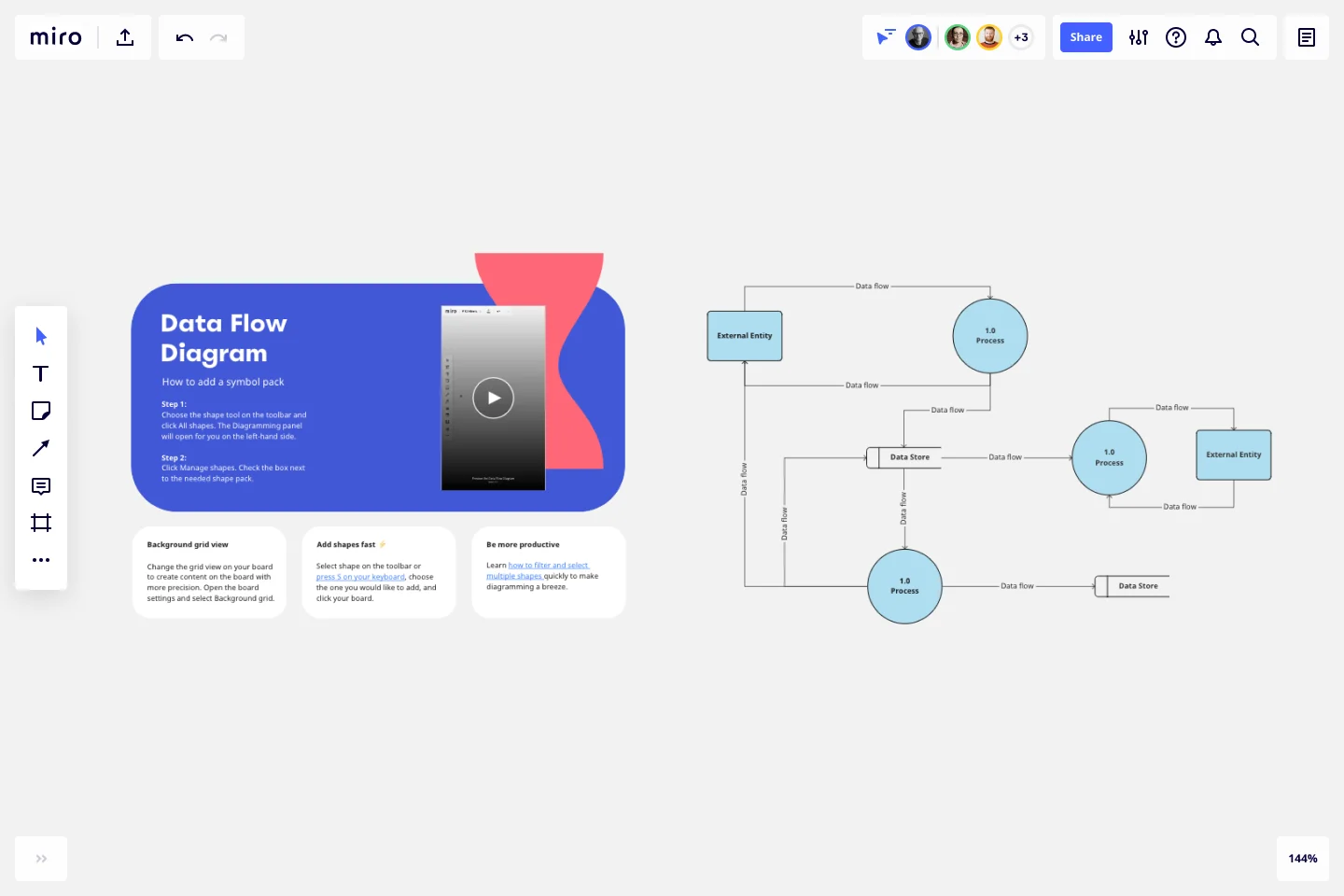
The data flow diagram template is a visual tool you can use to improve your understanding of how data travels within a system — namely by visualizing the inputs, outputs, and the processes involved. Organizations use data flow diagrams (DFD) in many business activities, including depicting notation styles, physical requirements, and system automation.
We’ll walk you through how you can start creating a data flow diagram using Miro’s free and customizable DFD template.
How to use Miro’s data flow diagram template
To get started with Miro’s data flow diagram template, scroll to the top of this page and click on the blue “use template” button. That’ll open the template and allow you to start using Miro’s diagram maker. Once you’ve opened it, think about what type of system you’re trying to visualize — whether it’s a business process, data flow within a software application, or something else. When you’re ready, here are a few more steps to make the most of the data flow diagram template.
1. Identify inputs and outputs
Each process you aim to map out should have at least one input and one output. This helps make sure that your DFD template is complete and has no loose ends. Look for the two blue, rounded rectangles on the left and right of the DFD template marked “external entity,” then edit the text boxes within them to label where the data is entering the system from and where it’ll go. To add more input and output sources, right-click on the rectangle and choose “Duplicate.”
2. Identify processes
On the data flow diagram template, the three circles labeled “Process” are for you to identify the activities or functions that manipulate data in some way. Edit the text boxes to add your system’s processes, and easily delete or duplicate these circles as needed.
3. Identify data stores
There are two symbols on the template labeled “data store.” As its name implies, it refers to where the system stores its data. Double-click on the text boxes to edit them and replace the text with how you want to label your data stores. Duplicate these symbols as needed, and click and drag them if you’d like to adjust their position on the diagram.
4. Label data flows
Last but not least, don’t forget to visualize the flow of data. The template comes with arrows connecting inputs, outputs, processes, and data stores. Edit the text along these arrows to identify the type of data that’s traveling, and click and drag them to adjust the direction of flow appropriately.
Is Miro’s data flow diagram template free?
Yes, Miro’s data flow diagram template is free and fully customizable, so you can make it your own. Just click on the blue “use template” button on this page to get started.
Who is Miro’s data flow diagram template for?
Miro’s data flow diagram template is for any team involved in system development, analysis, optimization, and collaboration — including data analysts, software development teams, growth teams, and product teams.
What’s the difference between a data flow diagram and a flowchart?
A data flow diagram is your guide to understanding the nitty-gritty of how information travels within a system — such as databases, software applications, and business processes. While a flowchart also visualizes flows, it isn’t limited to representing data. Flowcharts are versatile maps that outline processes, decisions, and actions much more broadly. Miro's free data flow diagram template is specially crafted to visualize the intricacies of data flow within complex systems.
Get started with this template right now.
Weekly Schedule Template
Works best for:
Planning, Project Management
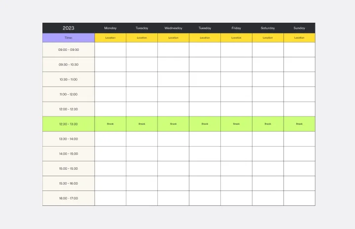
The Weekly Schedule Template is a powerful tool that makes it easy for users to manage their time effectively. Specifically designed for weekly planning, this template provides a visual guide for organizing tasks, events, and activities. Its most notable feature is its ability to prioritize and allocate time systematically throughout the week. This unique flexibility ensures that users have a comprehensive overview of their schedule and can adjust it as needed to meet changing priorities and goals. With this template, people can achieve a well-organized and balanced week, promoting increased productivity and focus.
Causal Loop Diagrams (1.0)
Works best for:
Diagramming
The Causal Loop Diagrams (1.0) template offers a visual tool for modeling complex systems and understanding the feedback loops that drive behavior. It provides a structured framework for identifying causal relationships, reinforcing loops, and balancing feedback within a system. This template enables teams to analyze system dynamics, anticipate unintended consequences, and formulate effective strategies for intervention. By promoting systems thinking and understanding of interdependencies, Causal Loop Diagrams empower organizations to navigate complexity and drive sustainable change.
DevOps Roadmap Template
Works best for:
Documentation, Product Management, Software Development
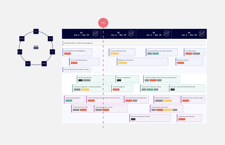
DevOps teams are constantly creating code, iterating, and pushing it live. Against this backdrop of continuous development, it can be hard to stay abreast of your projects. Use this DevOps Roadmap template to get a granular view of the product development process and how it fits into your organization's product strategy. The DevOps Roadmap lays out the development and operations initiatives you have planned in the short term, including milestones and dependencies. This easy-to-use format is easily digestible for audiences such as product, development, and IT ops.
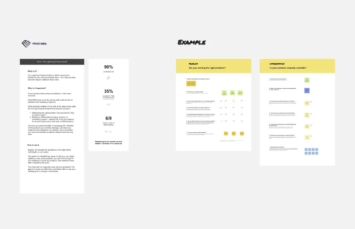
The Lightning Product Audit
Works best for:
Product Management, Planning
The Lightning Product Audit template streamlines product evaluation processes with a comprehensive framework. By assessing key areas such as market fit, user experience, and feature performance, this template enables teams to identify strengths, weaknesses, and areas for improvement swiftly. With sections for conducting SWOT analysis, user feedback review, and competitive benchmarking, it facilitates data-driven decision-making and prioritization. This template serves as a catalyst for refining product strategies and driving continuous improvement.
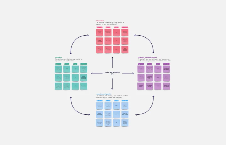
Balanced Scorecard Template
Works best for:
Operations, Strategic Planning, Project Planning
Balanced scorecards are useful tools for understanding business performance at a glance with regard to customers, employees, business processes, and financial progress. Learn more about BSCs and create your own using Miro’s Balanced Scorecard template.
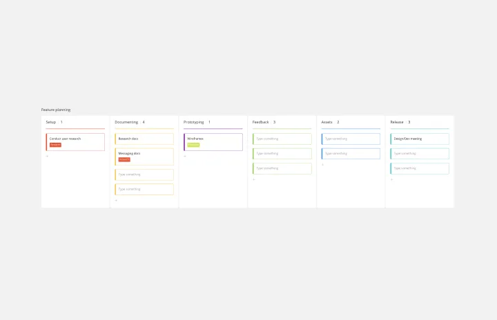
Feature Planning Template
Works best for:
Desk Research, Agile Methodology, Product Management
Features are what make a product or service fun, but adding new ones is no walk in the park. It takes many steps—ideating, designing, refining, building, testing, launching, and promoting—and just as many stakeholders. Feature Planning lets you put a smooth, sturdy process in place, so you can add a feature successfully, and spend less time and resources doing it. That makes our Feature Planning Template a smart starting point for anyone looking to add new product features, especially members of product, engineering, marketing, and sales teams.