Azure Architecture Diagram Template
This diagram will help you visualize the combination of any data and build and deploy custom machine learning models at scale.
Trusted by 65M+ users and leading companies


About the Azure Architecture Diagram template
The Azure Architecture Diagram Template will help you visualize and develop sophisticated, transformational apps using state-of-the-art machine learning algorithms. It will also allow you to create architecture diagrams, combine data, and build and deploy custom machine learning models at scale.
Keep reading to learn more about the Azure Architecture Diagram Template.
What is an Azure Architecture Diagram Template
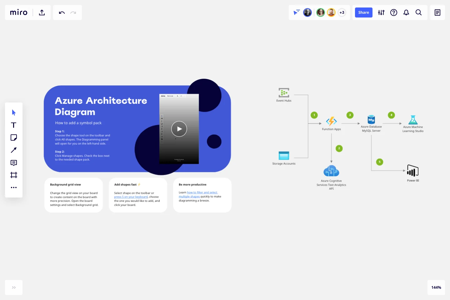
The Azure Architecture Diagram Template, like any other network diagram, visually shows the steps of a given process, in this case, of the cloud architecture framework. The Azure Architecture Diagram has unique icons categorized into Stencils. Each Stencil focuses on a specific task to make it easier for users to access the right set of icons.
Azure helps to build, manage, and deploy applications. You can also use your preferred languages, frameworks, and infrastructure—even your data center and other clouds—to solve challenges large and small. Its framework consists of five pillars:
Cost optimization
Operational excellence
Performance efficiency
Reliability
Security
When to use Azure Architecture Diagram Template
You can use the Azure Architecture Diagram Template to transform your data into actionable insights. Microsoft Azure has a wide range of use cases that it serves. Here you can see the most common examples:
Analytics
DevOps
Networks
Security
Databases
How to create an Azure Architecture Diagram Template
Here you can see some of the best practices when building your own Azure Architecture Diagram template.
Data comes from various sources. Use the Events Hubs icon for high volumes of data ingestion or the Storage Account icon for data uploaded to Blob Storage.
Use Azure Function App icon to signalize calls to the Text Analytics API icon.
Add Azure Database for MySQL icon after Function Apps.
Add Azure Machine Learning Studio icon to show data is being further analyzed for more insights.
Add the Power BI icon to show how MySQL Power BI provides options for data visualization and analysis in Power BI.
If you are interested in creating other network diagrams, Miro is the perfect network diagram tool with several available shape packs and templates to suit your needs.
How do I create an Azure Architecture Diagram Template?
Creating an Azure Architecture Diagram in Miro is easy. You can use our Azure Architecture Diagram Template and customize it as you see fit. Once you have the diagram structure, you can start adding the icons. You can find the icons under our Azure Icon Set integration.
Get started with this template right now.
Pedigree Diagram Template
Works best for:
Diagrams, Education
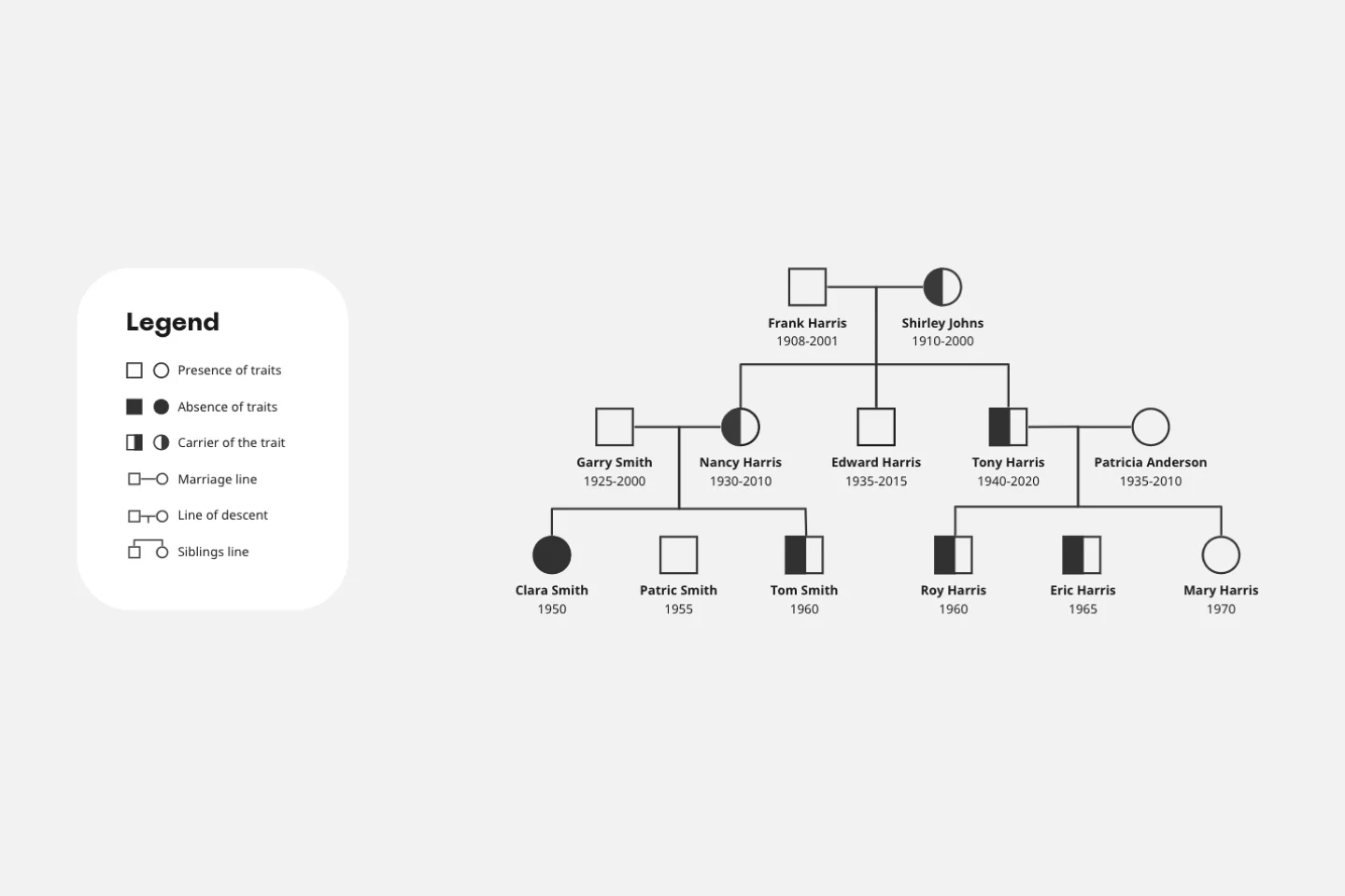
Use our Pedigree Diagram Template to show how traits and diseases are passed from one generation to the next. Whether you’re a doctor, farmer, or just someone interested in genetics, a Pedigree Diagram can help you identify hereditary traits.
Portfolio Template
Works best for:
Presentations, UX Design
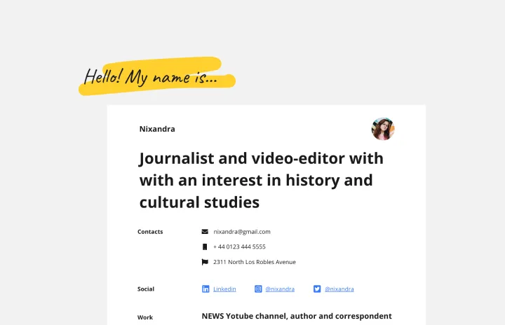
The portfolio template is a way for you to showcase your best work in a visual manner. Think of your work portfolio as a way to present who you are as a professional and describe with more detail what you have achieved and what is your unique expertise. You will use a portfolio template as a way to market yourself to future employers when applying for jobs, universities, and training programs.
Agenda Template
Works best for:
Project Management, Meetings, Workshops
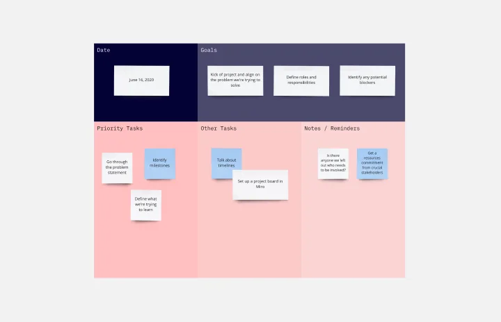
Even when you’ve hosted meetings for years, hosting them online is different. Keeping them structured, purposeful, and on-task is key. That all starts with having a detailed agenda, and this template makes it so easy for you to create one.
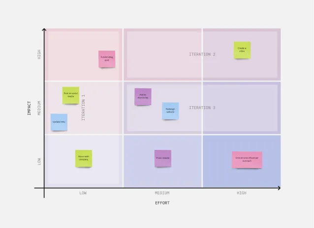
3x3 Prioritization Method Template
Works best for:
Operations, Prioritization, Strategic Planning
It’s all about assessing a task or idea, and quickly deciding the effort it will take and the potential impact it will have—ranked low, medium, or high. That’s what the 3x3 prioritization method does: Help teams prioritize and identify quick wins, big projects, filler tasks, or time-wasters. With nine bucket areas, it offers slightly greater detail than the 2x2 Prioritization Matrix (or Lean Prioritization Method). It’s easy to make your own 3x3 prioritization matrix—then use it to determine what activities or ideas to focus on with your valuable resources.
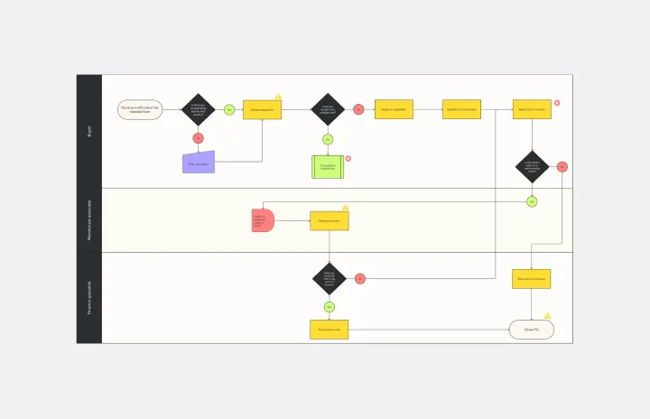
Current State vs. Future State Flowchart Template
Works best for:
Diagramming
The Current State vs Future State Flowchart Template is an essential tool for strategic planning, providing teams with a dynamic and visual roadmap for organizational transformation. One of its key benefits is streamlining collaboration by using swimlanes to allocate tasks to specific departments. This feature promotes accountability and transparent communication, ensuring everyone is aligned on their responsibilities. As a result, teams can navigate complex processes with ease, fostering a shared understanding of the current and future states, ultimately leading to efficient and collaborative decision-making.
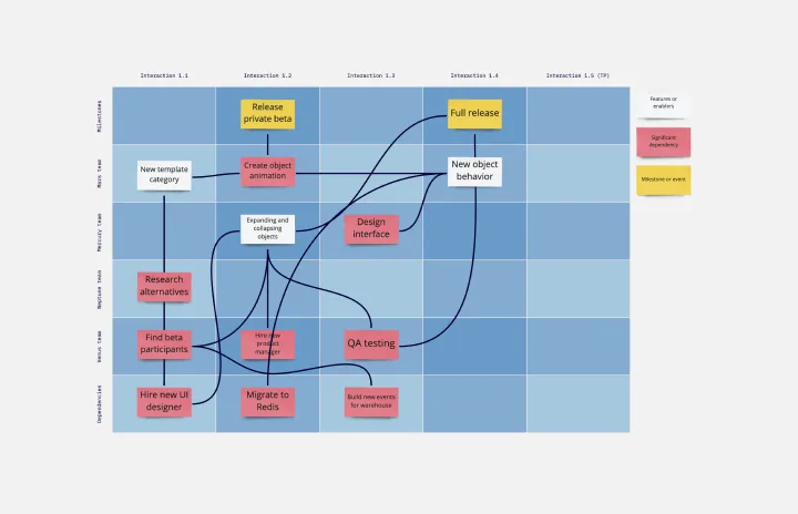
SAFe Program Template
Works best for:
Agile Methodology, Diagrams, Agile Workflows
Many organizations use the Agile model, but even companies that don’t rigorously adhere to all Agile standards have adopted Agile tools and methods like Program Increment (PI) Planning. Even if you’re not participating in a formal PI session, a program board can be a great way to establish communication across teams and stakeholders, align development objectives with business goals, clarify dependencies, and foster cross-functional collaboration. The board provides much-needed structure to planning sessions, yet is adaptable enough to accommodate brainstorming and alignment meetings.