Burndown Chart Template
Help your Agile team make their productivity and progress visible
Trusted by 65M+ users and leading companies


About the Burndown Chart Template
Burndown charts are visual graphs that show teams how much work is left to complete and how much time is available to finish the job.
A typical layout will have two lines representing the volume of work and the number of workdays. Team members leading and executing the day-to-day workload can use a burndown chart to make realistic project estimates.
The visual format helps project managers figure out the difference between the “ideal” progress of work and how the “actual” work is tracking. Teams can use a burndown chart to work toward specific goals and finish a project on time and within budget.
When to use a burndown chart
A burndown chart is a useful project management tool and can be a quicker alternative to a Kanban board or a Gantt Chart. With a burndown, the team can focus on the time left to finish tasks instead of each task’s specific breakdowns.
As a visual reference, burndown charts encourage team transparency and awareness of how much work is getting done on a day-to-day basis.
Burndown charts can also help individual team members realize their pace of work. By checking on it at least once a day, everyone can figure out how to adjust or maintain their output level according to project needs.
How to use the burndown chart template
Making your own burndown chart is easy with Miro's template. Simply follow these steps to get started:
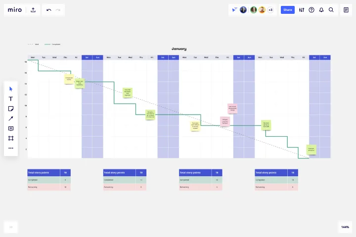
1. Set a target
Set a target for the ideal number of story points you need to finish. Once “total story points” is set, that number should stay untouched for the duration of your team’s sprint.
By default, this template assumes your sprint will last 2.5 weeks. You can edit the X-axis to accommodate week-long, fortnightly, or month-long sprints as well. Your team should keep an eye on the “completed” and “remaining” numbers as these will be updated daily.
2. Set the completion rate
Edit the “ideal” completion rate line to set your target. The grey dotted line represents what the best-case productivity rate would look like. Consider this your visual baseline for whether or not your project is on track.
3. Add to the "completed" storyline
As your team completes story points on a daily basis, update the relevant sticky notes. Grow the solid line that represents your team’s actual completion rate by adding daily extensions. Keep in mind non-working days like weekends or public holidays where progress slows down or isn't expected.
4. Check-in regularly
Keep an open line of communication with your team to set expectations, predict risks, and keep your project on track. Priorities will evolve, and stakeholders may come back to your team with new requests. If your team keeps a record of their progress, they can push back on unreasonable requests together.
A burndown chart tracks your team’s daily progress honestly. Burndowns should also account for when new items are added after the sprint kicks off.
5. Plan future sprints based on previous ones
Use the chart as a reference to plan for future sprints. The chart can help you visualize the impact of new stakeholder requests over time and how much your team can do in an allocated sprint period. Notice a large productivity spurt at the end of your sprint? Break tasks into smaller, manageable tasks for your next sprint.
Get started with this template right now.
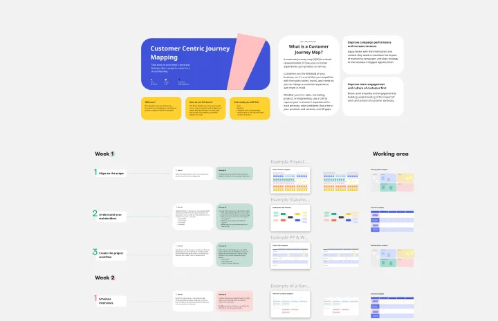
Customer Journey Mapping Template Pack
Works best for:
Mapping, User Experience, Workshops
A customer journey map (CJM) is a visual representation of your customer’s experience. It allows you to capture the path that a customer follows when they buy a product, sign up for a service, or otherwise interact with your site. Most maps include a specific persona, outlines their customer experience from beginning to end, and captures the potential emotional highs and lows of interacting with the product or service. Use this template to easily create customer journey maps for projects of all kinds.
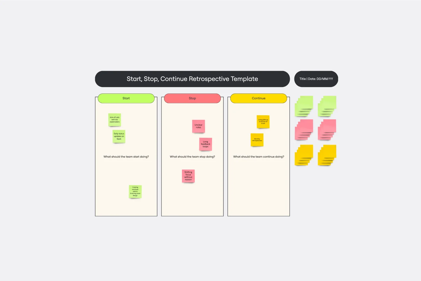
Start, Stop, Continue Template
Works best for:
Retrospectives, Meetings, Workshops
Giving and receiving feedback can be challenging and intimidating. It’s hard to look back over a quarter or even a week and parse a set of decisions into “positive” and “negative.” The Start Stop Continue framework was created to make it easier to reflect on your team’s recent experiences. The Start Stop Continue template encourages teams to look at specific actions they should start doing, stop doing, and continue doing. Together, collaborators agree on the most important steps to be more productive and successful.
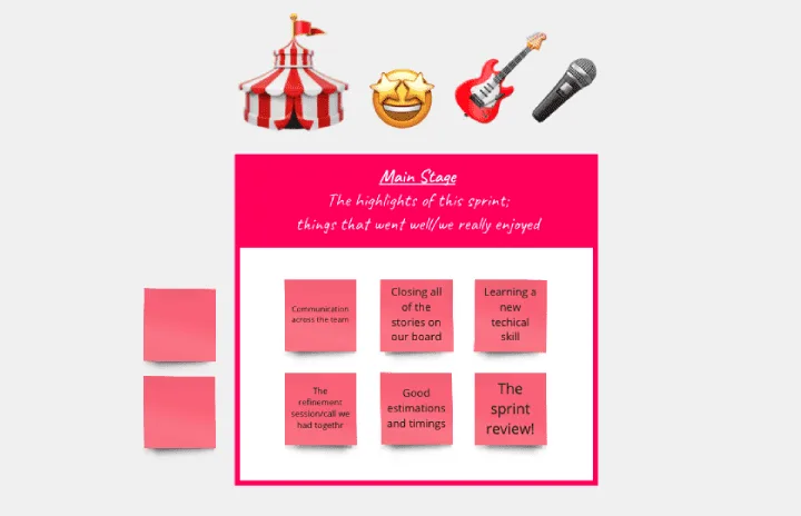
Festival Retrospective
Works best for:
Retrospectives, Meetings, Agile Methodology
The Festival Retrospective template offers a unique and engaging approach to retrospectives by framing the session as a festive event. It provides elements for reflecting on past experiences, celebrating achievements, and setting goals for the future. This template enables teams to foster a positive and celebratory atmosphere, encouraging open communication and collaboration. By promoting a festive spirit, the Festival Retrospective empowers teams to strengthen bonds, boost morale, and drive continuous improvement effectively.
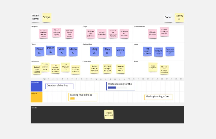
Project Charter Template
Works best for:
Project Management, Documentation, Strategic Planning
Project managers rely on project charters as a source of truth for the details of a project. Project charters explain the core objectives, scope, team members and more involved in a project. For an organized project management, charters can be useful to align everyone around a shared understanding of the objectives, strategies and deliverables for a project of any scope. This template ensures that you document all aspects of a project so all stakeholders are informed and on the same page. Always know where your project is going, its purpose, and its scope.
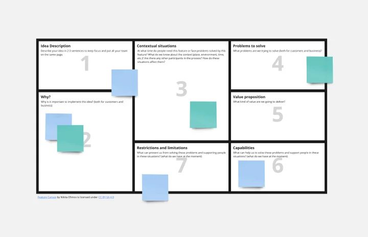
Feature Canvas Template
Works best for:
Design, Desk Research, Product Management
When you’re working on a new feature that solves a problem for your users, it’s easy to dive right in and start looking for solutions. However, it’s important to understand the initial user problem first. Use the Feature Canvas template to do a deep-dive into the user’s problems, the context in which they will use your feature, and the value proposition you will deliver to your users. The template enables you to spend more time exploring the problem to anticipate any potential blind spots before jumping into solutions mode.
Features Audit Template
Works best for:
Desk Research, Product Management, User Experience
Add new features or improve existing features—those are the two paths toward improving a product. But which should you take? A features audit will help you decide. This easy, powerful product management tool will give you a way to examine all of your features, then gather research and have detailed discussions about the ones that simply aren’t working. Then you can decide if you should increase those features’ visibility or the frequency with which it’s used—or if you should remove it altogether.