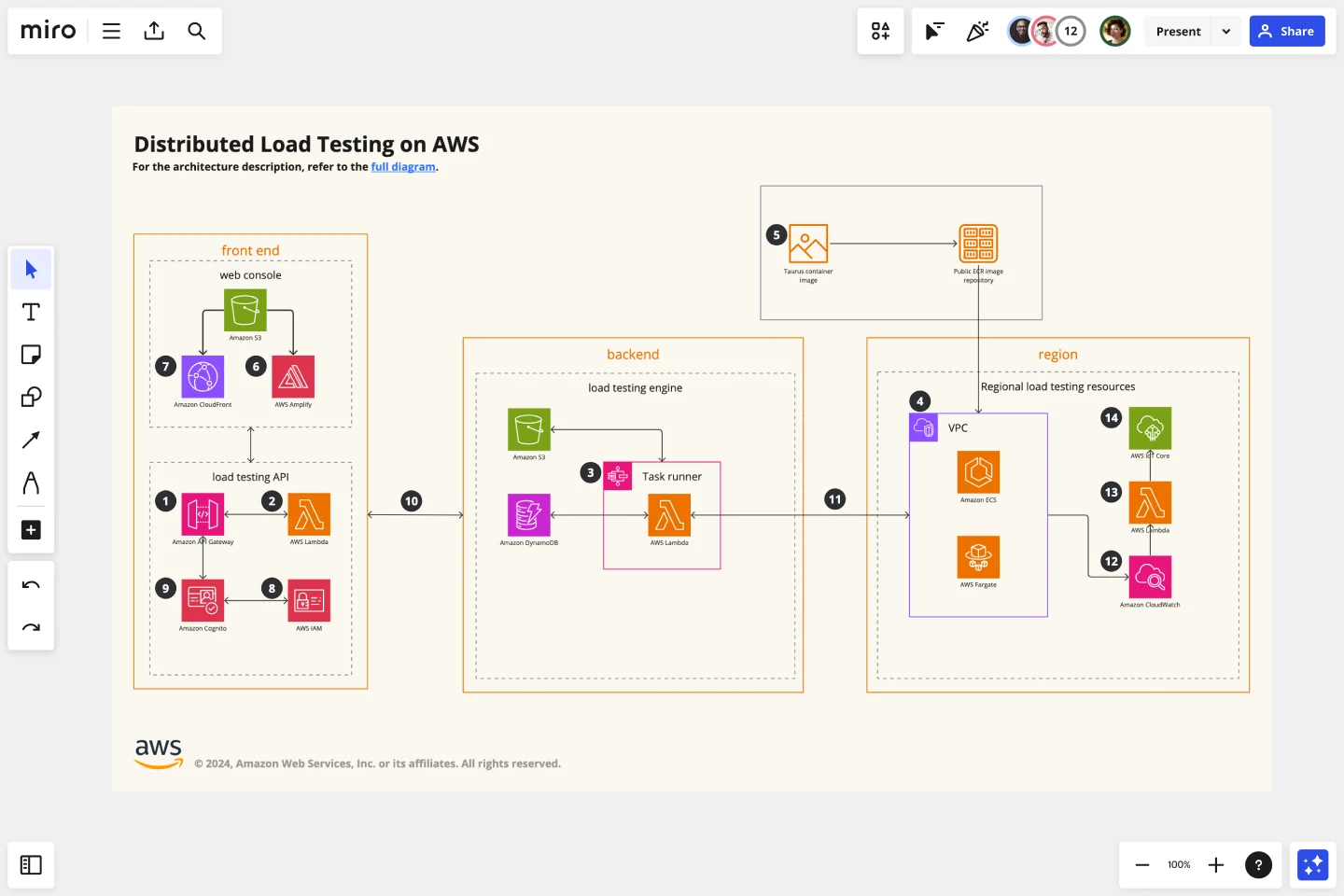
AWS Architecture Diagram Template
The AWS Architecture Diagram is a visual representation of the AWS framework, and it also translates the best practices when using Amazon Web Services architecture.
Trusted by 65M+ users and leading companies


About the AWS Architecture Diagram
The AWS Architecture Diagram is a visual representation of the Amazon Web Services architecture. AWS is a cloud web service designed for you to store data at a minimum cost. Government agencies, companies, and organizations often need to store their data securely without overloading the platforms, and with the AWS Architecture, they can ensure their cloud solutions are working smoothly.
Keep reading to learn more about the AWS Architecture Diagram Template.
What is an AWS Architecture Diagram Template
The AWS Architecture Diagram Template, like any other network diagram, visually shows the necessary steps of the architecture within AWS. The AWS Architecture Diagram has unique icons, symbols, and arrows that you can use for planning, designing, or auditing an architecture before or after deployment.
What are the AWS Diagram system elements?
The AWS architecture system key elements include:
Shapes: includes service, resource, or general resource icons from AWS.
Connectors: includes arrows that describe a flow of information or connect different parts of the diagram. They have a predetermined color.
Layout and grouping: the groups show the connection between multiple services or resources.
Styling and semantics: the colors mean the types of AWS functions and they are predetermined. When selecting an icon from the library, the right color will automatically be used.
When to use AWS Architecture Diagram Template
You can use the AWS Architecture Diagram Template to communicate and collaborate with your team. With the AWS Architecture diagram, you will be able to:
Identify single points of error
Design for fault-tolerance
Design for cost optimization
Build security into your design
Troubleshoot faster
Conduct security reviews
Prove and maintain compliance
Onboard new employees
IT professionals often use the AWS Architecture Diagram to easily see and evaluate the cloud infrastructure that supports the business or organization. There are specific logos and icons from Amazon Web Services that also are easy to identify and search, so you and your team can easily manage the system architecture. The main categories of the AWS icons are: compute icons, stage icons, database icons, and networking and content delivery icons.
How to use this template
To create your AWS Architecture Diagram in Miro, follow the steps:
Lay out the structure: select the groups to use.
Open AWS Icon Set to add Architecture service and resource icons.
Add other steps: Does your diagram include external users or devices? Use resources to add depth or context to your diagram.
Connect the steps with arrows: use the arrows to connect the steps and describe the workflow.
If you are interested in creating other network diagrams, Miro is the perfect network diagram tool with several available shape packs and templates to suit your needs.
How do I make an AWS architecture diagram?
Making an AWS architecture diagram in Miro is easy. You can use our AWS Architecture Diagram Template to and customize it as you see fit. Here’s how you can easily customize it: 1. Click on the “Diagramming” icon in the creation toolbar. 2. Click on the “More shapes” button. 3. Check the “AWS” to add it to your library. 4. Drag and drop additional resources, services, and containers as you see fit. 5. Use the Connection Line to connect related entities.
How is AWS architected?
The AWS Architecture Diagram framework has five pillars that describe the key concepts, design principles, and best practices for designing and running workloads in the Amazon cloud. See below these 5 AWS framework principles: Operational Excellence: runs and monitors systems to deliver business value Security: protects information and systems, keeps confidentiality and integrity of data Reliability: ensures the workload performs and recovers from failures quickly Performance Efficiency: uses IT and computing resources efficiently Cost optimization: avoids unnecessary costs, controls the money
Get started with this template right now.
HEART Framework Template
Works best for:
Desk Research, Project Management, User Experience
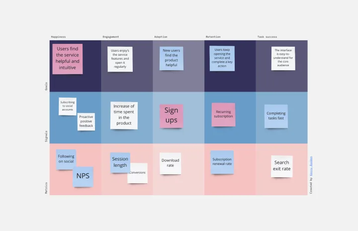
Happiness, Engagement, Adoption, Retention, and Task Success. Those are the pillars of user experience — which is why they serve as the key metrics in the HEART framework. Developed by the research team at Google, this framework gives larger companies an accurate way to measure user experience at scale, which you can then reference throughout the product development lifecycle. While the HEART framework uses five metrics, you might not need all five for every project — choose the ones that will be most useful for your company and project.
Business Organizational Chart Template
Works best for:
Leadership, Org Charts, Operations
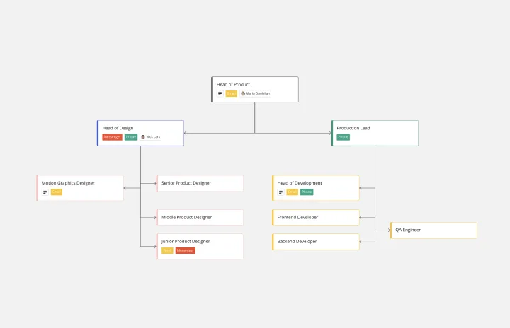
Establishing hierarchy in a business can empower employees—to know their roles and responsibilities, team members, potential cross-functional collaborators, and who to turn to with a specific need. That’s just what a Business Organizational Chart does. And this template makes it simple to build a BOC for your company. The first step is to determine the high-level organizational structure of your company. Then it's easy to create a visual representation of how different employees are interconnected.
Driver Diagram Template
Works best for:
Diagramming
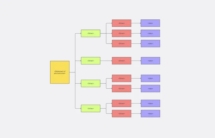
The driver diagram template is a strategic visual tool that helps teams map out their primary objectives and break them down into actionable components. It presents goals, drivers, and specific change ideas in a coherent and interconnected format, ensuring clarity of objective. By doing so, every team member is aligned towards a common endpoint, fostering unified efforts. The visual nature of the template simplifies complex objectives, making it easier for teams to stay on track and measure their progress effectively.
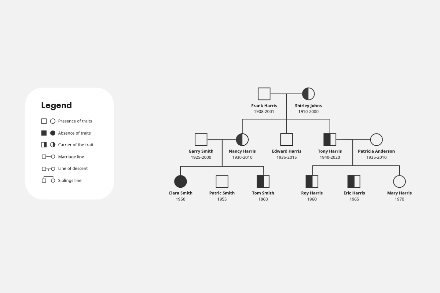
Pedigree Diagram Template
Works best for:
Diagrams, Education
Use our Pedigree Diagram Template to show how traits and diseases are passed from one generation to the next. Whether you’re a doctor, farmer, or just someone interested in genetics, a Pedigree Diagram can help you identify hereditary traits.
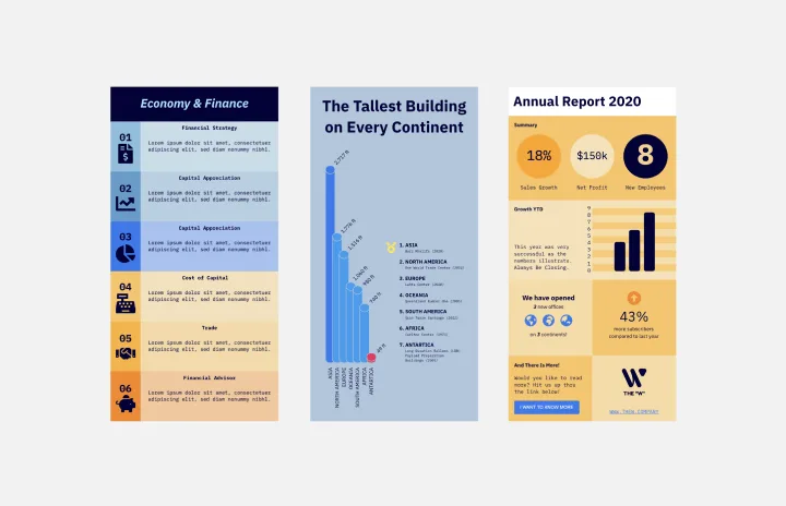
Infographic Template
Works best for:
Marketing, Desk Research, Documentation
As we bet you’ve experienced, data can get pretty dense and dry. But you need it to be compelling, memorable, and understandable. The solution? Infographics. These are tools that let you present information in a visually striking way and turn quantitative or qualitative data into stories that engage and resonate. Whoever you’ll be presenting to — customers, donors, or your own internal teams — our template will let you design an infographic that combines text and visuals to break down even the most complicated data.
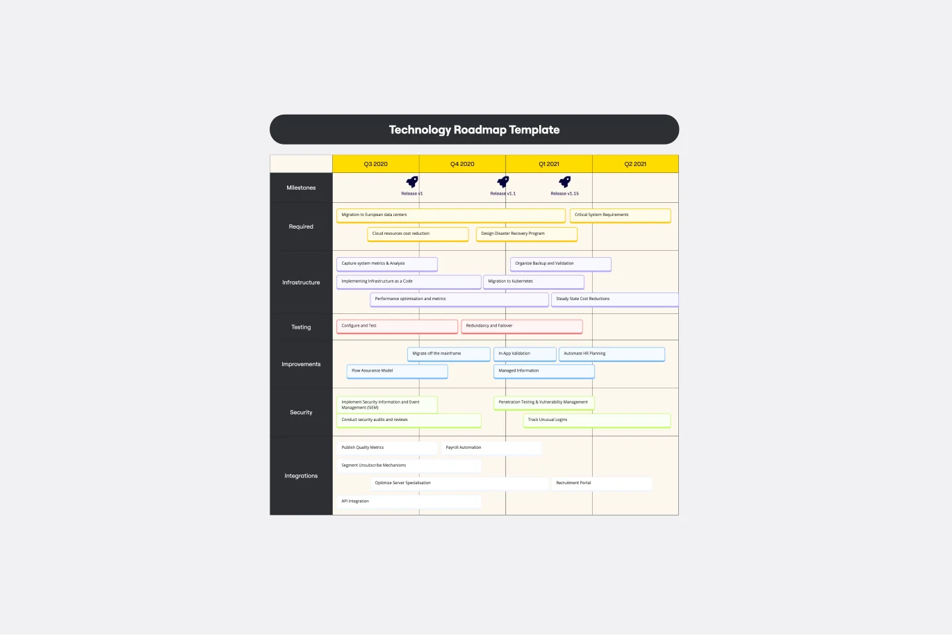
Technology Roadmap Template
Works best for:
Agile Methodology, Roadmaps, Agile Workflows
A technology roadmap helps teams document the rationale of when, why, how, and what tech-related solutions can help the company move forward. Also known as IT roadmaps, technology roadmaps show teams what technology is available to them, focusing on to-be-scheduled improvements. They allow you to identify gaps or overlap between phased-out tech tools, as well as software or programs soon to be installed. From a practical point of view, the roadmap should also outline what kinds of tools are best to spend money on, and the most effective way to introduce new systems and processes.