AWS Architecture Diagram Template
The AWS Architecture Diagram is a visual representation of the AWS framework, and it also translates the best practices when using Amazon Web Services architecture.
Trusted by 65M+ users and leading companies


About the AWS Architecture Diagram
The AWS Architecture Diagram is a visual representation of the Amazon Web Services architecture. AWS is a cloud web service designed for you to store data at a minimum cost. Government agencies, companies, and organizations often need to store their data securely without overloading the platforms, and with the AWS Architecture, they can ensure their cloud solutions are working smoothly.
Keep reading to learn more about the AWS Architecture Diagram Template.
What is an AWS Architecture Diagram Template
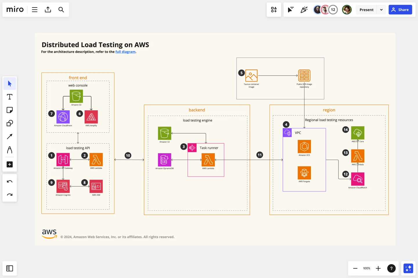
The AWS Architecture Diagram Template, like any other network diagram, visually shows the necessary steps of the architecture within AWS. The AWS Architecture Diagram has unique icons, symbols, and arrows that you can use for planning, designing, or auditing an architecture before or after deployment.
What are the AWS Diagram system elements?
The AWS architecture system key elements include:
Shapes: includes service, resource, or general resource icons from AWS.
Connectors: includes arrows that describe a flow of information or connect different parts of the diagram. They have a predetermined color.
Layout and grouping: the groups show the connection between multiple services or resources.
Styling and semantics: the colors mean the types of AWS functions and they are predetermined. When selecting an icon from the library, the right color will automatically be used.
When to use AWS Architecture Diagram Template
You can use the AWS Architecture Diagram Template to communicate and collaborate with your team. With the AWS Architecture diagram, you will be able to:
Identify single points of error
Design for fault-tolerance
Design for cost optimization
Build security into your design
Troubleshoot faster
Conduct security reviews
Prove and maintain compliance
Onboard new employees
IT professionals often use the AWS Architecture Diagram to easily see and evaluate the cloud infrastructure that supports the business or organization. There are specific logos and icons from Amazon Web Services that also are easy to identify and search, so you and your team can easily manage the system architecture. The main categories of the AWS icons are: compute icons, stage icons, database icons, and networking and content delivery icons.
How to use this template
To create your AWS Architecture Diagram in Miro, follow the steps:
Lay out the structure: select the groups to use.
Open AWS Icon Set to add Architecture service and resource icons.
Add other steps: Does your diagram include external users or devices? Use resources to add depth or context to your diagram.
Connect the steps with arrows: use the arrows to connect the steps and describe the workflow.
If you are interested in creating other network diagrams, Miro is the perfect network diagram tool with several available shape packs and templates to suit your needs.
How do I make an AWS architecture diagram?
Making an AWS architecture diagram in Miro is easy. You can use our AWS Architecture Diagram Template to and customize it as you see fit. Here’s how you can easily customize it: 1. Click on the “Diagramming” icon in the creation toolbar. 2. Click on the “More shapes” button. 3. Check the “AWS” to add it to your library. 4. Drag and drop additional resources, services, and containers as you see fit. 5. Use the Connection Line to connect related entities.
How is AWS architected?
The AWS Architecture Diagram framework has five pillars that describe the key concepts, design principles, and best practices for designing and running workloads in the Amazon cloud. See below these 5 AWS framework principles: Operational Excellence: runs and monitors systems to deliver business value Security: protects information and systems, keeps confidentiality and integrity of data Reliability: ensures the workload performs and recovers from failures quickly Performance Efficiency: uses IT and computing resources efficiently Cost optimization: avoids unnecessary costs, controls the money
Get started with this template right now.
Onion Diagram Template
Works best for:
Diagramming, Mapping and Diagramming
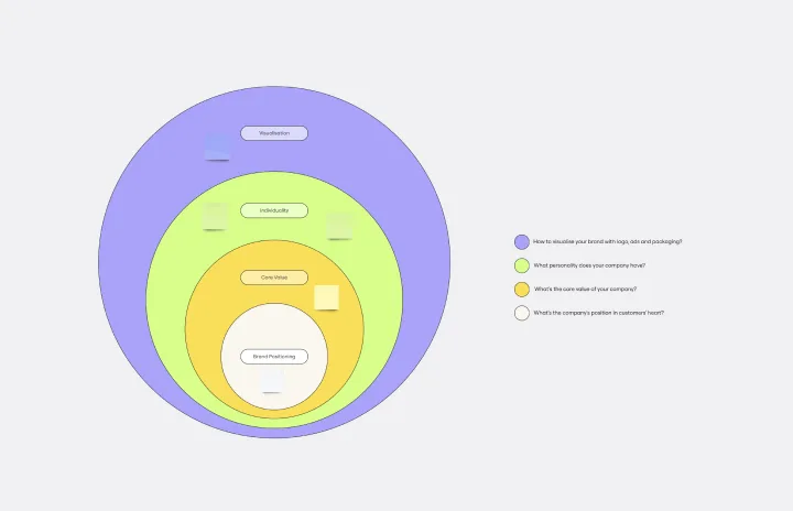
The Onion Diagram Template is a distinct tool designed to visually represent layers of a specific concept, system, or process, akin to the layers of an onion. Each concentric layer of the diagram provides insights into a different aspect or phase of the topic at hand, moving from the core foundational element outwards to more peripheral components. One of the prime benefits of this template is its ability to offer hierarchical clarity. Users can immediately discern the importance, sequence, or interrelation of different elements within a system, facilitating enhanced comprehension and efficient decision-making.
Lotus Diagram Template
Works best for:
UX Design, Ideation, Diagrams
Even creative thinkers occasionally need help getting their creative juices flowing. That's where a lotus diagram comes in. It'll empower you to run smoother, more effective brainstorming sessions. This creative-thinking technique explores ideas by putting the main idea at the diagram center and ancillary concepts in the surrounding boxes. This template gives you an easy way to create Lotus Diagrams for brainstorms, as well as an infinite canvas for the endless ideas generated.
Website Flowchart Template
Works best for:
Flowcharts, Mapping, User Experience
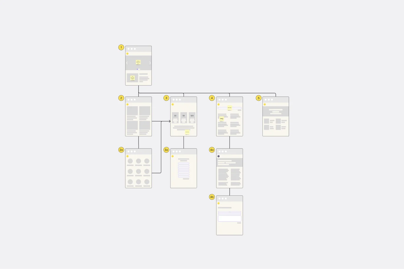
A website flowchart, also known as a sitemap, maps out the structure and complexity of any current or future website. The flowchart can also help your team identify knowledge gaps for future content. When you’re building a website, you want to ensure that each piece of content gives users accurate research results based on keywords associated with your web content. Product, UX, and content teams can use flowcharts or sitemaps to understand everything contained in a website, and plan to add or restructure content to improve a website’s user experience.
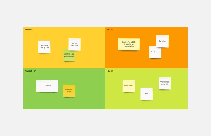
4P Marketing Mix Template
Works best for:
Marketing, Brainstorming, Workshops
Product, Place, Promotions, and Price. Starting with this template (and those 4Ps) you can choose the best way to take your product or service to market. The secret is to create just the right mix—deciding how much each P needs in terms of investment, attention, and resources. That will help you build your strengths, adapt to the market, and collaborate with partners. And our tool is the perfect canvas to create your marketing mix and share with teams and across your organization.
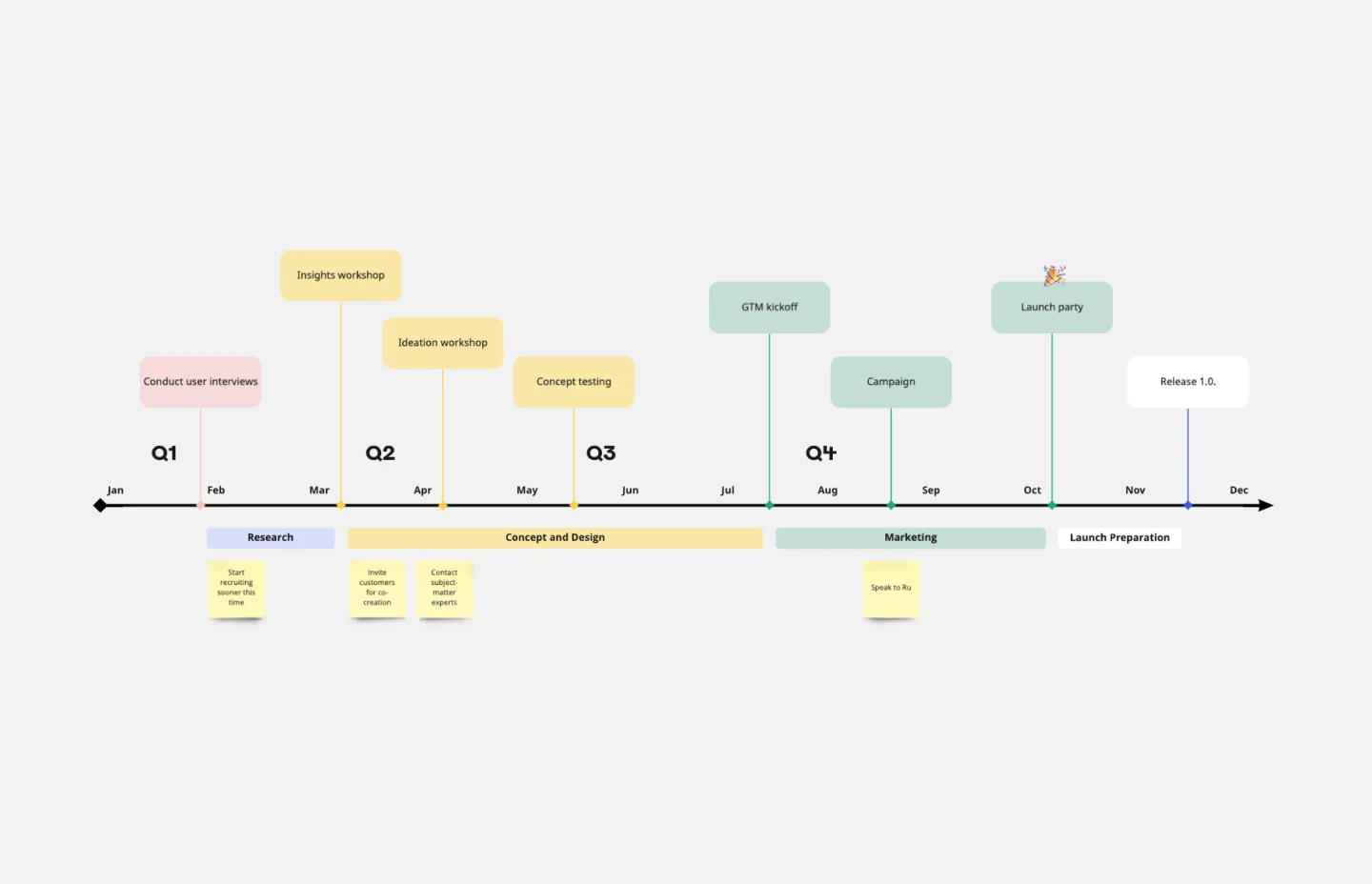
Timeline Template
Works best for:
Project Management, Flowcharts, Project Planning
A timeline displays a chronological order of important dates, and scheduled events. Timelines help product managers, project managers, and team members tell visual stories about progress and obstacles. Timelines enable teams to see at a glance what happened before, what progress is happening now, and what needs tackling in the future. Projects or products with specific purpose or deliverables should be based on a timeline to be successful. Use the timeline as a shared reference for start dates, end dates, and milestones.
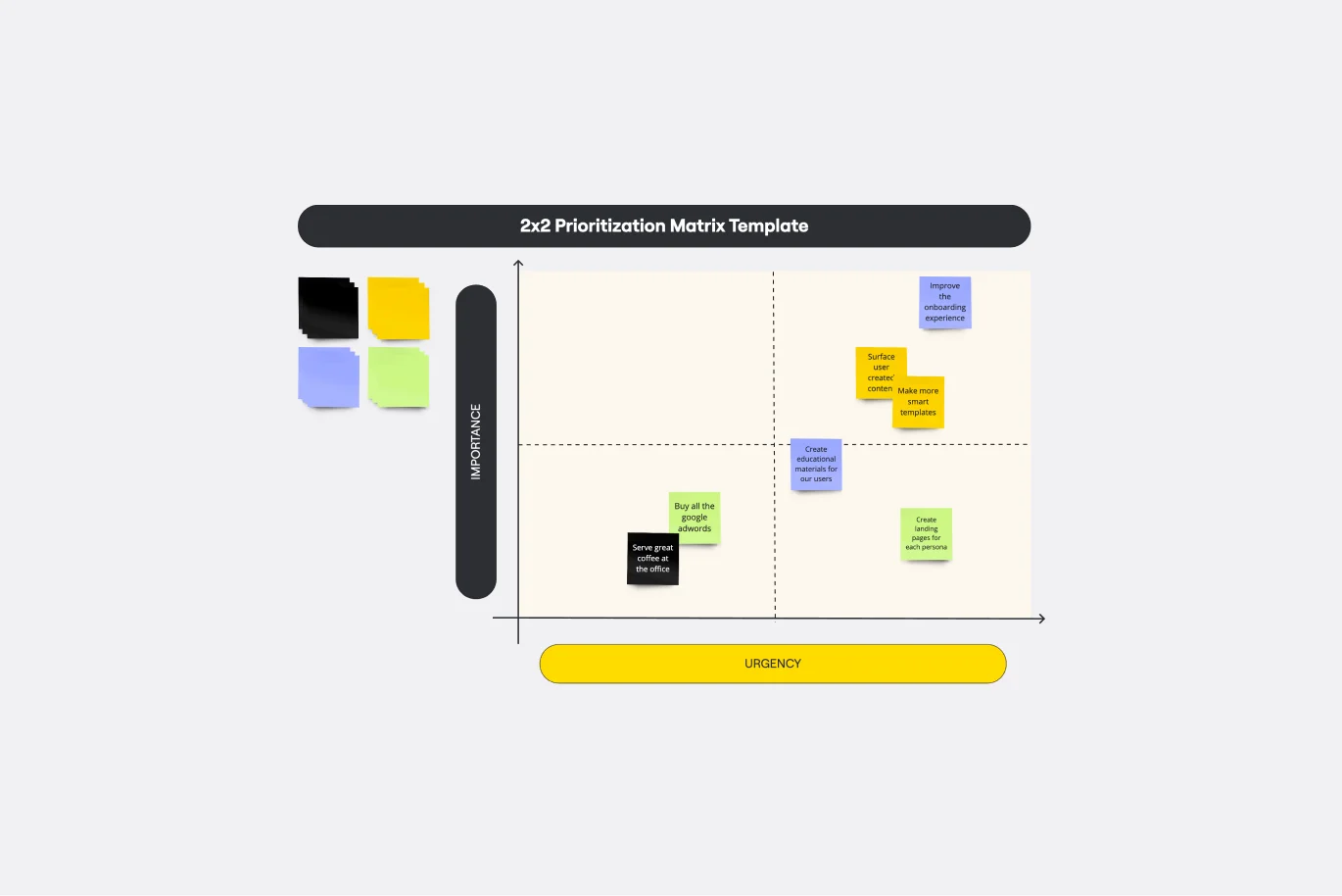
2x2 Prioritization Matrix Template
Works best for:
Operations, Strategic Planning, Prioritization
Ready to set boundaries, prioritize your to-dos, and determine just what features, fixes, and upgrades to tackle next? The 2x2 prioritization matrix is a great place to start. Based on the lean prioritization approach, this template empowers teams with a quick, efficient way to know what's realistic to accomplish and what’s crucial to separate for success (versus what’s simply nice to have). And guess what—making your own 2x2 prioritization matrix is easy.