Wireframe vs. storyboard

Understanding wireframes and storyboards
When diving into digital product and user experience design, you'll often hear about wireframes and storyboards. It's easy to mix them up or not fully grasp what each one does, and that confusion is pretty common among both pros and enthusiasts. Here's the deal: wireframes and storyboards both have their special spots in the design world, but they're not doing the same job. Think of wireframes as the blueprint of your site or app - they lay out the structure and define what goes where functionally. On the other hand, storyboards are more about bringing to life the story of how users will interact with your design, highlighting those crucial moments. To really understand how wireframes and storyboards differ and where they might overlap, it helps to start with a clear picture of what each one is all about and why it matters.
What are wireframes?
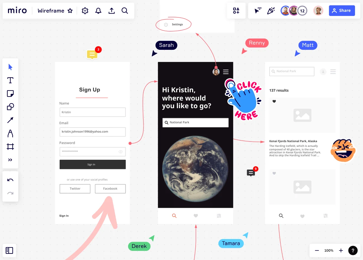
Wireframes are basically the backbone of any digital product design. Think of them as a visual blueprint that shows you how the user interface is going to be laid out. They map out where all the key parts go, but they don't get into the nitty-gritty details of how everything will look in the end. It's like sketching out your ideas before you dive into making everything look pretty. For more inspiration, take a look at some wireframe examples to see how different layouts and components come together in real-world designs.
What are storyboards?
Storyboards are like comic strips for designing digital products or services. They show step-by-step how someone interacts with what you're creating, bringing their experience to life. But they're not just about showing pictures of screens. They dive deeper, showcasing the context, how things change from one step to the next, and how people feel about it. Imagine you're sprinkling in some visuals, scribbling notes, and captions here and there to make things super clear. You're pointing out what the user is trying to achieve, what's bugging them, and all the tiny, important moments of interaction. It's like taking a helicopter view of the whole journey, which lets you poke around, tweak things, and even try out different routes to make sure the end product feels just right. Through storyboards, you can play around with how the story flows, get some feedback, and make sure everything wraps up nicely, aligning perfectly with what you want the user's adventure to look like.
Wireframe vs. storyboard
Reasons for confusion
While wireframes and storyboards have clear differences, various factors contribute to the confusion and misuse of these terms:
Visual similarity: Both wireframes and storyboards use visual representations to communicate design concepts. They can both feature boxes, placeholders, and simplified illustrations. This visual similarity can lead to confusion, especially for those unfamiliar with the differences of each.
Overlapping terminology: Terms used in the design field, such as "frames" or "screens," can be applied to both wireframes and storyboards, contributing to confusion. This interchangeability of terminology can blur the distinctions between the two, leading to misunderstandings.
Lack of awareness: Many professionals, stakeholders, or people outside the design field may not be fully aware of the specific purposes and characteristics of wireframes and storyboards. Without a clear understanding of their unique roles, it becomes easier to mistake one for the other.
Evolving design practices: The way design practices keep changing, along with how different design disciplines are coming together more and more, kinda mixes things up between wireframes and storyboards. Designers are starting to use a bit of both in their work, which can make it a bit tricky to tell them apart.
When to use a wireframe vs. storyboard
Alright, let's break it down in a simpler way. Wireframes and storyboards are two powerful tools in the design toolbox, but they do totally different jobs. A wireframe tool is like your guide to mapping out the user experience and making sure everything functions just right. It’s your go-to for planning out the nitty-gritty details of how users interact with your site or app. On the other hand, a storyboard creator is your storytelling buddy. It lets you sketch out user journeys in a more visual, narrative form, kind of like creating a mini-movie or comic strip of the user's experience. It focuses on bringing the visual storytelling aspect to life.
Bringing it all together with Miro
Wireframes and storyboards are super important when you're developing a product. Guess what? Miro is your go-to for quickly sketching out wireframes to get a clear picture of your product's layout. Then, you can switch to storyboards to really bring the journey of your user to life. What's cool about Miro is that it's super flexible and plays well with other design tools, making it a fantastic choice for product teams dreaming big. Whether you're just throwing ideas around or polishing up the final design, Miro's got all the tools and features you need to make it happen.