KWL Chart Template
Focus on important ideas and expand your learning with the KWL Chart template.
Trusted by 65M+ users and leading companies


About the KWL Chart template
A KWL chart allows you to guide your audience through learning a concept by breaking down the learning process into three steps: what you already know, what you want to know, and what you learned.
What is a KWL Chart?
A KWL chart is a learning tool that helps guide people through an educational session or reading. It was created in 1986 by Donna Ogle as a chart for students to improve their learning progress.
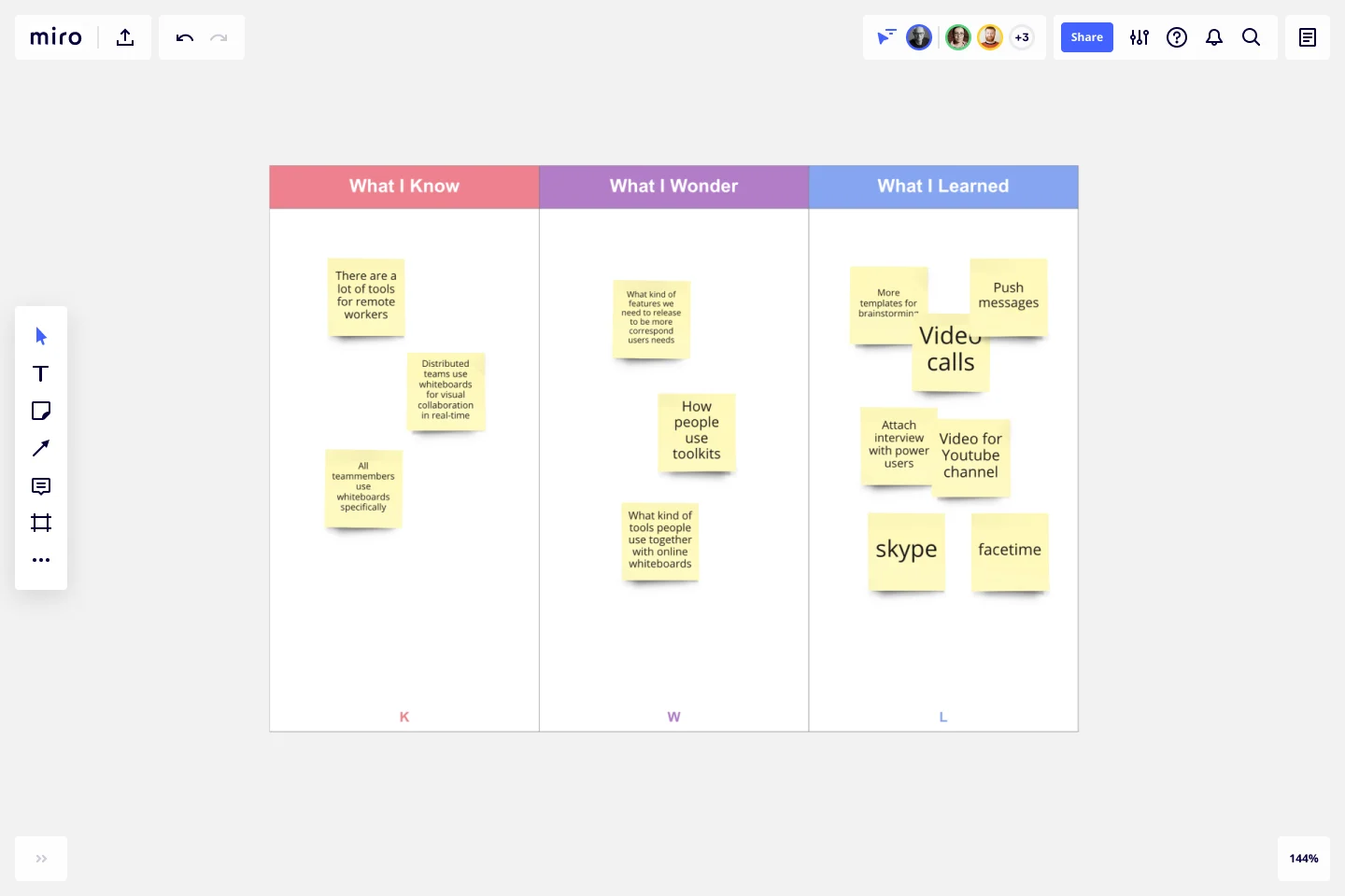
All KWL charts have three columns: What I Know, What I Wonder, and What I Learned. You begin your session by taking stock of what you know. Then, record what you want to get out of your session. Last, you record what you have learned.
When do you need a KWL chart?
Let’s take a look at the two common scenarios where using a KWL chart can be helpful:
To help students: KWL charts can be a helpful tool for students to learn new concepts and be accountable for their learning. They can be clear about what they already understand and reflect on what they’ve learned about a specific topic of study.
To support employees: As a business leader, the KWL chart can help staff learn and retain new information. They can also return to the chart later to refresh their memory.
Although these are the most common use cases, a KWL chart is helpful whenever you need to learn something new and retain knowledge. It helps you track the learning process, starting with what you already know, what you hope to learn, and what you did learn.
The bottom line is that a KWL chart is not limited to these two situations. It’s a versatile template that can be used for a variety of reasons.
How do you fill in a KWL chart template?
Filling in a KWL chart template is a pretty straightforward task. Follow these steps to see for yourself:
Step 1) Add what you already know in the first column. Begin by listing everything you know about a topic and recording that information in the What I Know column. This will solidify your starting position and help you identify gaps in your knowledge.
Step 2) Outline what you want to know in the second column. Generate a list of questions or statements about what you want to know in the What I Wonder column. These statements will guide your learning to give you direction throughout the learning process.
Step 3) Summarize what you learned in the final column. When you’ve completed your training, lessons, or research, you can outline what you’ve learned in the What I Learned column. Use these statements to review what you learned in comparison with what you wanted to learn in the second column.
In some charts, you might come across a fourth column titled How will I learn? This would go between the second and third columns. In this column, you’ll outline the steps you plan to take to develop your learning. Whether that’s conducting research online, speaking to a manager, or having a discussion with a faculty member — this is where you’ll outline your actionable steps.
Benefits of using an online KWL Chart template
If you want to save yourself time, using an online template could be the way to go. You don’t have to worry about creating it from scratch. You simply have to select the template and add your information to the columns.
Let’s take a look at a few more reasons why using an online template can make your life easier.
Collaborate and share your chart. If you’re using an online template, you’ll be able to collaborate with your colleagues. With Miro, you can share the template with other users. People can add comments and other visual notes so you can collaborate effectively on the same chart.
Update information in real-time. Using an online chart makes it easy to update the information and make changes. If your chart is on a blank sheet of paper, you’ll need a pen and a lot of scribbling to make changes. But with an online template, all you need is a few clicks and taps on the keyboard, and your chart has been instantly updated.
Customize the template. Platforms like Miro have a lot of features and functions that allow you to customize existing templates. You can change fonts, add new text, upload files, add shapes, and even add additional columns to your template if you want to. As a result, you can create a template that’s perfect for your needs.
How do I make a KWL chart online?
Creating a KWL chart online is pretty simple. You can start by selecting this template to get the ball rolling. Feel free to customize our existing template if you want to make any changes. When your template is ready to go, you can add information to the What I Know column. This is your starting point, so put all your current knowledge into this section. Next is the What I Wonder column. Here, you’ll add all the information you want to learn. You can write this as questions or statements — whatever works best for you. The final column is titled What I Learned, although it’s sometimes known as the Complete column. This is where you’ll outline all the new information you’ve learned. It’s also a good place to reflect on how you’ve progressed through your learning.
Is the KWL chart a graphic organizer?
Yes, the KWL chart is often described as a graphic organizer. It’s a great way to outline what you want to learn and how you plan to learn it, as well as to keep track of what you’ve learned. It’s very much a visual of the learning process.
What does the H stand for in a KWL chart?
‘H’ is an optional column that stands for ‘How will I learn?’ This column isn’t included in every template, but it can be used between the second and third columns. It outlines where you plan to get new information and how you’ll retain it. If you’re using Miro’s template, you can easily add this column if you want to use it.
Get started with this template right now.
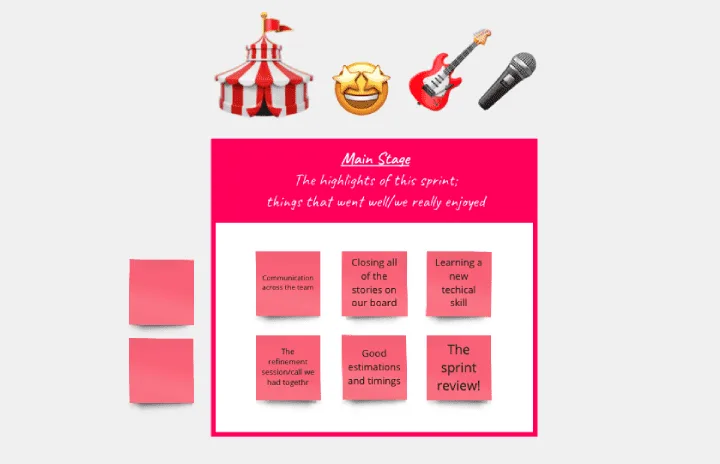
Festival Retrospective
Works best for:
Retrospectives, Meetings, Agile Methodology
The Festival Retrospective template offers a unique and engaging approach to retrospectives by framing the session as a festive event. It provides elements for reflecting on past experiences, celebrating achievements, and setting goals for the future. This template enables teams to foster a positive and celebratory atmosphere, encouraging open communication and collaboration. By promoting a festive spirit, the Festival Retrospective empowers teams to strengthen bonds, boost morale, and drive continuous improvement effectively.
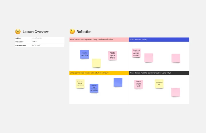
Lesson Reflection Template
Works best for:
Education, Meetings
The Lesson Reflection template is a tool to create space for self-reflection and improvement. Students can evaluate the key takeaways from a lesson and what are the topics they find most interesting. As teachers receive the student’s Lesson Reflection, they can look for opportunities to improve learning and teaching methodologies. The Lesson Reflection template can help you facilitate the educational process, and it’s easy to use and straightforward.
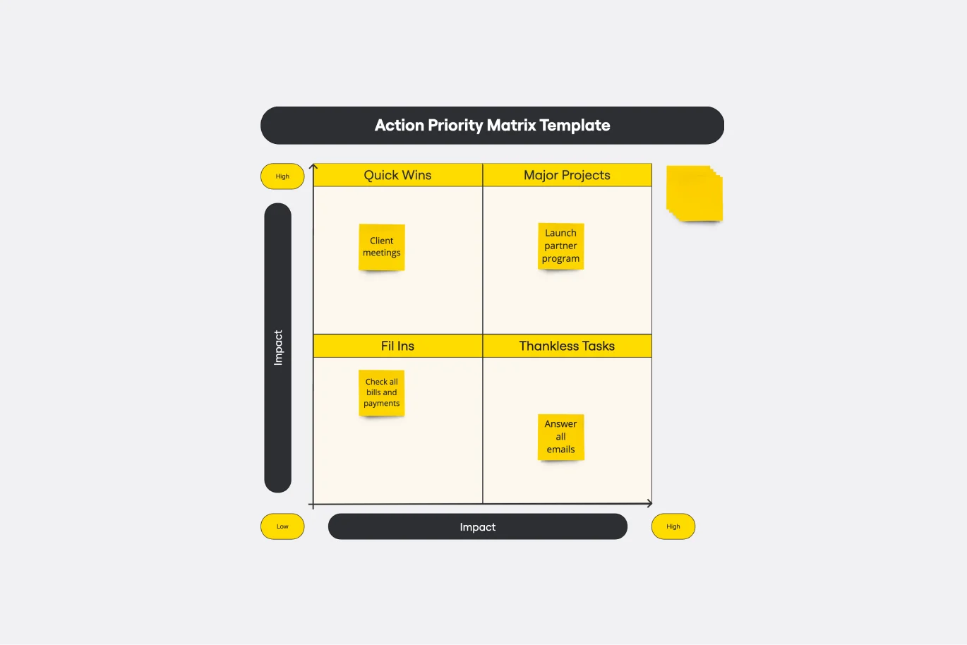
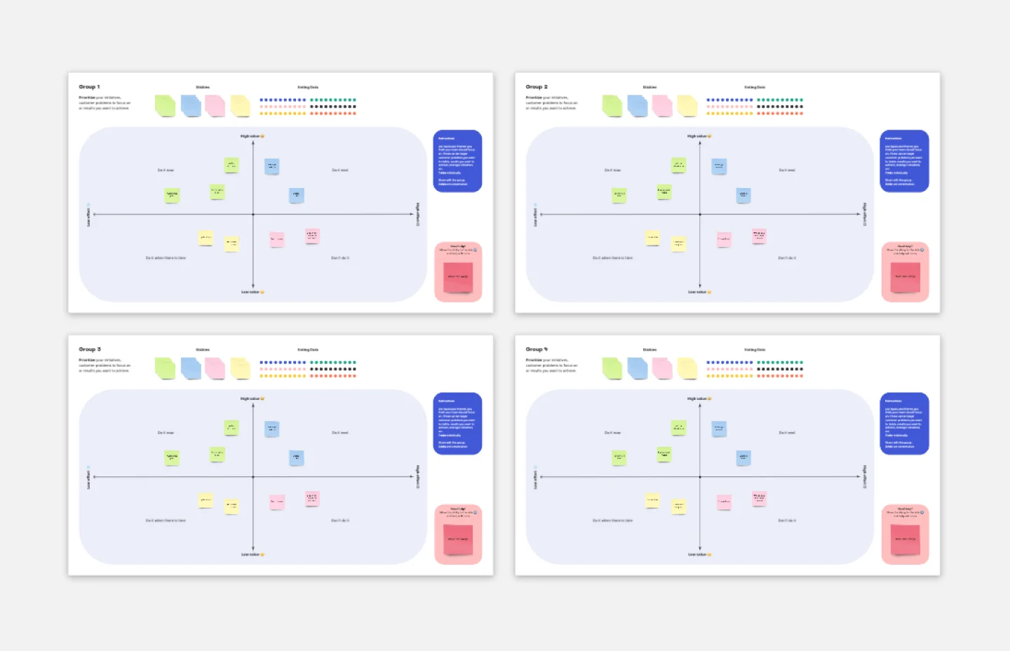
Action Priority Matrix Template
Works best for:
Mapping
You and your teammates probably have more ideas than resources, which can make it difficult to prioritize tasks. Use an Action Priority Matrix to help choose the order in which you will work on your tasks, allowing you to save time and money and avoid getting bogged down in unnecessary work. An Action Priority Matrix is a simple diagram that allows you to score tasks based on their impact and the effort needed to complete them. You use your scores to plot each task in one of four quadrants: quick wins, major projects, fill-ins, and thankless tasks.
Breakout Group Template
Works best for:
Education, Team Meetings, Workshops
Breakout groups provide an excellent opportunity for teammates to have candid conversations and connect on a more intimate level than is possible during a broader meeting. When you’re in a large group setting, it can be difficult for people to feel safe or comfortable speaking up. In a smaller group, participants can feel safer sharing their ideas. Since the group is more intimate, teams are empowered to participate rather than observe.
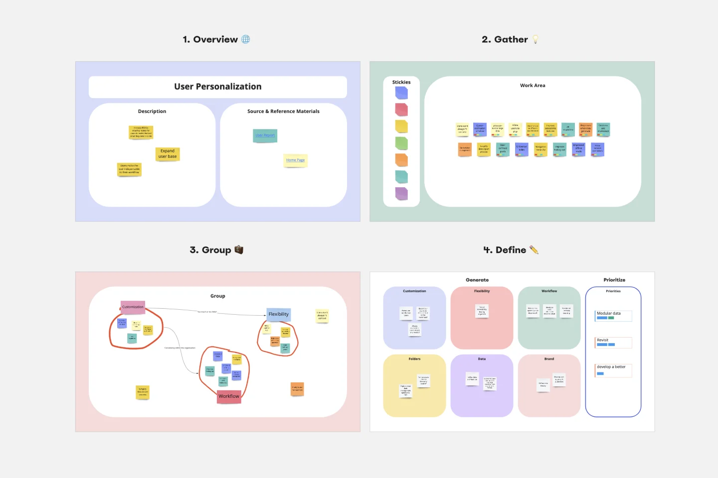
Affinity Diagram Template
Works best for:
Desk Research, Mapping, Product Management
You can use an affinity diagram to generate, organize, and consolidate information that comes out of a brainstorming session. Whether you’re building a product, working through a complex problem, establishing a process, or piecing apart an issue, an affinity diagram is a useful and simple framework that gives each team member the opportunity to pitch in and share their thoughts. But it’s not just ideal for brainstorms—this is a great template and tool when you need to reach consensus or analyze data such as survey results.
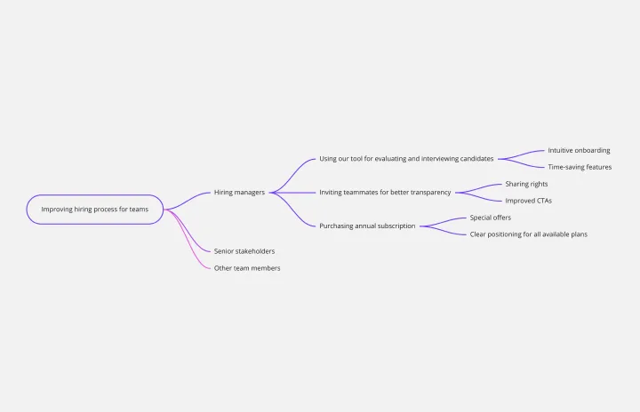
Impact Mapping Template
Works best for:
Agile Methodology, Mapping, Agile Workflows
When you’re building products and shipping goods (oh, and everything in between) there’s nothing more important than staying organized and on-task. Impact mapping is a great way to do it. This trusty product planning technique creates a graphical representation of all your goals and the steps it’ll take to reach each one — so you can clearly communicate with your teammates, align on business objectives, and build better roadmaps. Our template will help you do impact mapping for any type of project planning.