Supply and Demand Graph Template
Determine the right price points for your products and services with a supply and demand graph template. Understand how to price your products in a way that's affordable for consumers — and profitable for the business.
Trusted by 65M+ users and leading companies


About the Supply and Demand Graph Template
Miro’s supply and demand graph template is a ready-to-use diagram designed to help you price your products strategically. By seeing where market demand meets supply, you’ll be better equipped to pinpoint the sweet spot for your prices — affordable enough for your customers and profitable for your business.
We’ll walk you through how to make the most of the supply and demand graph template and point out the unique benefits that come with filling it out in Miro.
How to use Miro’s supply and demand graph template
Ready to use the supply and demand graph template? Get started by clicking on the blue “Use template” button on the page to open the template up in Miro. Once you’re in, follow the steps below:
1. Gather the data
You’ll need data to populate the supply and demand graph template, so pull up a spreadsheet. In Miro, you can easily embed your spreadsheets right on your board — allowing you to fill the template in without having to go back and forth to get data. Just head to the toolbar, click “More apps,” look for “Upload,” and choose how you’d like to import your spreadsheet.
2. Edit the axes
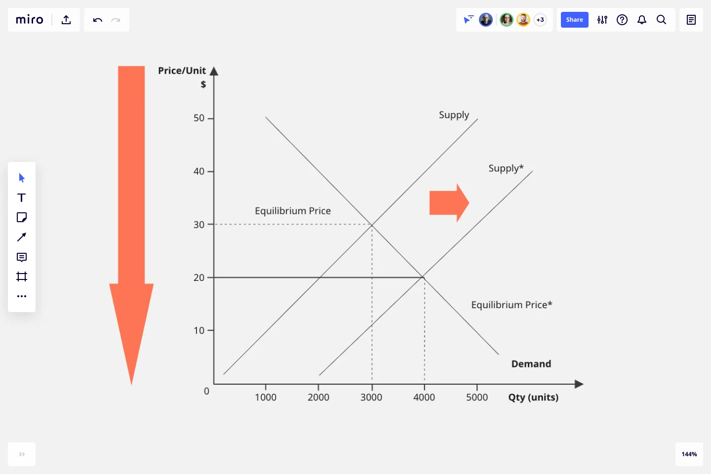
The template comes with a pre-made X-axis representing the product quantity and a Y-axis representing the price per unit. Take a look at the values and measurement units along the axes and edit them if needed. For example, if you’re measuring your prices in the Euro (EUR), double-click on the ‘$’ symbol to replace it with a ‘€’ symbol.
3. Adjust the curves
Click and drag the pre-made supply and demand curves to adjust their position on the diagram based on your data — making sure both curves intersect at some point.
To lengthen a curve, click on it once to reveal the two white dots on each end, then click and drag either dot until the line is as long or short as you want it to be. You can use the blue dot in the middle of the line to adjust the arch of the curve.
4. Mark the equilibrium point
See where the curves intersect on the diagram? You’ll need to mark that as the equilibrium point by drawing lines from the two axes toward it. Luckily, the supply and demand graph template already comes with a few lines like these, so all you’ll have to do is adjust their lengths and positions on the diagram.
5. Customize the template
Your supply and demand diagram should be easy and inviting to read, so feel free to customize its look and feel. Try changing text colors, font types, or line styles and thickness. You can even add sticky notes to include important context about the supply and demand diagram — just press N on your keyboard.
Taking the time to customize the template can be especially helpful if you’ll be sharing it with senior stakeholders and need to keep up with brand guidelines.
Benefits of using Miro’s supply and demand graph template
Accessing Miro’s supply and demand graph template doesn’t just save you time from having to build a diagram from scratch but also grants you access to our visual workspace for innovation — packed with intuitive diagramming tools and next-level collaboration features.
Easily collaborate on the template with teammates by inviting them to edit your Miro board with you in real time — even if you aren’t in the same room. Prefer to work async? Share your board when you’re ready and have others view and comment on your diagram, and keep each other in the loop by tagging the right people.
Need to present your supply and demand diagram to others? Use Presentation Mode to run live and engaging sessions right from your Miro board, complete with interactive features to maximize participation. Not up for another meeting? Use TalkTrack to record immersive audio and video walkthroughs and share these as interactive sessions people can watch in their own time.
Last but not least, you’ll want to keep your template up to date as market conditions change. With a supply and demand graph maker like Miro, it’s easy to make changes and keep everyone informed in real time — making sure everyone on the Miro board has the same source of truth at all times.
Is Miro’s supply and demand graph template free?
Yes, the supply and demand graph template is free and fully customizable. Just click on the “Use template” button to create a free account and open the template in Miro.
Why create a supply and demand diagram?
Understanding supply and demand is helpful for determining the prices and quantities of goods and services on the market. More specifically, it helps businesses understand what their customers want — allowing them to set their products and services at reasonable price yet profitable prices.
How can I share my supply and demand diagram with others?
Absolutely. When you’re done filling in the supply and demand graph template, you can choose from multiple ways to share it. Export it as a PDF or image by heading to the “Main menu” at the top of your Miro board, clicking “Export” and choosing a file format. You can also generate a shareable link or an embed code. Alternatively, invite others to view and comment on your Miro board, allowing you to get instant feedback and make any necessary changes — all in one place.
Get started with this template right now.
Kubernetes Architecture Diagram Template
Works best for:
Software Development, Diagrams
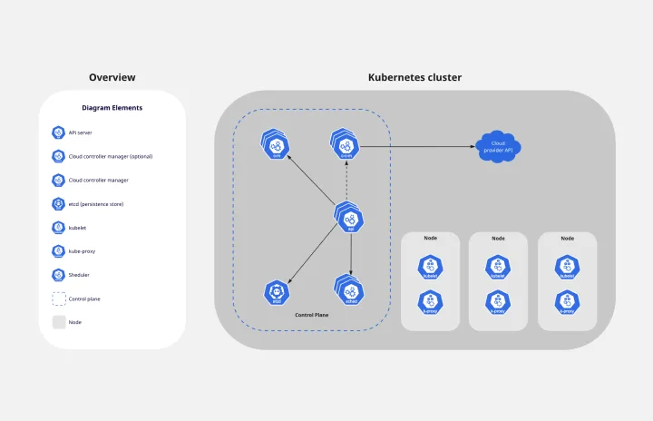
Use the Kubernetes Architecture Diagram template to manage your containerized applications better and bring your apps’ deployment, management, and scalability to the next level. This template helps you lower the downtime in production and allows you to have a more agile app production. Improve the deployment of your apps by visualizing every step of the process with the Kubernetes Architecture template. Try it out, and see if it works for you and your team.
Bull's Eye Diagram Template
Works best for:
Diagrams, Project Management, Prioritization
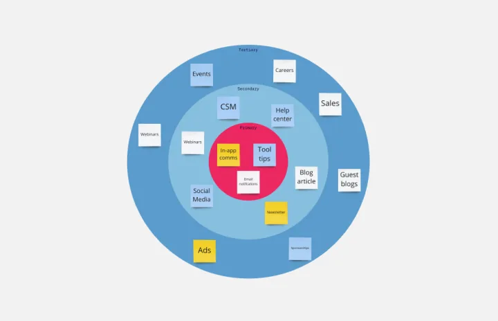
When you’re a growing organization, every decision can feel like it has make-or-break consequences—which can lead to decision paralysis, an inability to prioritize, inefficient meetings, and even low morale. If that sounds like you, put a Bull’s Eye Diagram to work. True to its name, a Bull’s Eye Diagram uses a model of concentric circles to help companies establish priorities, make critical decisions, or discuss how to remove or overcome obstacles.
Algorithm Flowchart Template
Works best for:
Diagramming, Flowcharts
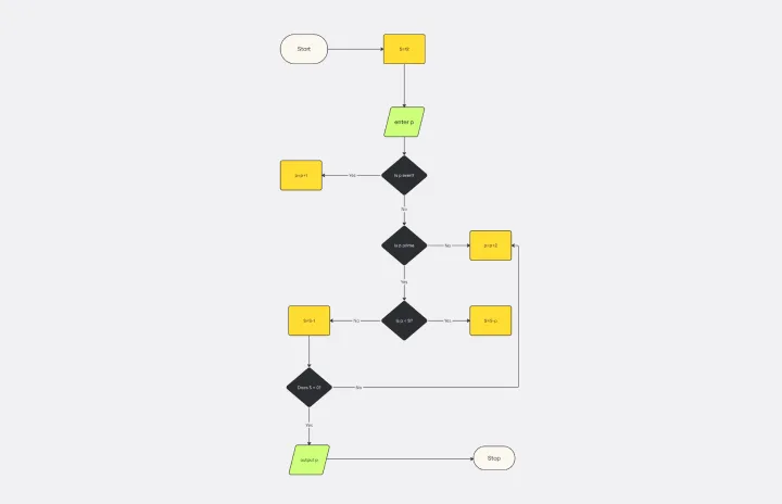
The Algorithm Flowchart Template is a useful tool for simplifying the process of creating and understanding complex algorithms. Its pre-structured format makes it easy to lay out each operation and decision point in a clear and easily understandable visual format. This is particularly helpful for explaining intricate processes to team members who may not be as technically proficient in the subject matter. With each step clearly defined within its designated shape, the flowchart promotes clarity and makes it easy to identify the logical flow at a glance. This clarity is the template's most significant advantage, reducing cognitive load and enabling a more inclusive and straightforward approach to discussing and refining algorithmic solutions.
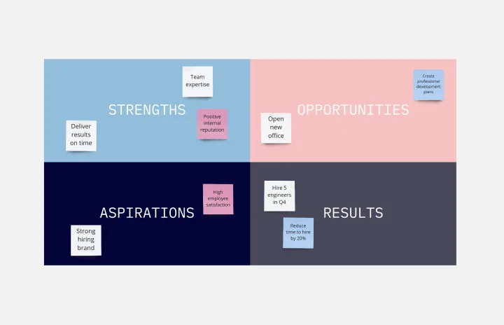
SOAR Analysis Template
Works best for:
Leadership, Decision Making, Strategic Planning
The SOAR Analysis template prompts you to consider your organization’s strengths and potential to create a shared vision of the future. The SOAR Analysis is unique in that it encourages you to focus on the positive rather than solely identifying areas for growth. SOAR stands for Strengths, Opportunities, Aspirations, and Results. To use the template, examine each category through a positive lens. Perform a SOAR Analysis whenever you want to bring people together and encourage action.
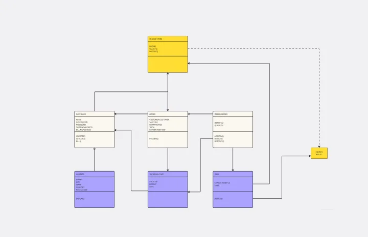
UML Diagram Template
Works best for:
Diagrams, Software Development
Originally used as a modeling language in software engineering, UML has become a popular approach to application structures and documenting software. UML stands for Unified Modeling Language, and you can use it to model business processes and workflows. Like flowcharts, UML diagrams can provide your organization with a standardized method of mapping out step-by-step processes. They allow your team to easily view the relationships between systems and tasks. UML diagrams are an effective tool that can help you bring new employees up to speed, create documentation, organize your workplace and team, and streamline your projects.
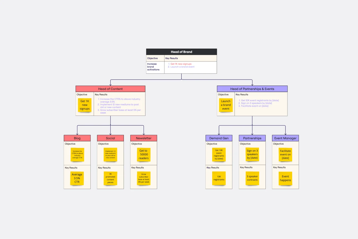
Objectives and Key Results (OKRs) Template
Works best for:
Leadership, Strategic Planning, Project Planning
Clarity, focus, and structure — those are the key ingredients to feeling confident in your company’s directions and decisions, and an OKR framework is designed to give them to you. Working on two main levels — strategic and operational — OKRs (short for objectives and key results) help an organization’s leaders determine the strategic objectives and define quarterly key results, which are then connected to initiatives. That’s how OKRs empower teams to focus on solving the most pressing organizational problems they face.