Data Flow Diagram Template
Model processes and map data flows efficiently with the data flow diagram template. Improve internal processes and lead development teams with more clarity.
Trusted by 65M+ users and leading companies


About the Data Flow Diagram Template
The data flow diagram template is a visual tool you can use to improve your understanding of how data travels within a system — namely by visualizing the inputs, outputs, and the processes involved. Organizations use data flow diagrams (DFD) in many business activities, including depicting notation styles, physical requirements, and system automation.
We’ll walk you through how you can start creating a data flow diagram using Miro’s free and customizable DFD template.
How to use Miro’s data flow diagram template
To get started with Miro’s data flow diagram template, scroll to the top of this page and click on the blue “use template” button. That’ll open the template and allow you to start using Miro’s diagram maker. Once you’ve opened it, think about what type of system you’re trying to visualize — whether it’s a business process, data flow within a software application, or something else. When you’re ready, here are a few more steps to make the most of the data flow diagram template.
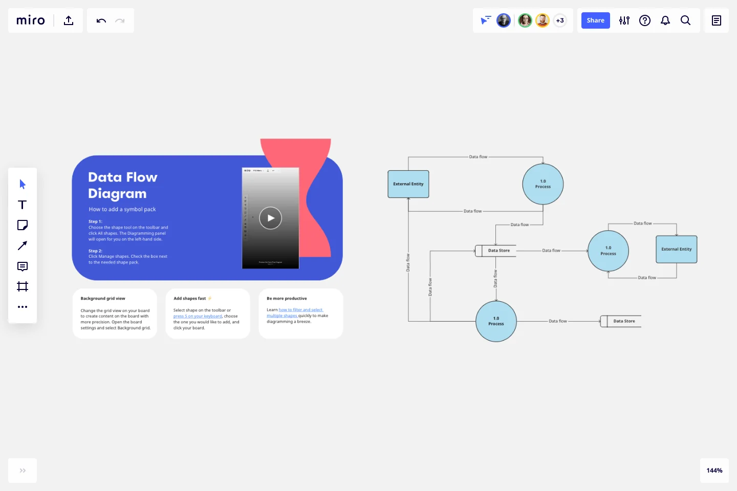
1. Identify inputs and outputs
Each process you aim to map out should have at least one input and one output. This helps make sure that your DFD template is complete and has no loose ends. Look for the two blue, rounded rectangles on the left and right of the DFD template marked “external entity,” then edit the text boxes within them to label where the data is entering the system from and where it’ll go. To add more input and output sources, right-click on the rectangle and choose “Duplicate.”
2. Identify processes
On the data flow diagram template, the three circles labeled “Process” are for you to identify the activities or functions that manipulate data in some way. Edit the text boxes to add your system’s processes, and easily delete or duplicate these circles as needed.
3. Identify data stores
There are two symbols on the template labeled “data store.” As its name implies, it refers to where the system stores its data. Double-click on the text boxes to edit them and replace the text with how you want to label your data stores. Duplicate these symbols as needed, and click and drag them if you’d like to adjust their position on the diagram.
4. Label data flows
Last but not least, don’t forget to visualize the flow of data. The template comes with arrows connecting inputs, outputs, processes, and data stores. Edit the text along these arrows to identify the type of data that’s traveling, and click and drag them to adjust the direction of flow appropriately.
Is Miro’s data flow diagram template free?
Yes, Miro’s data flow diagram template is free and fully customizable, so you can make it your own. Just click on the blue “use template” button on this page to get started.
Who is Miro’s data flow diagram template for?
Miro’s data flow diagram template is for any team involved in system development, analysis, optimization, and collaboration — including data analysts, software development teams, growth teams, and product teams.
What’s the difference between a data flow diagram and a flowchart?
A data flow diagram is your guide to understanding the nitty-gritty of how information travels within a system — such as databases, software applications, and business processes. While a flowchart also visualizes flows, it isn’t limited to representing data. Flowcharts are versatile maps that outline processes, decisions, and actions much more broadly. Miro's free data flow diagram template is specially crafted to visualize the intricacies of data flow within complex systems.
Get started with this template right now.
Lotus Diagram Template
Works best for:
UX Design, Ideation, Diagrams
Even creative thinkers occasionally need help getting their creative juices flowing. That's where a lotus diagram comes in. It'll empower you to run smoother, more effective brainstorming sessions. This creative-thinking technique explores ideas by putting the main idea at the diagram center and ancillary concepts in the surrounding boxes. This template gives you an easy way to create Lotus Diagrams for brainstorms, as well as an infinite canvas for the endless ideas generated.
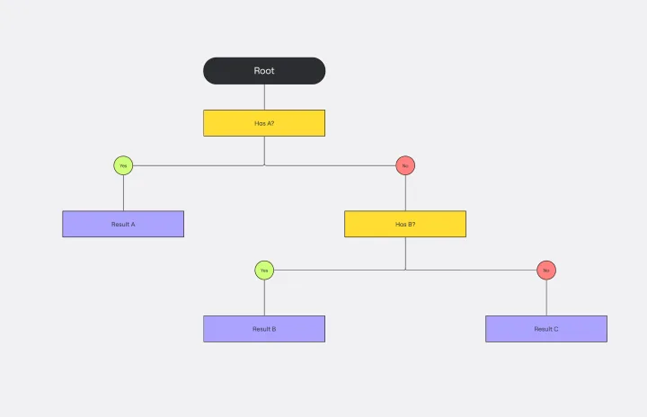
Dichotomous Key Template
Works best for:
Diagramming
The Dichotomous Key Template stands out as an exceptional tool for simplifying complex classification processes, significantly enhancing learning experiences. Breaking down intricate subjects into a series of binary decisions transforms how information is absorbed and understood. This systematic approach not only aids in retaining intricate details but also makes the learning process more engaging and interactive. Whether for educational purposes or professional use, the template’s design fosters a deeper comprehension of the subject matter, allowing learners and professionals to navigate complex scenarios with clarity and ease.
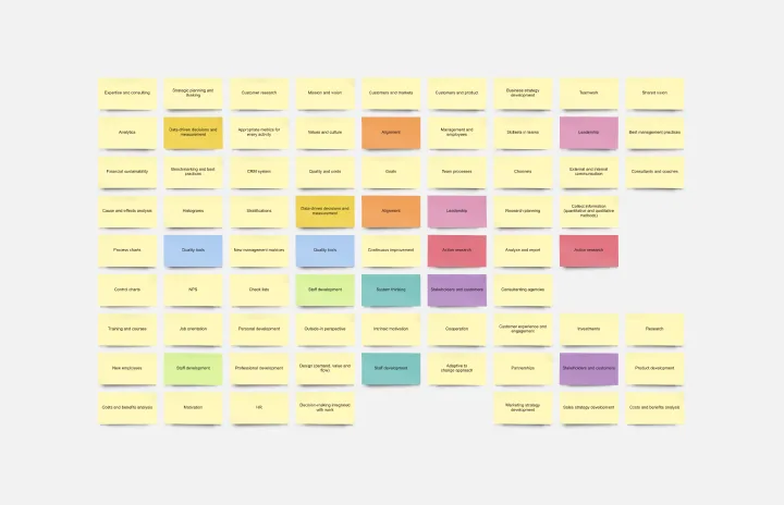
Stakeholder Mapping Template
Works best for:
Business Management, Mapping, Workflows
A stakeholder map is a type of analysis that allows you to group people by their power and interest. Use this template to organize all of the people who have an interest in your product, project, or idea in a single visual space. This allows you to easily see who can influence your project, and how each person is related to the other. Widely used in project management, stakeholder mapping is typically performed at the beginning of a project. Doing stakeholder mapping early on will help prevent miscommunication, ensure all groups are aligned on the objectives and set expectations about outcomes and results.
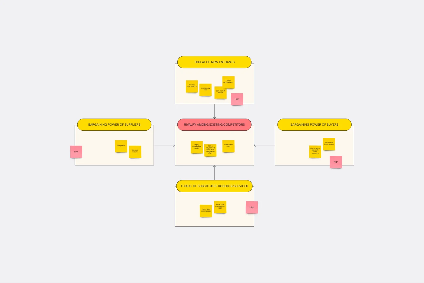
Porter's Five Forces Template
Works best for:
Leadership, Strategic Planning, Market Research
Developed by Harvard Business School professor Michael Porter, Porter’s Five Forces has become one of the most popular and highly regarded business strategy tools available for teams. Use Porter’s Five Forces to measure the strength of your current competition and decide which markets you might be able to move into. Porter’s Five Forces include: supplier power, buyer power, rivalry among existing competitors, the threat of substitute products or services, the threat of substitute products and services, and the threat of new entrants.
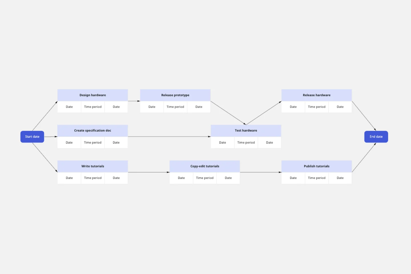
PERT Chart Template
Works best for:
Mapping, Diagrams, Project Planning
A Program Evaluation and Review Technique (PERT) diagram is used to plan projects efficiently. They help you set a clear timeline, plan out tasks and dependencies, and determine a critical path.
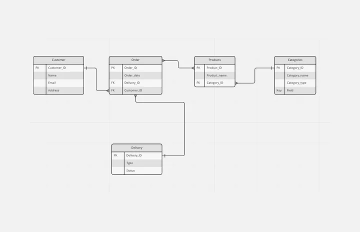
Entity Relationship Diagram Template
Works best for:
Flowcharts, Strategic Planning, Diagrams
Sometimes the most important relationships in business are the internal ones—between the teams, entities, and actors within a system. An entity relationship diagram (ERD) is a structural diagram that will help you visualize and understand the many complex connections between different roles. When will an ERD come in handy? It’s a great tool to have for educating and onboarding new employees or members of a team, and our template makes it so easy to customize according to your unique needs.