design
principles
Design that delights in every detail
From playful reactions that fuel conversation, to fluid motion that keeps you engaged as you work. Every element is crafted to bring joy to your workflows while ensuring clarity and easy navigation.
A richer palette for
bigger ideas
Miro's refreshed color palette delivers more than a modern look—it offers greater creative flexibility. With more shades for every base color, matching hues is effortless. Now it’s easier than ever to find the perfect tone, highlight key ideas, and let your work shine.
Accent Colors
A font for everyone
Meet Noto Sans, Miro’s new body text font. It supports 800+ languages and 100+ writing systems, making it the ideal fit for multi-lingual, hybrid teams based all over the world. With clarity and accessibility in mind, this font ensures that your work is legible and inclusive for all.
Clear & cohesive
Icons simplify navigation while adding visual appeal. Our refreshed icons do just that. With a balance of beveled and rounded edges, they're designed for instant recognition and effortless flow—so your tools work as smoothly as you do.
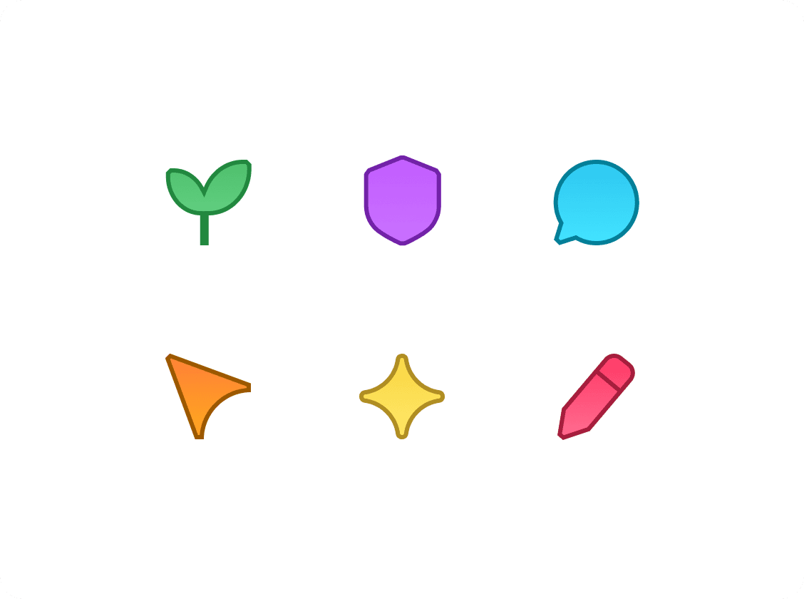
Fresh & functional
With simplified strokes, vibrant colors, and bold shapes, our reimagined board icons help you mark and navigate your workspace at a glance. Navigate boards faster with visuals that speak louder than labels.
Aura is the synergy of creative minds, the spark that ignites new ideas, and the light that reveals endless possibilities—brought to life in Miro.